Module 3
Goal of the exercise
Create a network and customize it.
The goal of this exercise is to learn how to create a network in Cytoscape and customize id. In this example, the proteins are the entities represented as nodes in the network and known physical interactions are the connections between the proteins that are represented as edges. We will overlay 2 additional pieces of information about these proteins, mutation information per protein as node color and mutation expression as node size.
Data
- The data used in this exercise is a set of protein - protein interactions and associated attributes.
Start the exercise
To start the lab practical section, first create a cytoscape_primer_files directoty on your computer and download the files below.
Right click on link below and select “Save Link As…”.
Place it in the corresponding module directory of your CBW work directory.
Two files are needed for this exercise:
Exercise 1a - Create Network from table
- Launch Cytoscape
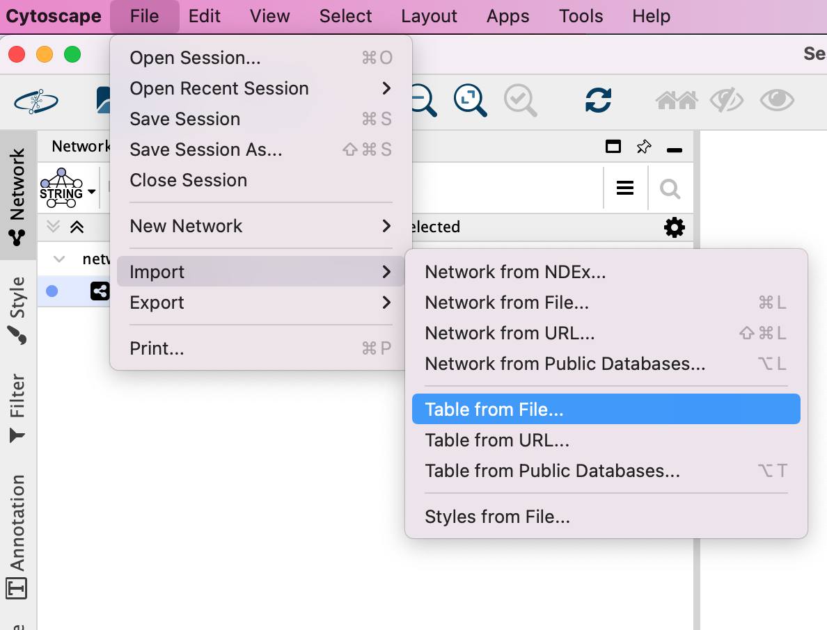
- Locate the top menu bar and select File,–> Import, –> Network from File….
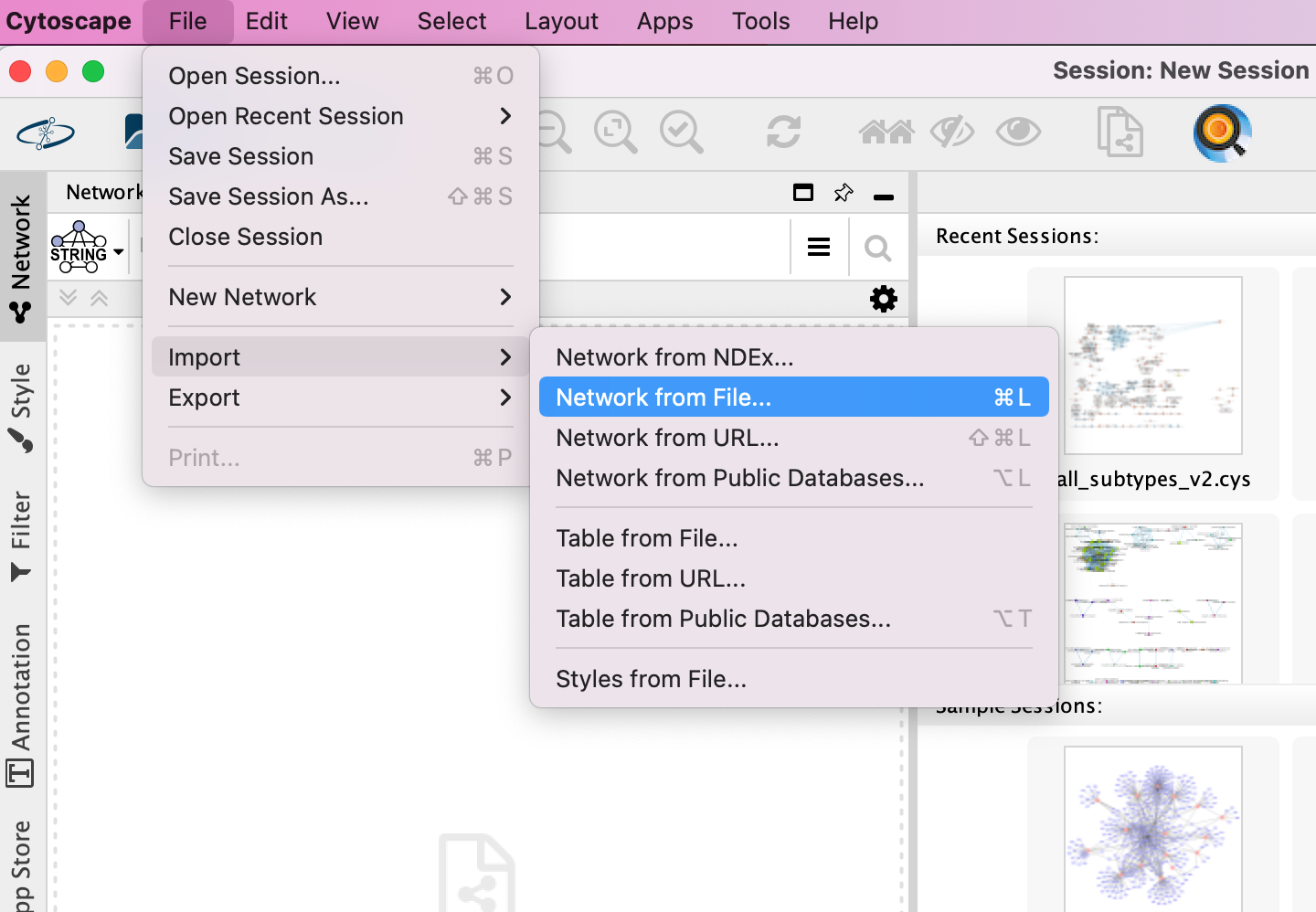
- Browse your computer and select the file networktable.txt
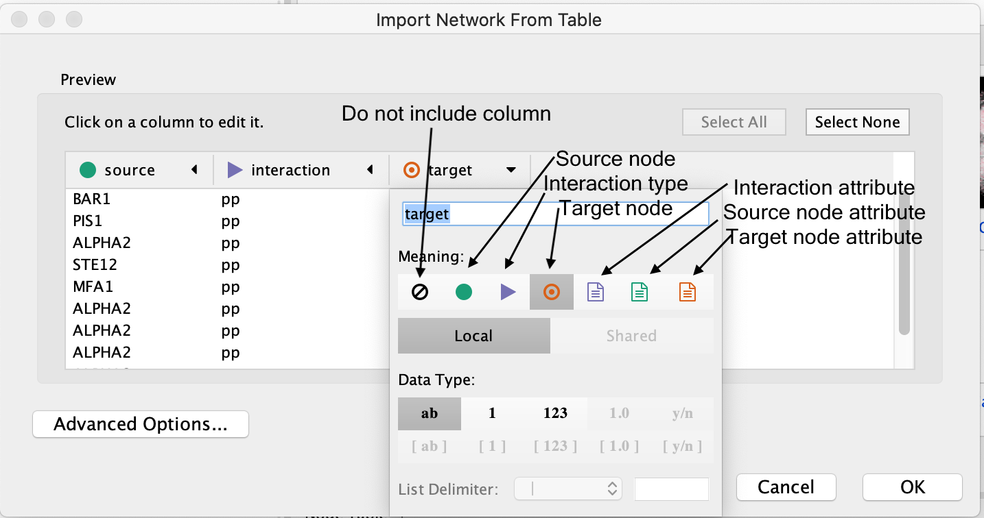
- An Import Network from Table dialog box opens. The 3 columns of the table should be set as “source”, “interaction” and “target” respectively.
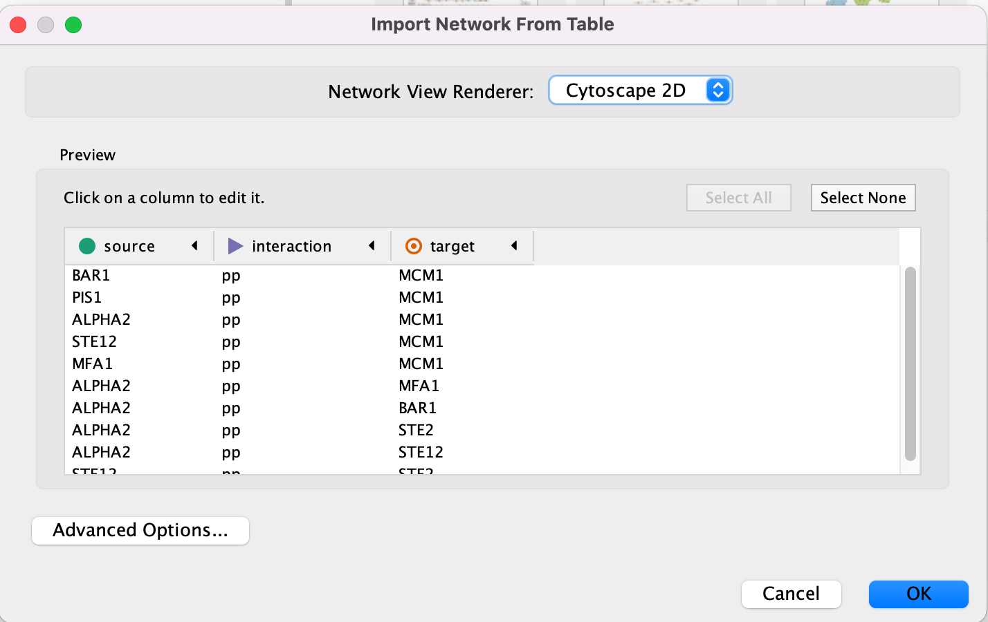
Cytoscape will assume, by default, will look for the column names that start with “source”, “interaction” and “target”. It will assume that any other column is an interaction attribute (edge attribute)
- This is just an example file. You can import files with any number of additional columns and choose to ignore all columns except for the ones that you want to import or import all of them. Although Cytoscape tries to guess the data type of each column and the type (ie. is it an attribute associated with source node, target nodes or the interaction) you are able to fine tune everything.
- Click “Ok”.
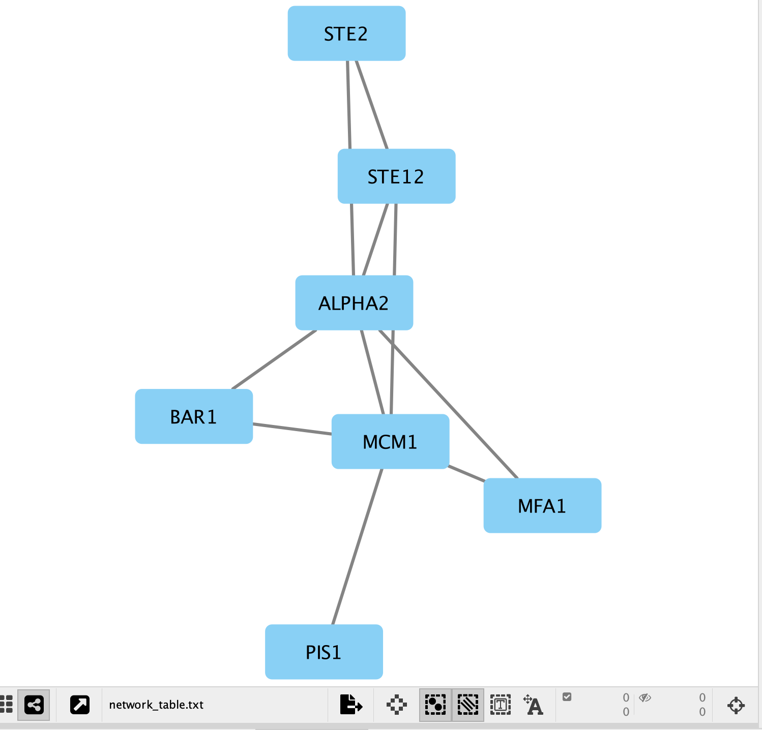
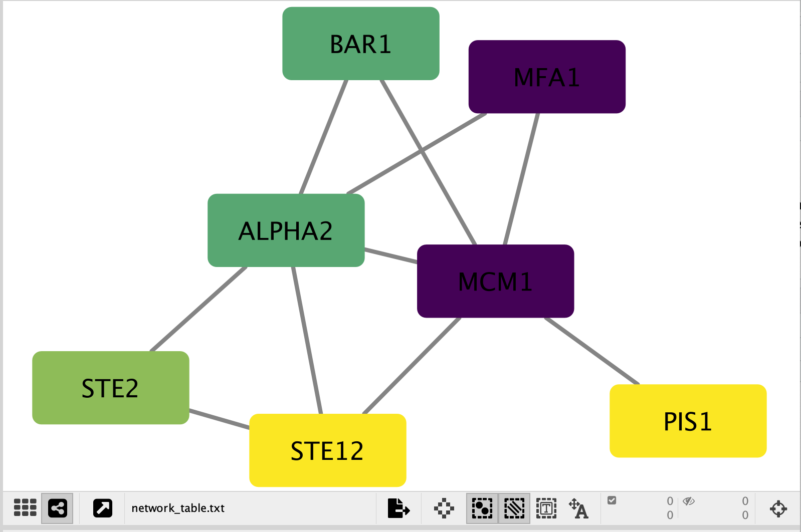
- A network containing the proteins as blue square nodes and interaction as edges should be displayed in the main Cytoscape window.
Exercise 1b - Load node attributes
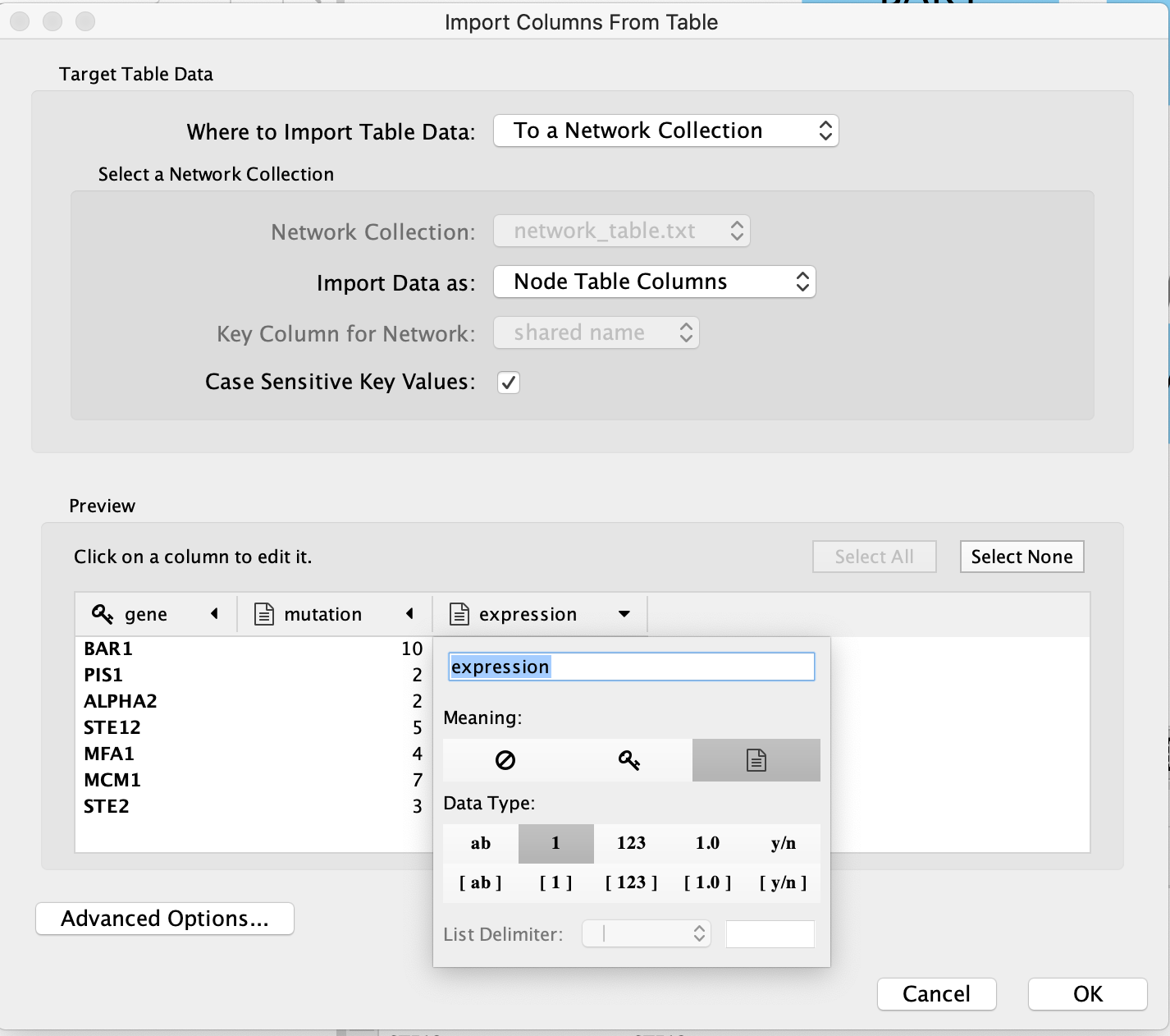
Locate the Cytoscape top menu bar and select File,–> Import,–> Table from File….
Browse your computer and select the file nodeattribute.txt
click “Open”.
An “Import Table from Columns” dialog appears.
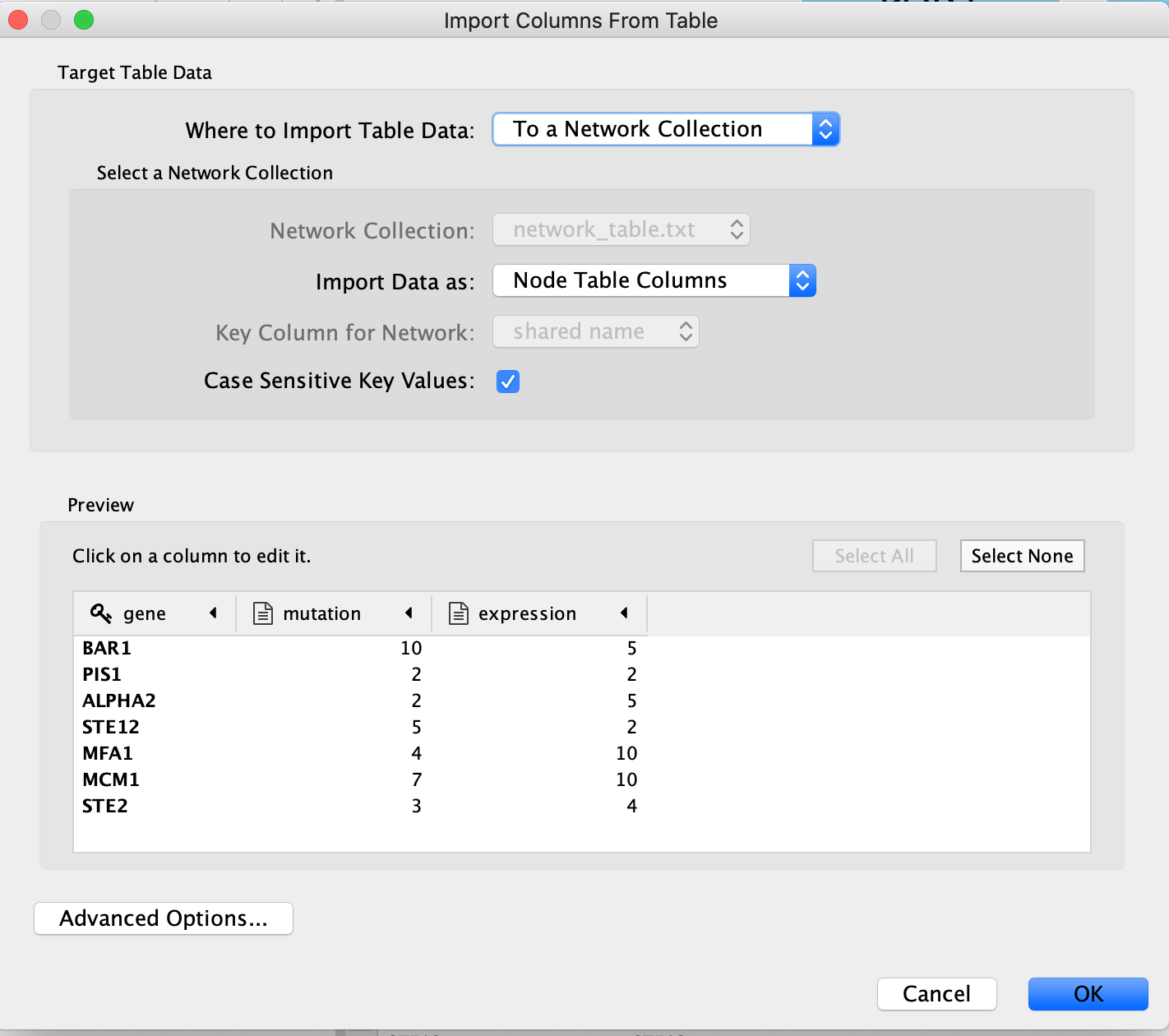
Click on “OK”.
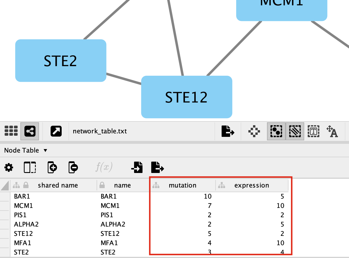
You should be able to see the imported attributes in the node table.
-
The key column is assumed to be the first column in your
table.
- The key is the column in the loaded attribute file used to match your attributes to your network.
- key colum for Network is the column in the Network that the key is matched to. (In this network there isn’t the ability to set this value because that is the only attribute associated with the nodes in our network but normally this drop box will be selectable)
- The key and matching column need to match perfectly (unless you have specifid that case does not matter).
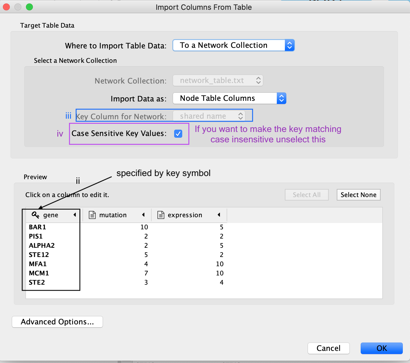
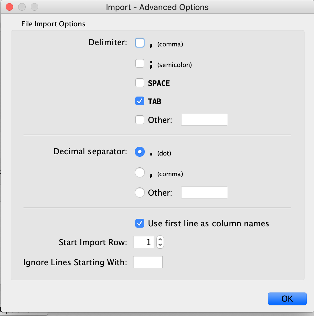
Similiar to the Import Network from Table, everything about the import is customizable. Cytoscape does its best to guess the datatypes of each column but you are able to fine tune it.
There are also advanced options if you want to:
- change the file delimiter
- skip lines
- specify the header column
Exercise 1c - Map node attributes to Visual Style
Go to “Control Panel” on the left side and select the “Style” tab. Make sure that you are in the “Node” tab.
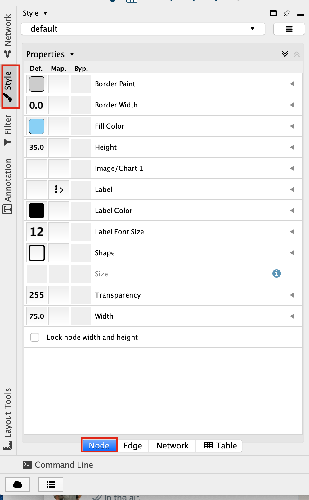
Select the “Fill Color” field
expand it by clicking on the right arrow.
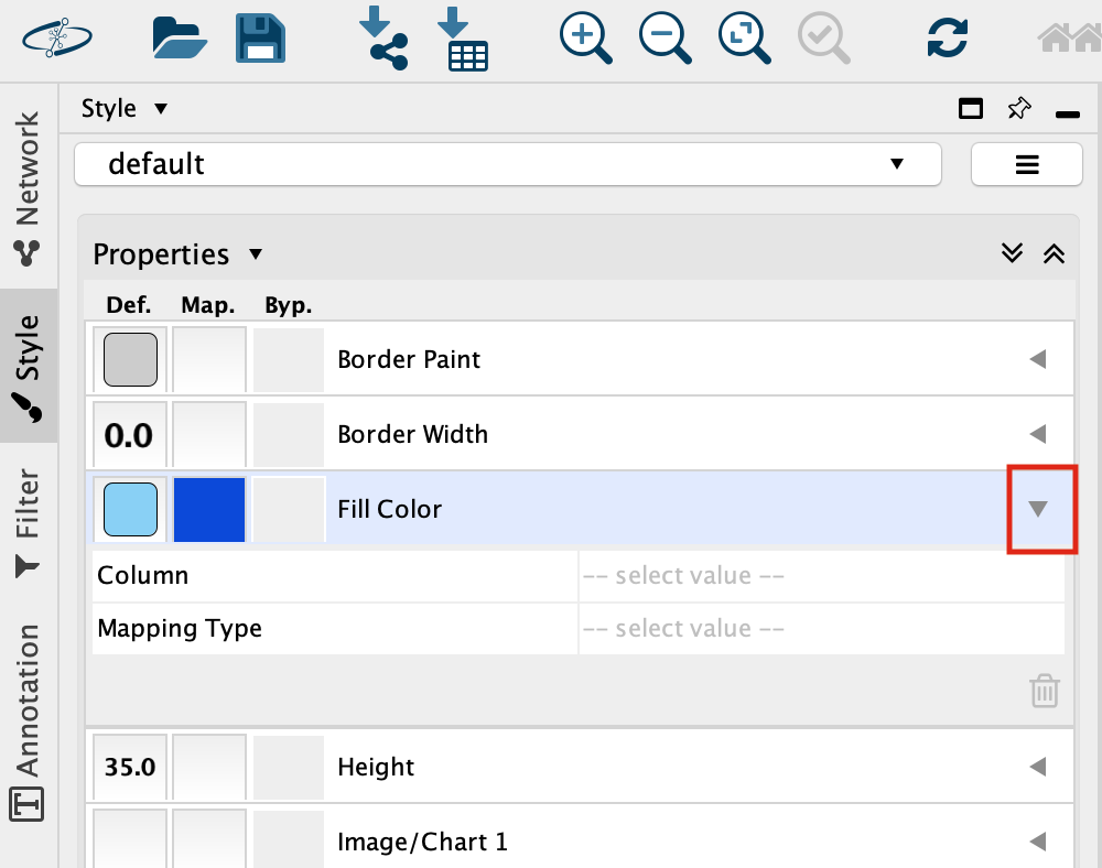
Set “Column” to “expression” and “Mapping Type” to “Continuous Mapping”.
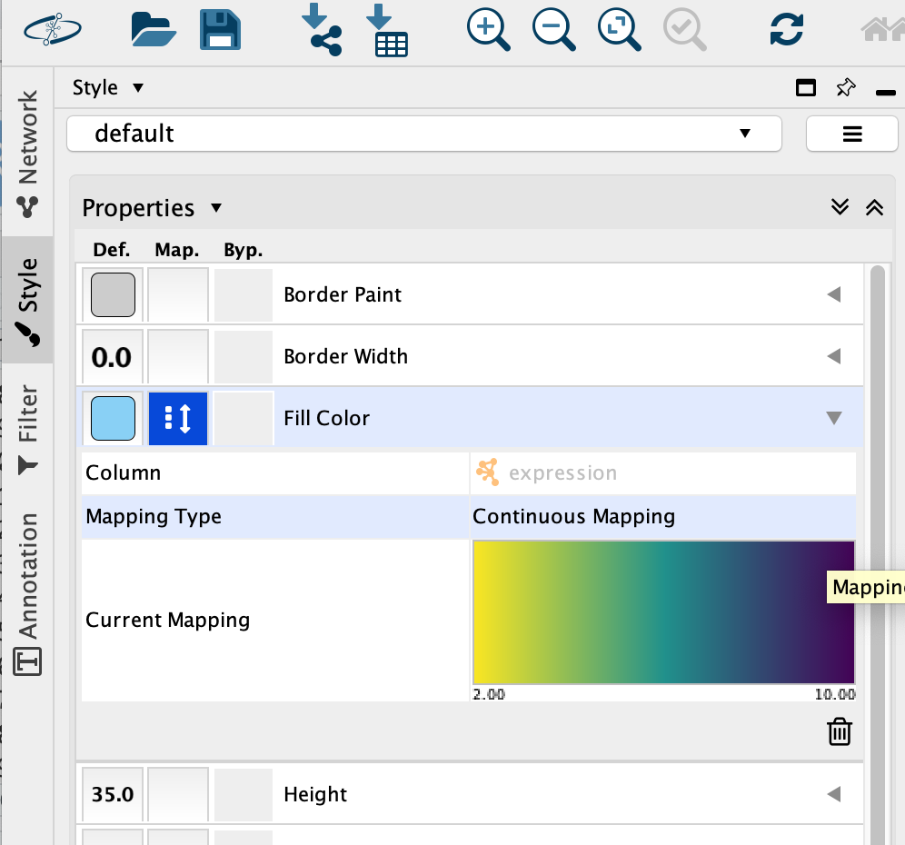
This will change the colours of the nodes to the default colour coding.
Double click on the continuos mapping colour box to manually adjust the colour and other settings.
At the bottom of the “Style” tab, check the box “Lock node width and height”.
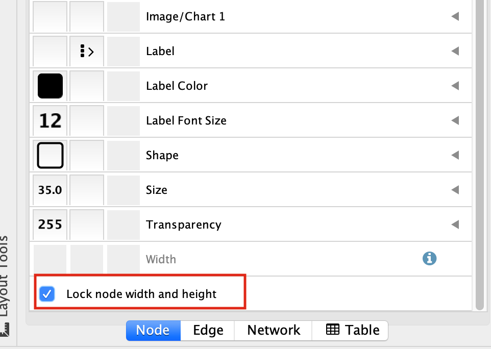
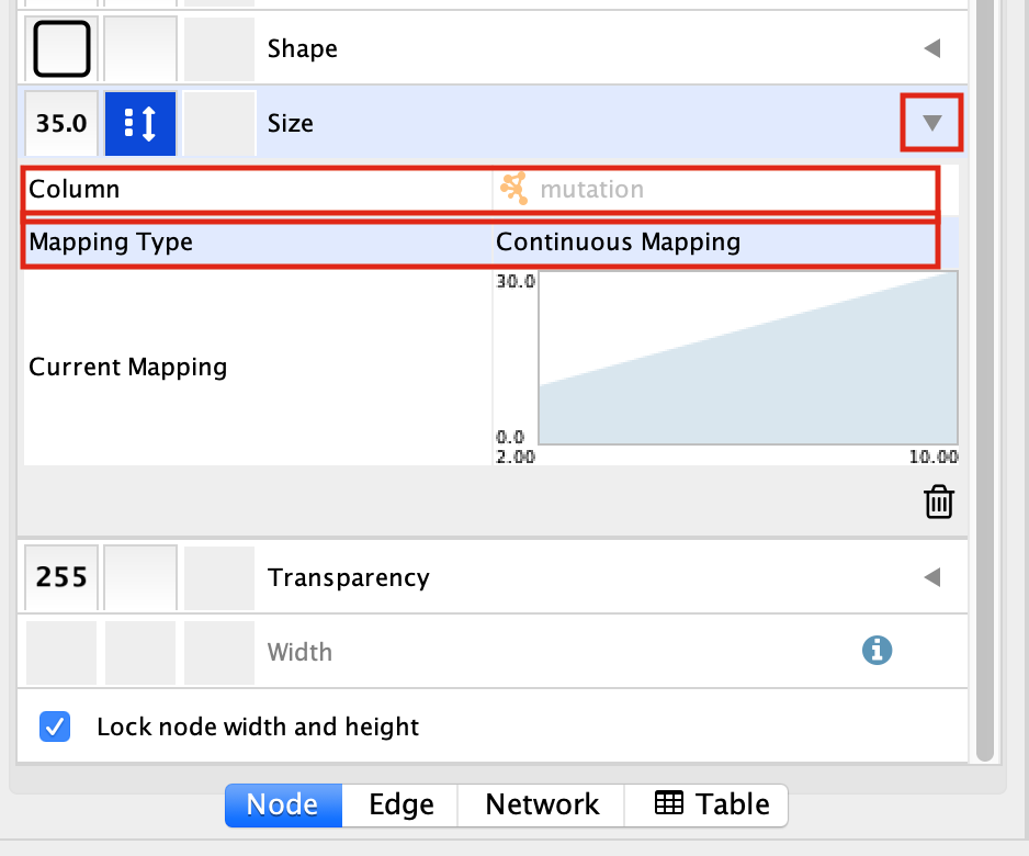
Select the “Size” field and
expand it by clicking on the right arrow.
Set “Column” to “mutation” and “Mapping Type” to “Continuous Mapping”.
Your resulting network maps expression to the colour of the node and the size of the node to the number of mutations.
- Adjust the setting on the colour mapping. Change the colour scheme. Change the maximum and minimum values.
- Adjust the setting on the size mapping. Make the nodes bigger with higher values.
- Eventhough the network is small, play around with the layouts.
Exercise 2 - Work with larger networks
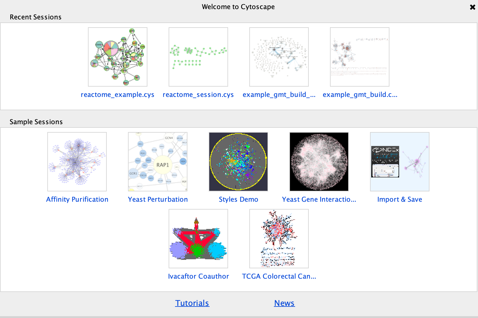
Cytoscape supplies a few demo networks that you can play around with. When you open cytoscape you are presented with a Start Panel where you can choose to reload a previous session or load in one of the sample networks.
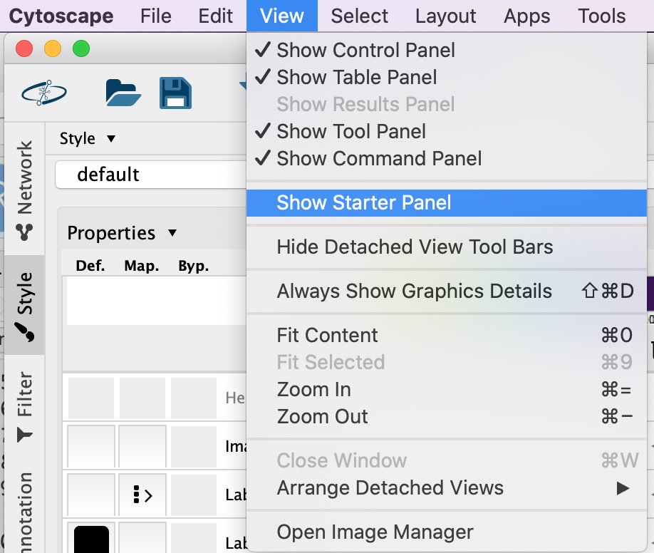
You do not need to re-open cytoscape to open the starter panel. Locate the Cytoscape top menu bar and select View,–> Show Starter panel.
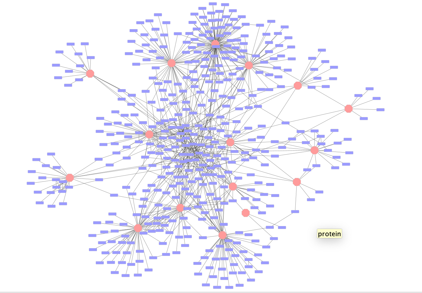
Double click on the Affinity Purification Network to open it.
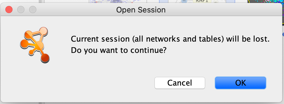
If you already have a session open then you will recieve a warning that the current session will be lost. Before proceeding make sure your current session is saved. (Click on cancel. Then, File –> Save as)
Once the network has loaded you will see a network of protein interactions derived from an affinity purification experiment. Bait proteins are reprsented as pink hexagons and their corresponing prey proteins blue boxes.
Using this larger network play around with the different layouts
- Search for the node “VPR”
- select all of the prey proteins associated with “VPR”
Exercise 3 - Perform basic enrichment analysis using EnrichmentTable
In Module 2 we performed detailed enrichment analysis with g:profiler and GSEA. We supplied gene lists and ranked expression sets in order to perform the analysis. What if you want to run a quick enrichment analysis with a given network or a given subset of the network? The easiest way to do this is to use the cytoscape app EnrichmentTable. EnrichmentTable will query g:profiler directly with the given network or subnetwork. Not all of the parameters that are available in the web version can be tweaked from the enrichmentmap table app but it can be an easy way to quickly see enrichment results.
We will select the bait protein VPR and all its associated prey proteins to use for an enrichment analysis.
Bait Protein - Is the labelled protein in an
affinity purification experiment that is pulled down.
Prey Protein - are the proteins that are associated
with the bait protein when it is pulled down and are assumed to interact
with the bait protein.
First neighbor - are all the
nodes that are directly connected to the given node
1. In the search bar enter “VPR”. Press enter.
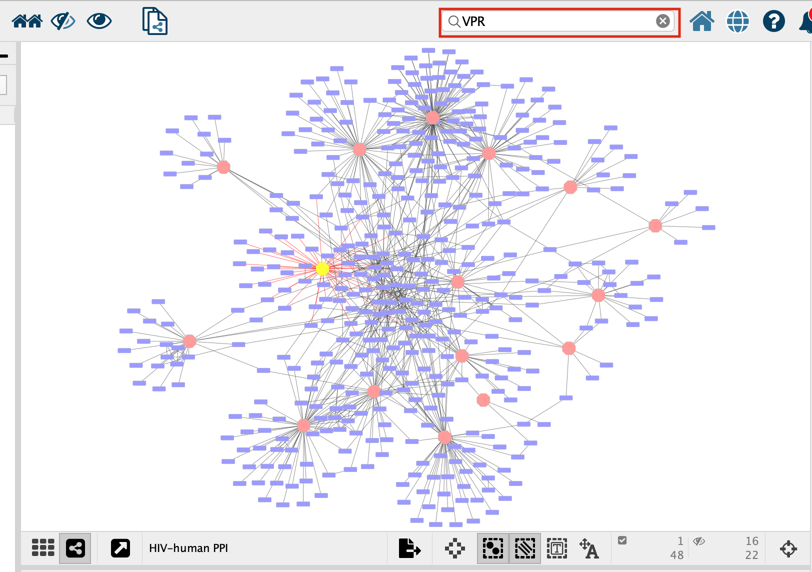
- VPR is now the only highlighted node in the network. In order to select all its associated preys we need to select all the nodes that are connected to VPR, all of VPR’s first neighbours. There are two ways to select the first neighbours:
- In the top menu bar click on Select –> Nodes –> First neighbors of selected nodes –> undirected
- Click on the first neighbor button,
 , in the quick links button set.
- Click on the “Enrichment Table” in the Table Panel.
-
Click on the cog icon in the top right hand corner of the Enrichment Table panel
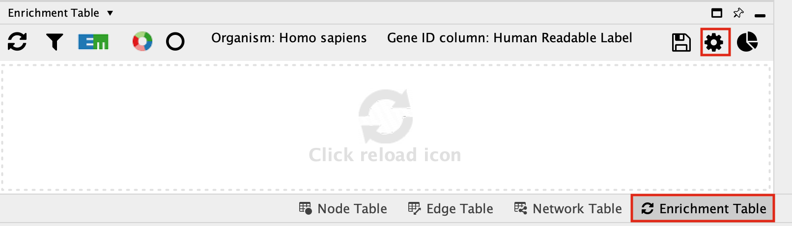
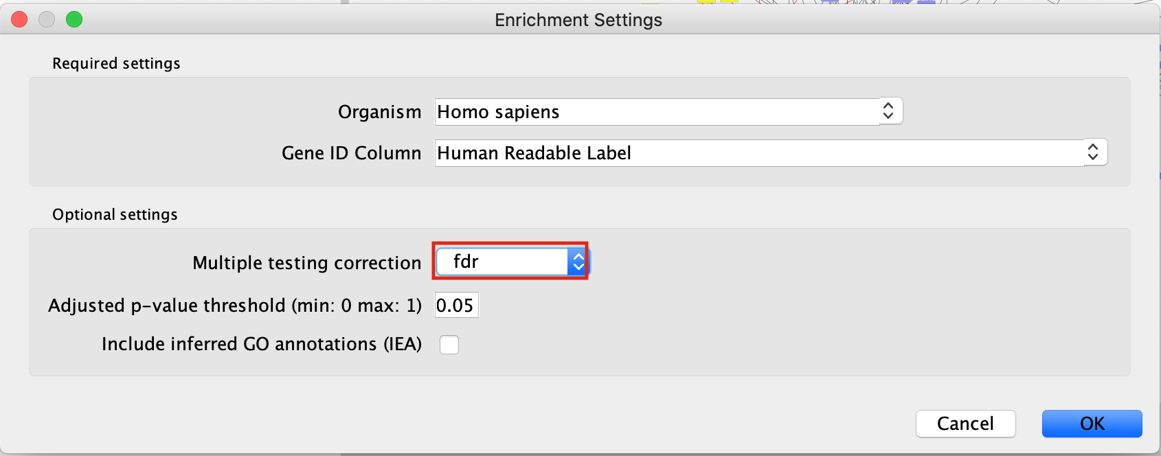
- This will bring up a panel with the adjustable settings. There are only 5 adjustable parameters-
- Organism - This shows a list of organisms that are available on the g:Profiler site.
- Gene ID column - the column in the current network that you want to use to search g:Profiler with. Ideally this should be a column specifying the Gene Name or other identifier.
- Multiple testing correction - change to fdr.
- Adjusted p-value threshold (min 0 max 1) - leave as 0.05. If you are getting too many results you can make this value smaller.
- Include inferred GO annotations (IEA) - by default the search will exclude inferred from electonic annotation GO terms. If you want to include them, select this option.
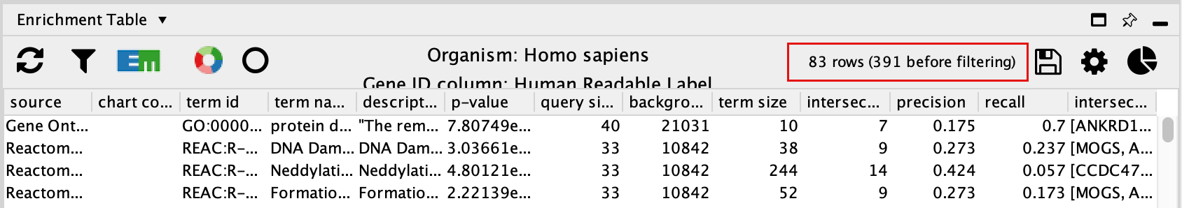
By default, EnrichmentTable automatically uses all the databases available on the g:Profiler site. There is no way to filter prior to running the analysis. You need to filter the results after the analysis has been run. This will change the results because you end up filtering the results after the multiple correction and the multiple correction is dependent on the number of genesets you are testing with.
- Filter the EnrichmentTable results to show only GO:BP, Reactome and Wikipathway, similiar to what we used in Module 2.
- Click on the filter icon in the top left hand corner of the enrichment table results.
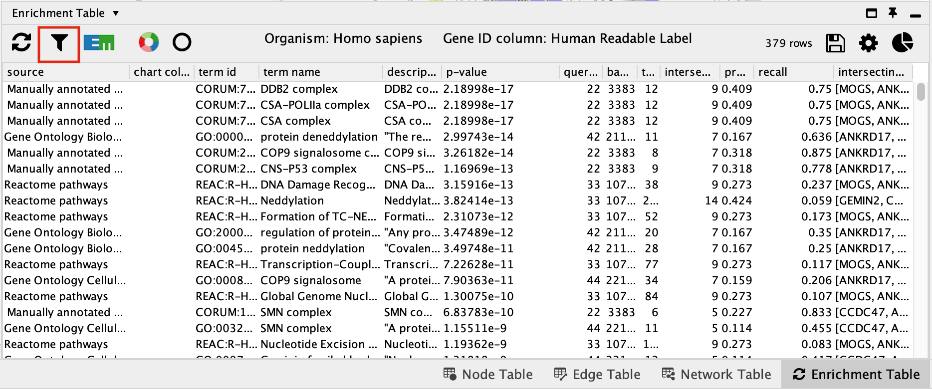
- Next to Select Categories select Gene Ontology Biological Process, Reactome, Wikipathways. To select multiple options click and hold command key on Mac or Shift on Windows.
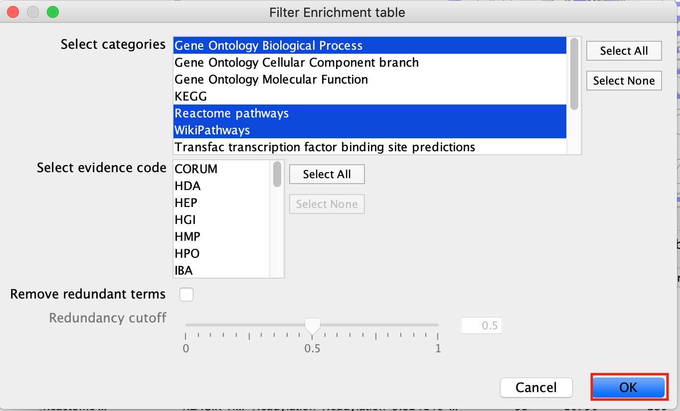
- click on OK
- The EnrichmentTable will update to only include the sets from Gene Ontology Biological Process, Reactome, Wikipathways.
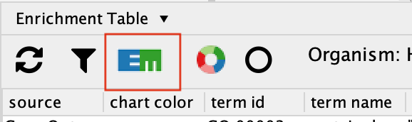
Exercise 3B - create Enrichment Map and Enhanced graphics nodes from EnrichmentTable
-
To create an Enrichment Map from the EnrichmentTable results, Click on the EM logo in the top left hand bar in the ErichmentTable Panel.
- This will bring up an EM options panel with very limited parameter adjustments. You can only change the name of the network and the connectivity threshold. You have already specified the p-value threshold when you originally performed the analysis. If you want to create your network with a more permissive q-value you need to go back to the EnrichmentTable search panel. Click on OK
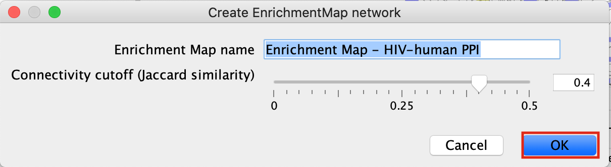
- This will create an Enrichment Map in a new network and represents all the Gene Ontology Biological Process, Reactome, Wikipathways terms enriched for the VPR and its prey protein set.
Exercise 4 - Load network from NDex
NDex is an open-source repository where scientists can store, share, manipulate and publish biological network data. Networks are viewable on the web through their webapp but can also be downloaded directly into cytoscape so you can search, manipulate, integrate and analyze the given network for yourselves.
For the purpose of this exercise we are going to load in a network from the publication A protein landscape of Breast Cancer. This publication is associated with multiple networks the the authors of this paper created and shared in NDex - https://www.ndexbio.org/index.html#/networkset/4423340d-e8e3-11eb-b666-0ac135e8bacf
- Start a new session. File –> Close
- In the Network Search bar (located at the top of the control panel) make sure that the search provider is set to NDex.
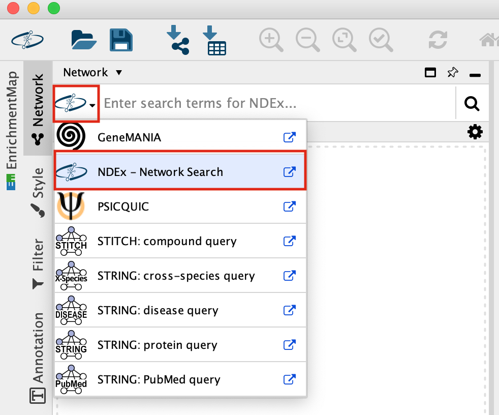
It should be set to NDex by default but click on down arrow to see the different data sources you can search for. Later in the workshop we will be using this bar to query GeneMania.
-
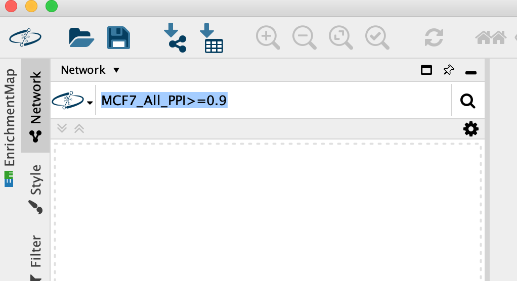
Enter MCF7_All_PPI>=0.9 into the search box, Click on the search icon.
-
A search results box will appear. The MCF7_All_PPI>=0.9 network is just one of the networks associated with this publication. Eventhough you are searching for this specific network, other networks associated with the original paper will also show up in the search results as well as others.
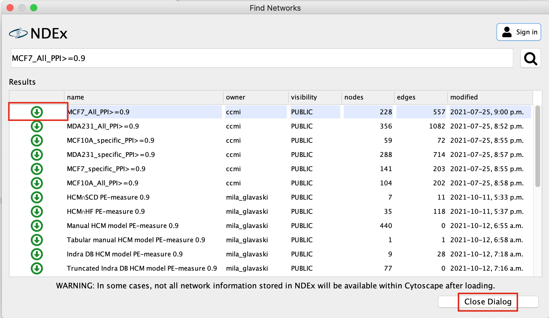
- Click on the green down arrow next to MCF7_All_PPI>=0.9, the network will start to import.
- Once the network has been loaded, click on Close Dialog
-
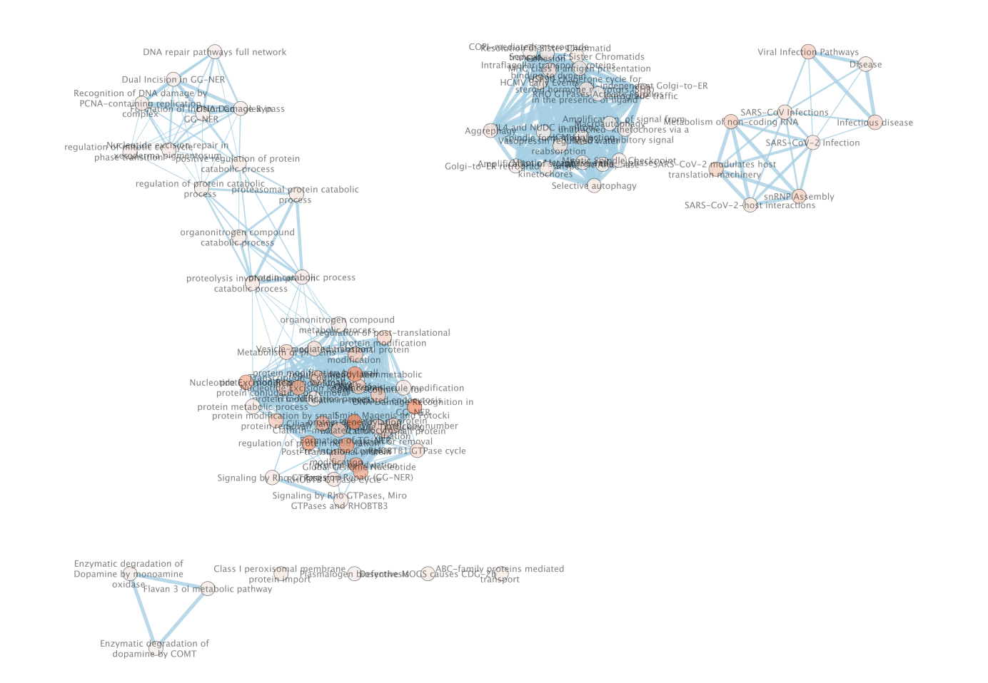
Resulting network loaded into cytoccape.
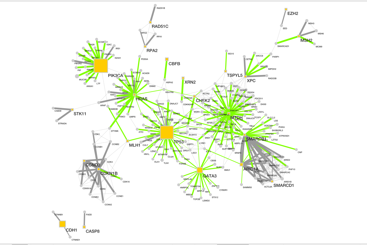
Description taken from NDex
record
- Baits are shown as yellow box, and
- preys as grey circle.
- Size of each node represents number of patients with alterations in each protein.
- Dotted line represents the physical protein-protein association (validated in other studies) with high Integrated Association Stringency score.
- Change the edge width to reflect the number of patients the associations is found in instead of the PPI score.
- Change the default node colour to blue.
Goal of the exercise
Create an enrichment map and navigate through the network
During this exercise, you will learn how to create an enrichment map from gene-set enrichment results. The enrichment results chosen for this exercise are generated using g:Profiler but an enrichment map can be created directly from output from GSEA, g:Profiler, GREAT, BinGo, Enrichr or alternately from any gene-set tool using the generic enrichment results (GEM) format.
Data
The data used in this exercise is a list of frequently mutated genes that we used in previous exercise. Pathway enrichment analysis has been run using g:Profiler and the results have been downloaded as a GEM format.
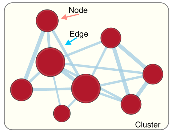
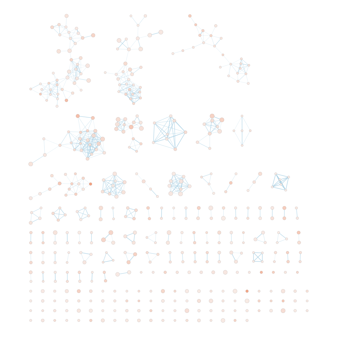
EnrichmentMap
A circle (node) is a gene-set (pathway) enriched in genes that we used as input in g:Profiler (frequently mutated genes).
edges (lines) represent genes in common between 2 pathways (nodes).
A cluster of nodes represent overlapping and related pathways and may represent a common biological process.
Clicking on a node will display the genes included in each pathway.
Description of this exercise
We will run the saved g:Profiler results (from Module 2 - gprofiler lab) using different parameters. An enrichment map represents the result of enrichment analysis as a network where significantly enriched gene-sets that share a lot of genes in common will form identifiable clusters. The visualization of the results as these biological themes will ease the interpretation of the results.
The goal of this exercise is to learn how to:
- Upload g:Profiler results into Cytoscape EnrichmentMap to create a map.
- Upload several g:Profiler results at the same time to create one map and learn how to distinguish and compare the results.
- To compare the differences resulting from the use of different g:Profiler parameters at the enrichment map level.
Start the exercise
To start the lab practical section, first create a gprofiler_files directory on your computer and download the files below.
Right click on link below and select “Save Link As…”.
Place it in the corresponding module directory of your CBW work directory.
Five files are needed for this exercise:
- Enrichment result 1: gProfiler_hsapiens_lab2_results_GEM_termmin3_max10000.gem.txt
- In g:Profiler, the parameters that we used to generate this file were:
- GO_BP no electronic annotation,
- Reactome,
- WikiPathways,
- Benjamini-Hochberg FDR 0.05
- The results were filtered using the Term size slidebar. Only the enriched gene-sets containing more than 3 and less than or equal to 10000 genes per gene-set were included in the result file.
- Enrichment result 2: gProfiler_hsapiens_lab2_results_GEM_termmin3_max250.gem.txt
- In g:Profiler, the parameters that we used were:
- GO_BP no electronic annotation,
- Reactome,
- WikiPathways,
- Benjamini-HochBerg FDR 0.05.
- The results were filtered using the Term size slidebar. Only the enriched gene-sets that contain more than 3 and less than or equal to 250 genes per gene-set were included in the result file.
- Enrichment result 3: gProfiler_hsapiens_Baderlab_max250.gem.txt
- Pathway database 1: gprofiler_full_hsapiens.name.gmt
- This file can be downloaded directly or can be been created by concatenating the hsapiens.GO/BP.name.gmt, hsapiens.WP.namt.gmt and the hsapiens.REAC.name.gmt files contained in the g:Profiler gprofiler_hsapiens.name folder.
- Pathway database 2: Human_GOBP_AllPathways_noPFOCR_no_GO_iea_June_01_2024_symbol_max250.gmt
Exercise 1a - compare different gprofiler geneset size results
Step 1
Launch Cytoscape and open the EnrichmentMap App
1a. Double click on Cytoscape icon
1b. Open EnrichmentMap App
In the Cytoscape top menu bar:
Click on Apps -> EnrichmentMap
- A ‘Create Enrichment Map’ window is now opened.
Step 2
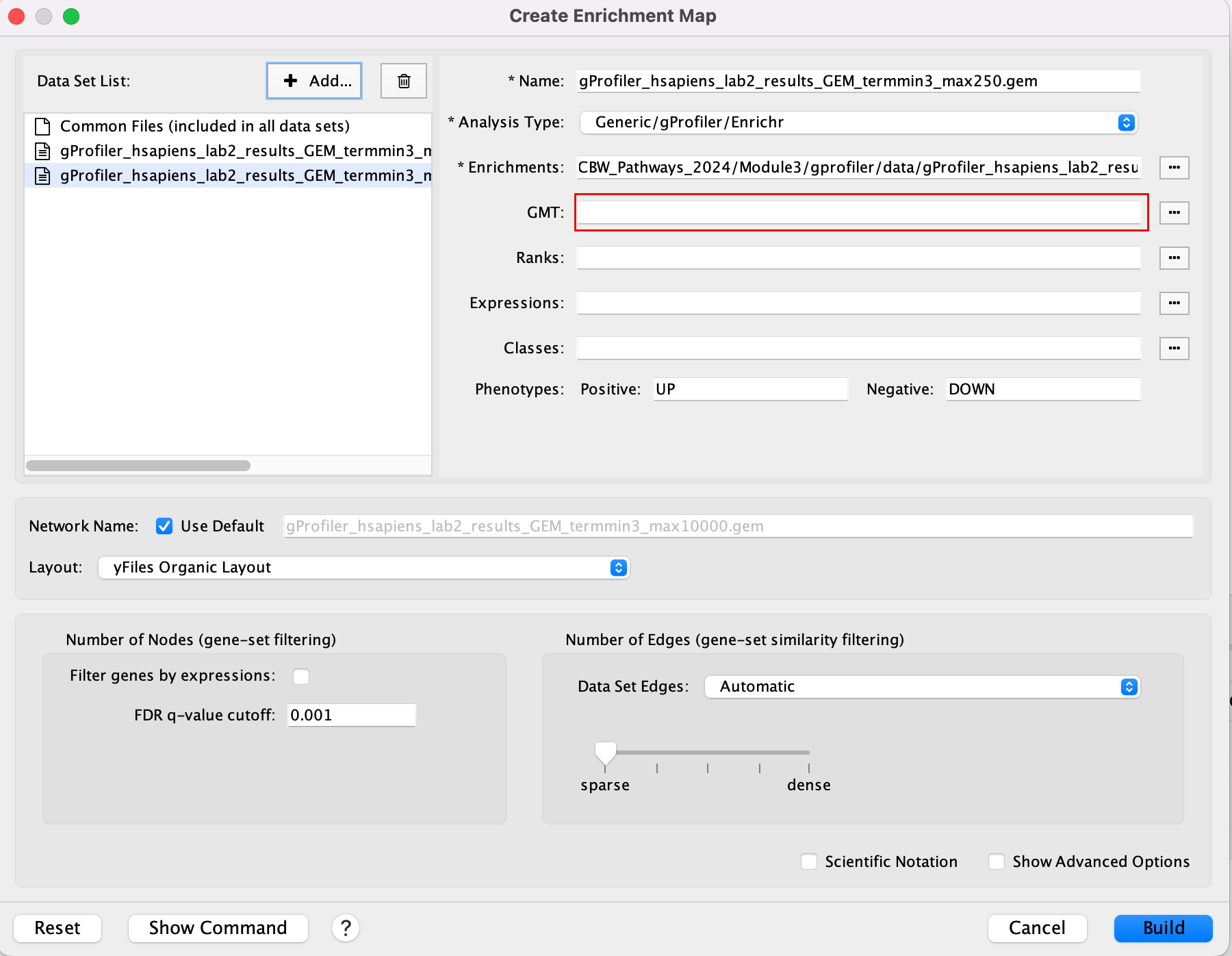
Create an enrichment map from 2 datasets and with a gmt file.
2a. In the ‘Create Enrichment Map’ window, drag and drop the 2 enrichment files gProfiler_hsapiens_lab2_results_GEM_termmin3_max10000.gem.txt and gProfiler_hsapiens_lab2_results_GEM_termmin3_max250.gem.txt.
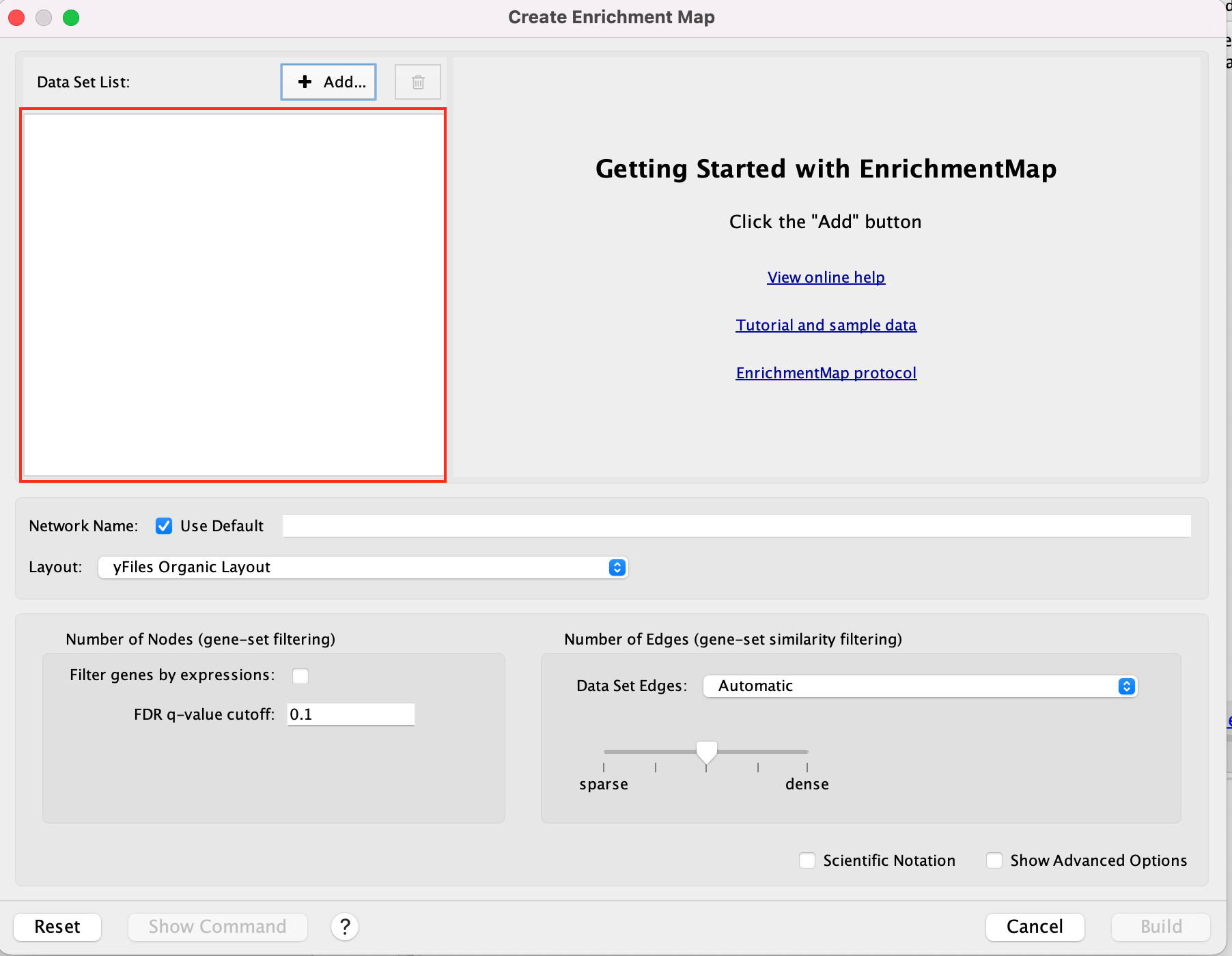
2b. In the white box, click on “gProfiler_hsapiens_lab2_results_GEM_termmin3_max250 (Generic/gProfiler)”
2c. On the right side, go to the GMT field, click on the 3 radio button (…) and locate the file gprofiler_full_hsapiens.name.gmt that you have saved on your computer to upload it.
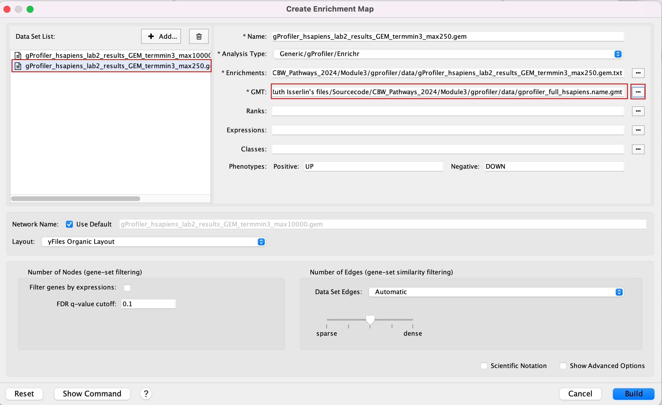
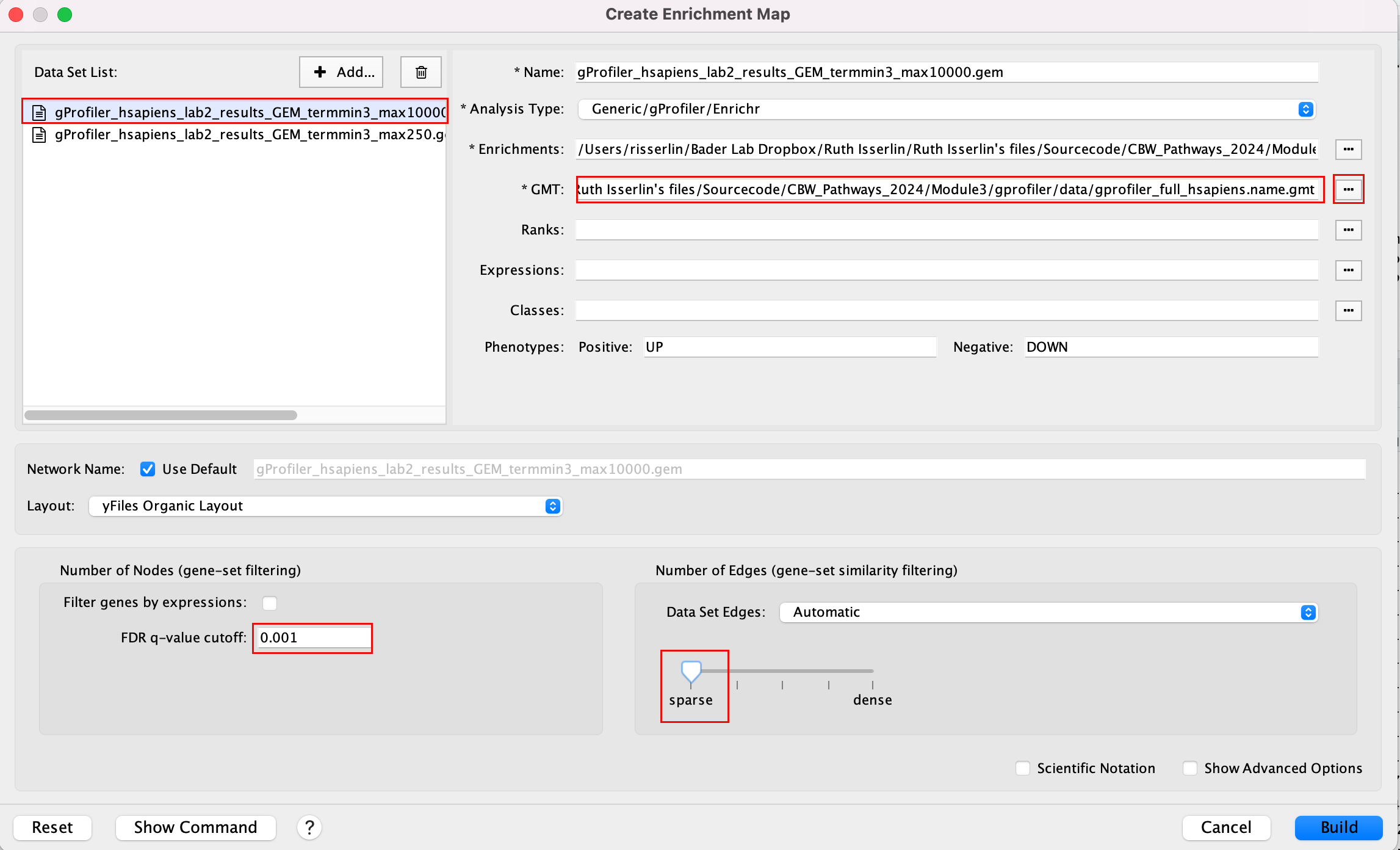
2d. In the white box, click on “gProfiler_hsapiens_lab2_results_GEM_termmin3_max10000 (Generic/gProfiler)”
2e. On the right side, go to the GMT field, click on the 3 radio button (…) and locate the file gprofiler_full_hsapiens.name.gmt that you have saved on your computer to upload it.
2f. Locate the FDR q-value cutoff field and set the value to 0.001
2g. Select the Connectivity slide bar to sparse.
Intstead of specifying the gmt file for each dataset separately, if all the dataasets in your analysis use the same gmt file, you can specify a common gmt file to be used by all datasets.
-
Click +Add… and select Add Common Files
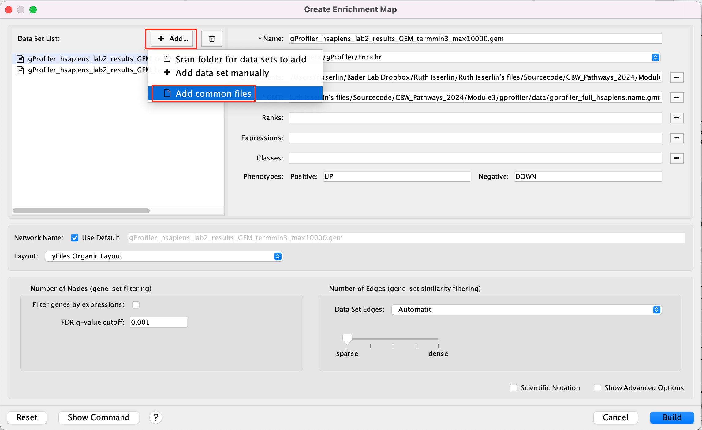
- On the right side, go to the GMT file field, click on the 3 radio button (…) and locate the file gprofiler_full_hsapiens.name.gmt that you have saved on your computer to upload it.
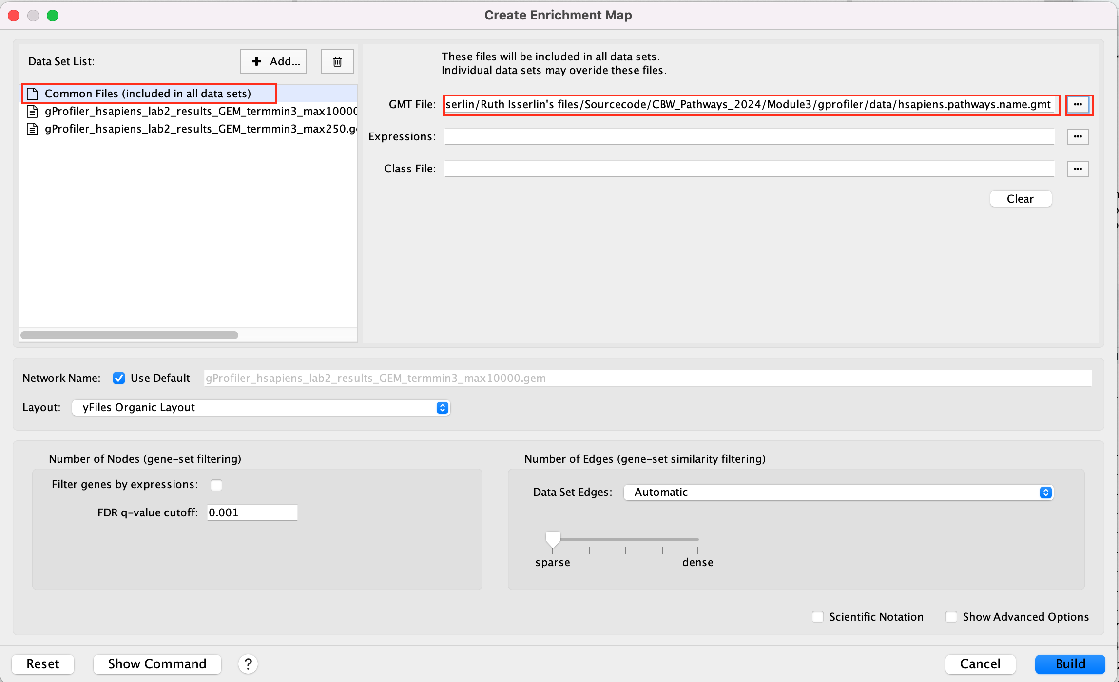
This can also be done for a shared expression file.
2h. Click on Build.
If you have specified common files this info box will appear
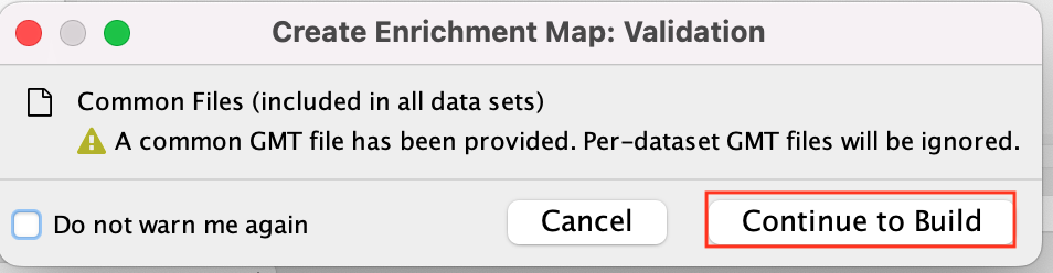 * Click on Continue to build
- A status bar should pop up showing progress of the Enrichment map build.
There might be multiple messages that appear when you first create an enrichment map. You can choose to silence them if you want (Although the yfiles message will continue to appear every two weeks).
 * Click on OK
 * Click on OK
Step3: Explore the results:
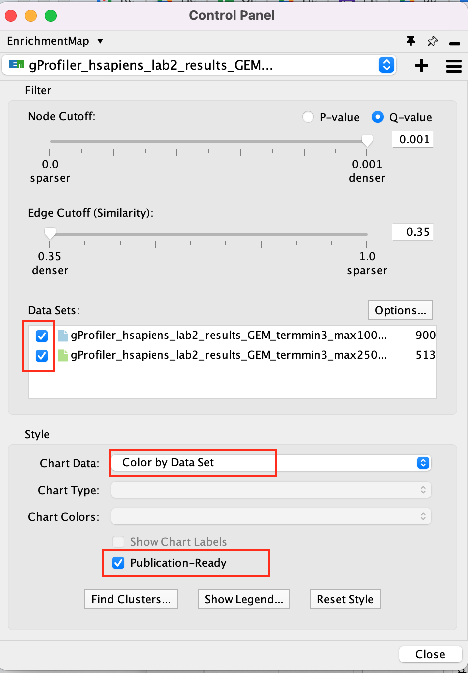
In the EnrichmentMap control panel located at the left:
- Select the 2 Data Sets (checked by default)
- Set Chart Data o Color by Data Set
- Select Publication Ready to remove gene-set label to have a global view of the map.
un-select Publication Ready when you explore the map in more detail to see the gene-set names.
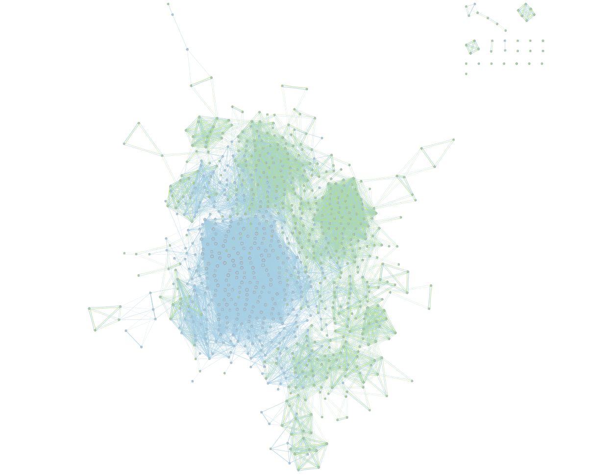
On the map, a node that is coloured both green and blue is a gene-set that is found in the both of the 2 gProfiler result sets that we have been uploaded.
- A node that is blue is a gene-set that is found only in the file gProfiler_hsapiens_lab2_results_GEM_termmin3_max10000 .
- A node that is green is a gene-set that is found only in the file gProfiler_hsapiens_lab2_results_GEM_termmin3_max250 .
- A blue edge represents genes that overlap between gene-sets found in the file gProfiler_hsapiens_lab2_results_GEM_termmin3_max10000.
- A green edge represents genes that overlap between gene-sets found in the file gProfiler_hsapiens_lab2_results_GEM_termmin3_max250.gem.
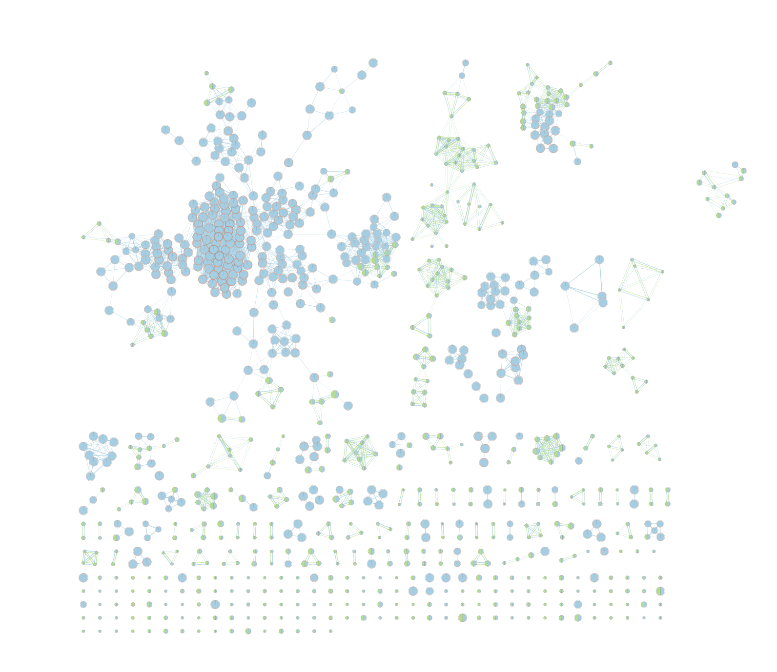
We can see clusters of blue nodes. All these nodes contain gene-sets that have more than 250 genes. Explore the detailed view (see below) to see if this cluster corresponds to informative terms.
Would you have lost information by filtering gene-sets larger than 250 genes?
Explore Detailed results
- In the Cytoscape menu bar, select ‘View” and ’Show Graphic Details’ to display node labels.
Make sure you have unselected “Publication Ready” in the EnrichmentMap control panel.
Zoom in to be able to read the labels and navigate the network using the bird eye view (blue rectangle).
Select a node and visualize the Table Panel
Click on a node
For this example the node “Signaling by Notch” has been selected.
you can type it in the search bar, quotes are important.
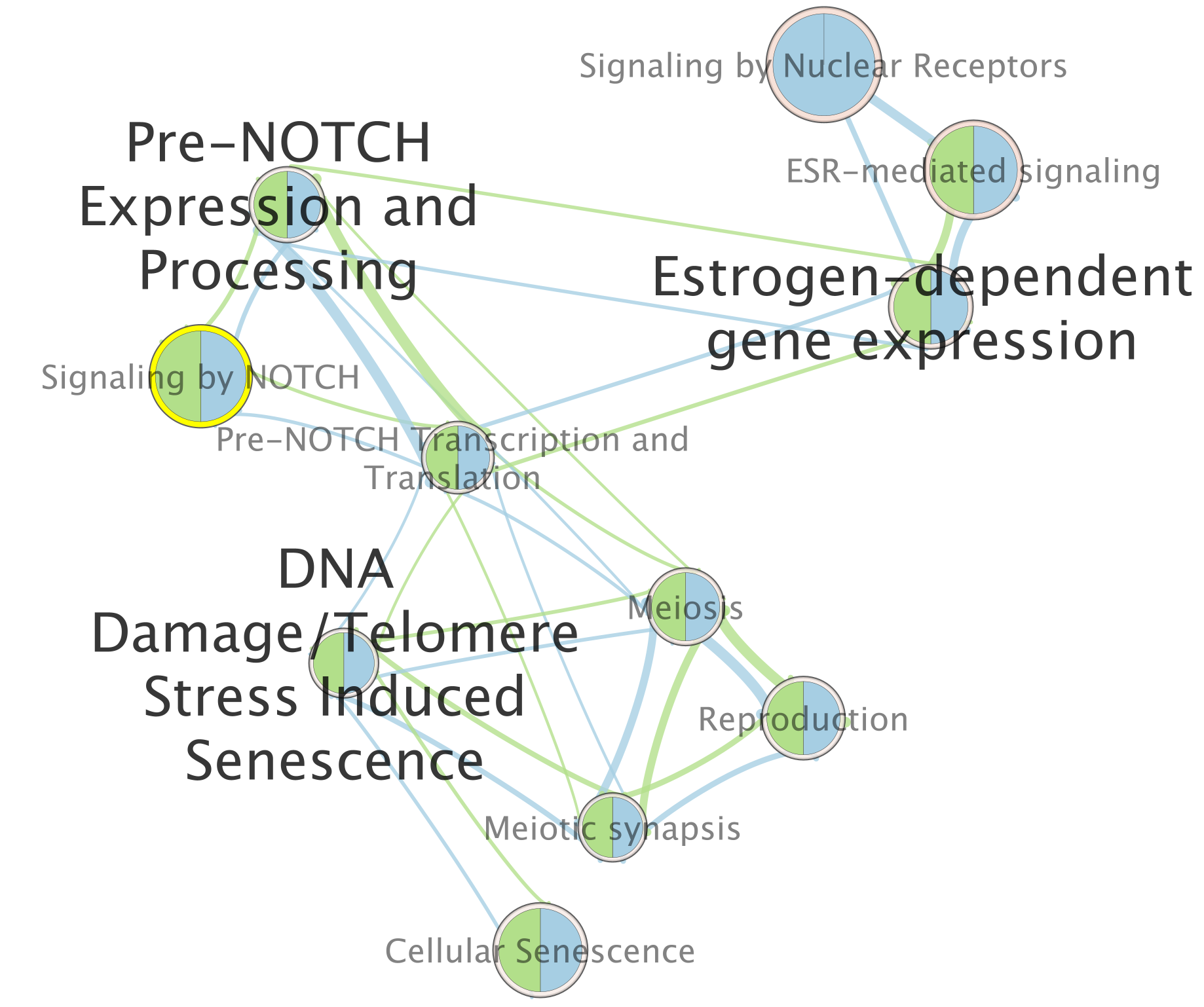
When the node is selected, it is highlighted in yellow.
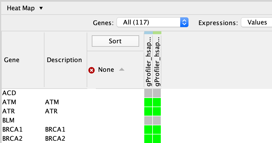
In table panel, we can see the genes included in the gene-set.
A green colored box indicates that the gene is in the gene-set(pathway) and in our gene list.
A gray colored box indicated that the gene is in the gene-set but not in our gene list.
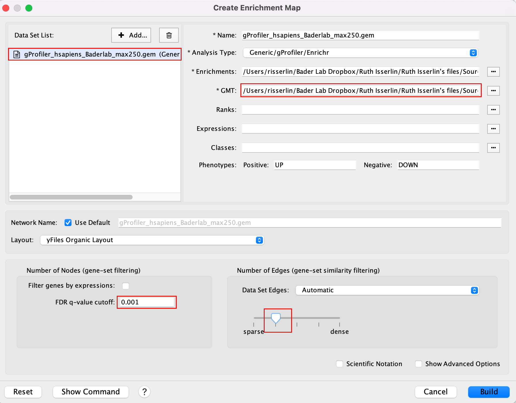
Exercise 1b - Is specifying the gmt file important?
Create an enrichment map without a gmt file to compare the results with Exercise 1a.
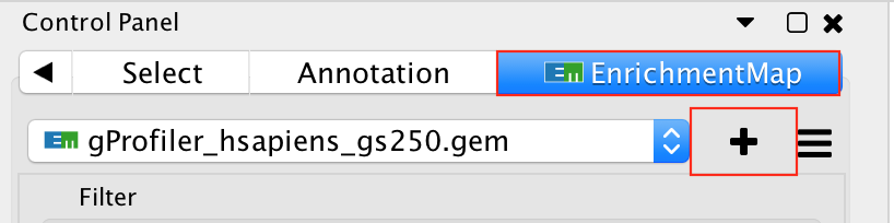
- Go to Control Panel and select the EnrichmentMap tab.
- Click on the “+” sign to re-open the Create Enrichment Map window.
- In the white box, select the “gProfiler_hsapiens_lab2_results_GEM_termmin3_max250.gem (Generic/gProfiler)” file
- Locate the GMT field and delete the file name, leaving it blank.
- In the white box, select the “gProfiler_hsapiens_lab2_results_GEM_termmin3_max10000 (Generic/gProfiler)” file
- Locate the GMT field and delete the file name , leaving it blank.
- Use same parameters as in exercise 1a: FDR q-value cutoff of 0.001 and Connectivity to sparse.
- Click on Build
Explore the results:
In the EnrichmentMap control panel located at the left:
- Select the 2 Data Sets (selecteded by default)
- Set Chart Data o Color by Data Set
- Select Publication Ready to remove gene-set label to have a global view of the map.
Uncheck this box when you explore the map in details to see the gene-set names.
On the map, a node that is coloured both green and blue is a gene-set that is found in the both of the 2 gProfiler result sets that we have been uploaded.
- A node that is blue is a gene-set that is found only in the file gProfiler_hsapiens_lab2_results_GEM_termmin3_max10000 .
- A node that is green is a gene-set that is found only in the file gProfiler_hsapiens_lab2_results_GEM_termmin3_max250 .
- A blue edge represents genes that overlap between gene-sets found in the file gProfiler_hsapiens_lab2_results_GEM_termmin3_max10000.
- A green edge represents genes that overlap between gene-sets found in the file gProfiler_hsapiens_lab2_results_GEM_termmin3_max250.gem.
Conclusion of exercises 1 a and 1b:
Loading a gmt file to create an enrichment map from g:Profiler result is optional. However, there are 2 main beneficial aspects to uploading a gmt file:
- The map will be less condensed and easier to read and interpret.
- Clicking on a node will display all genes in the gene-set and not only genes included in our query list.
Exercise 1c - create EM from results using Baderlab genesets
Create an enrichment map from the results of g:Profiler generated using the custom Baderlab gene-set file.
To get a map that is easy to read and that does not display too many gene-sets, one option is to focus the analysis on gene-sets (pathways) that contain 250 genes or less. We prefiltered our pathway database prior to upload it into g:Profiler so that FDR is calculated only on these gene-sets (as opposed to exercise 1a where the FDR was calculated on all gene-sets and then some gene-sets > 250 genes were excluded from the result file). For this exercise, we will use:
Filtered gmt file: Human_GOBP_AllPathways_noPFOCR_no_GO_iea_June_01_2024_symbol_max250.gmt.
We have uploaded this file as a custom gmt file in g:Profiler and run the query. (in Module 2 lab)
To create an enrichment map of these results:
Go to Control Panel and select the EnrichmentMap tab.
Click on the “+” sign to re-open the Create Enrichment Map window.
Click on Reset to reset the Enrichment map panel
Drag the file that we created in Module 2 lab gProfiler_hsapiens_Baderlab_max250.gem.txt and the filtered gmt file (Human_GOBP_AllPathways_noPFOCR_no_GO_iea_June_01_2024_symbol_max250.gmt into the Datasets box on Enrichment map panel.
In the white box, select the “gProfiler_hsapiens_Baderlab_max250.gem.txt (Generic/gProfiler)” file
Locate the GMT field and upload the file “Human_GOBP_AllPathways_noPFOCR_no_GO_iea_June_01_2024_symbol_max250.gmt”.
Set the FDR q-value cutoff to 0.001 and set the Connectivity slide bar to second level.
Explore the results:
SAVE YOUR CYTOSCAPE SESSION (.cys) FILE !
Exercise 1d (optional) - investigate individual pathways in GeneMANIA or String
Each node in the Enrichment map represents a biological process or pathway. It consists of a collection of genes. Often we want to know how the genes in that group interact. There are many different ways you can investigate the underlying interactions for the given group. Some involve searching online databases and others are directly integrated into cytoscape.
- GeneMANIA - an integrative database of gene connections including co-expression, protein interactions, genetic interactions, pathways and more. Cytoscape App
- String - an integrative database of gene connections including co-expression, protein interactions, genetic interactions, pathways and more. Cytoscape App
- Pathway Commons - a intergrative database of pathways. (There is a beta feature in EM to show your pathway in the painter app, a pathway common web page that overlays your expression data on the given pathway. Still in beta testing and requires expression data to work correctly so won’t work for this example)
GeneMANIA
- Navigate to the enrichment map that you created using the Baderlab genesets
- Click on Network Tab and navigate to the third network (it should be the third network if you followed the above examples - name: gProfiler_hsapiens_Baderlab_max250_gem)
- or in the Enrichment map panel in the top drop down select the network named gProfiler_hsapiens_Baderlab_max250_gem
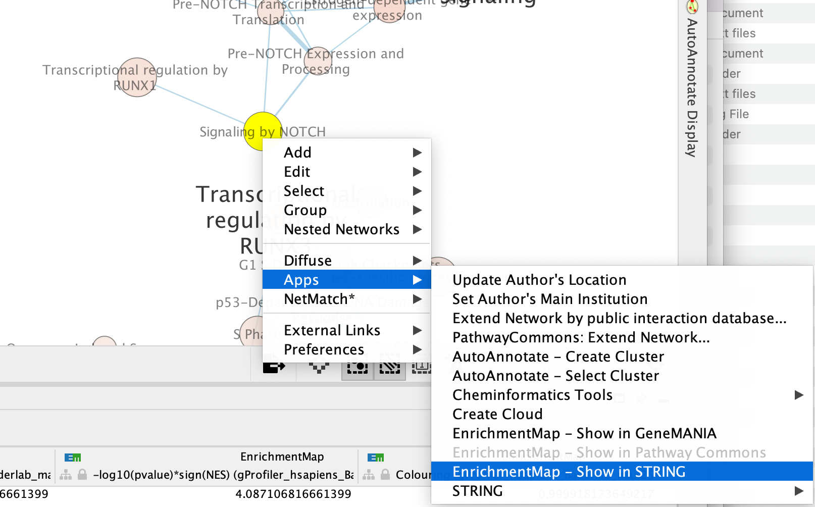
- In the cytoscape search bar enter “Signaling by Notch”
If you can’t see the selected nodes, click on “Fit Selected” to focus
on the selected node.
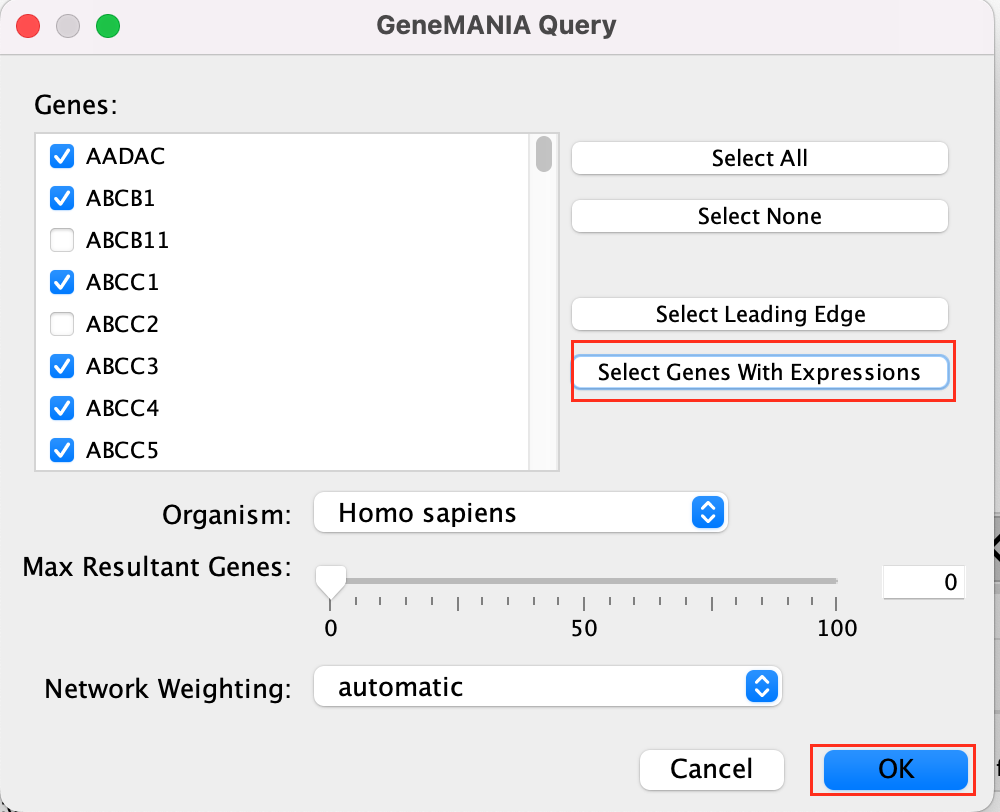
Right click on the node “Signaling by Notch” and Select Apps –> Enrichmemt Map - Show in GeneMANIA
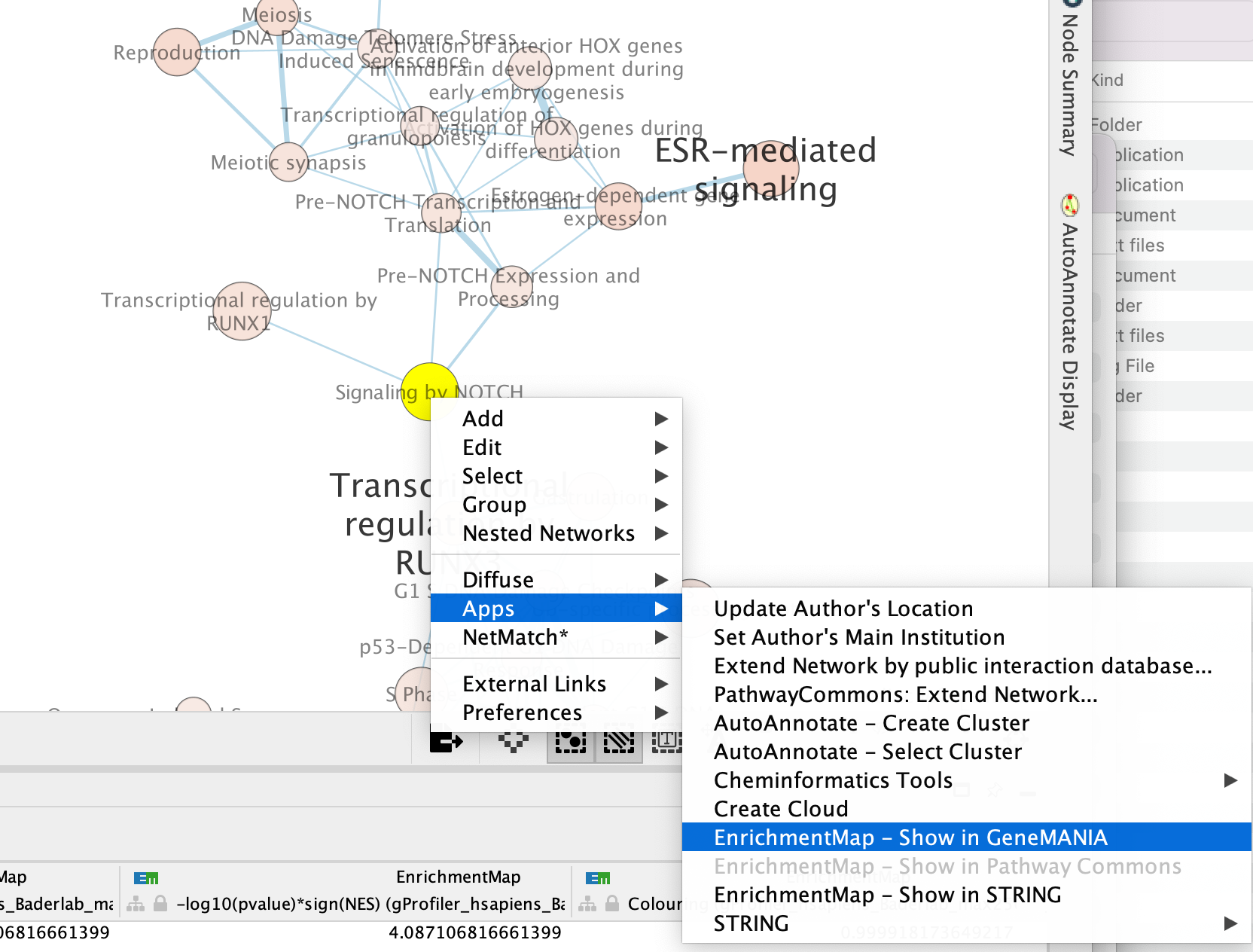
A GeneMANIA Query Panel will pop up.
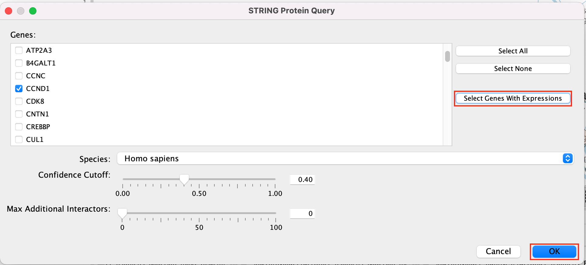
Select Select genes with expression to reduce the query set to just the genes in the given pathway that was in your original dataset (for example we search for a set of 127 genes in g:profiler but the given pathway has 233 genes associated with it of which only 10 genes are found in our original query set )
Click on OK
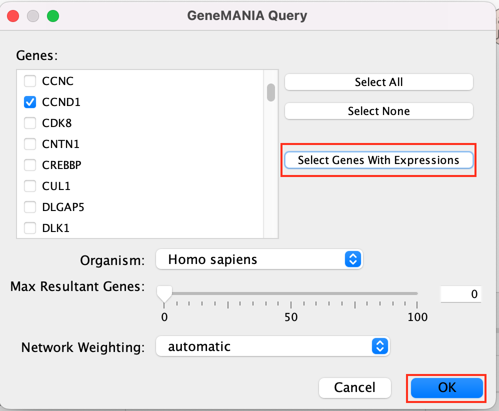
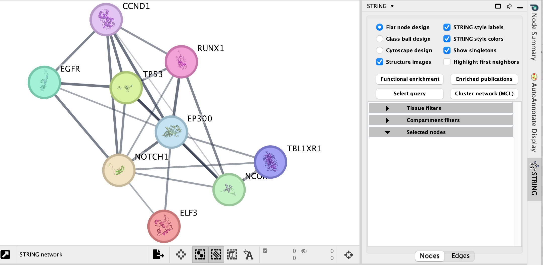
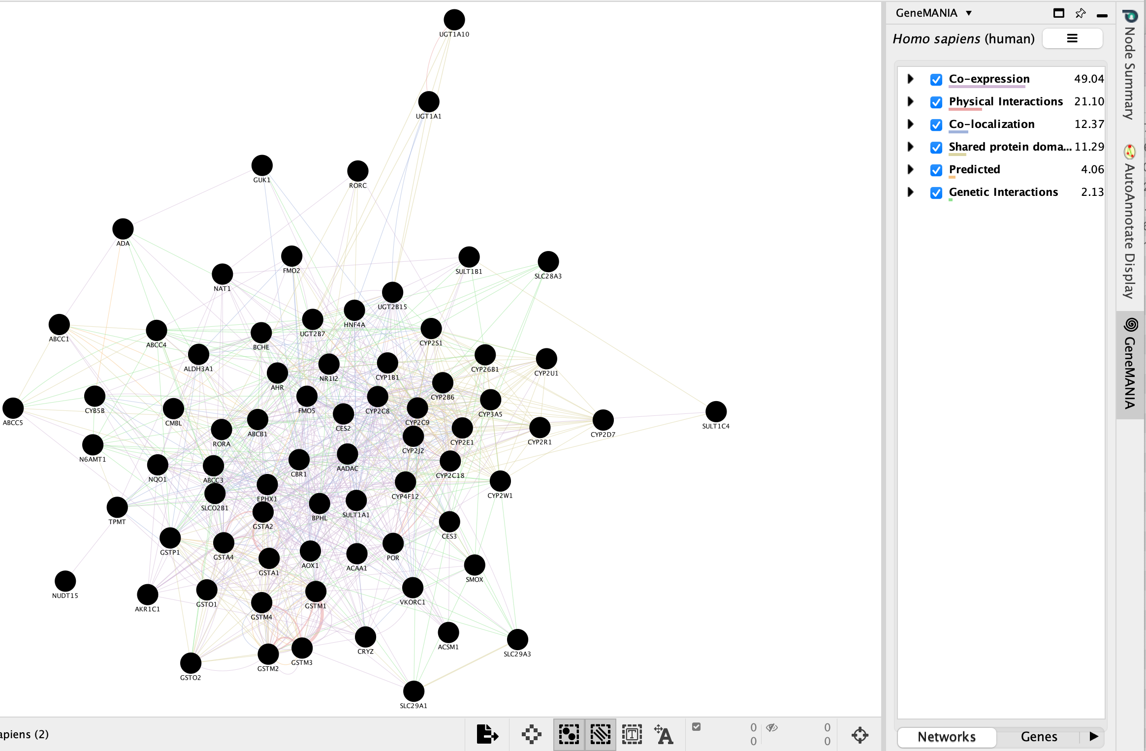
A GeneMANIA network will show up with the connections between the genes found in your query set and the pathway “Signaling by Notch”
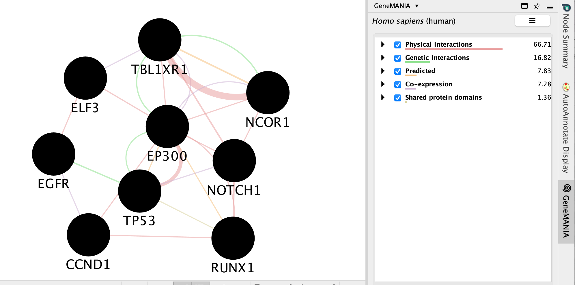
We will go more in depth into GeneMANIA in module 5
String
- Navigate to the enrichment map that you created using the Baderlab genesets
- Click on Network Tab and navigate to the third network (it should be the third network if you followed the above examples - name: gProfiler_hsapiens_Baderlab_max250_gem)
- or in the Enrichment map panel in the top drop down select the network named gProfiler_hsapiens_Baderlab_max250_gem
- In the cytoscape search bar enter “Signaling by Notch”
If you can’t see the selected nodes, click on “Fit Selected” to focus
on the selected node.
Right click on the node “Signaling by Notch” and Select Apps –> Enrichmemt Map - Show in String
A String Query Panel will pop up.
Select Select genes with expression to reduce the query set to just the genes in the given that pathway that was in your original dataset (for example we search for a set of 127 genes in g:profiler but the given pathway has 233 genes associated with it of which only 10 genes are found in our original query set )
Click on OK
A String network will show up with the connections between the genes found in your query set and the pathway “Signaling by Notch”
Explore the features and data of each Cytoscape app.
What sort of
information does each tell you?
What is the main difference between
the two resulting networks?
Bonus - Automation.
Run analysis directly from R for easy integration into existing pipelines.
Instead of creating an Enrichment map manually through the user interface you can create an enrichment map directly using the RCy3 bioconductor package or through direct rest calls with Cytoscape cyrest.
Follow the step by step instructions on how to run from R here - https://risserlin.github.io/CBW_pathways_workshop_R_notebooks/create-enrichment-map-from-r-with-gprofiler-results.html
First, make sure your environment is set up correctly by following there instructions - https://risserlin.github.io/CBW_pathways_workshop_R_notebooks/setup.html
Goal of the exercise
Exercise 1 - Create an enrichment map and navigate through the network
During this exercise, you will learn how to create an EnrichmentMap from gene-set enrichment results. The enrichment tool chosen for this exercise is GSEA but an enrichment map can be created from output from GSEA, g:Profiler, GREAT, BinGo, Enrichr or alternately from any gene-set tool using the generic enrichment results format.
Exercise 2 - Post analysis (add drug target gene-sets to the network)
As second part of the exercise, you will learn how to expand the network by adding an extra layer of information.
Exercise 3 - Autoannotate
A last optional exercise guides you through the creation of automatically generated cluster labels to the network.
Data
The data used in this exercise is gene expression data obtained from high throughput RNA sequencing. The data correspond to Pancreatic Ductal Adenocarcinoma samples (TCGA-PAAD). We use precomputed results of the GSEA analysis Module 2 lab - gsea to create an enrichment map with the aim to transform the tabular format to a network so we can better visualize the relationships between the significant gene-sets:
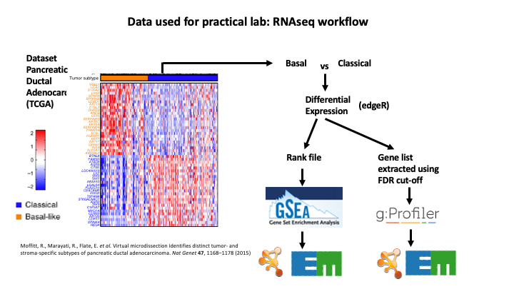
GSEA outpus an entire directory of files and results. For the purpose of this analysis we only need two tables found in the output directory. The output result tables are:
One table (pos) contains all pathways with an enrichment score (significant or not) related to enrichment of the basal category (positive score). (By default called - gsea_report_for_na_pos_#############.tsv)
One table (neg) contains all pathways with an enrichment score (significant or not) related to enrichment of the classical category (negative score). (By default called - gsea_report_for_na_neg_#############.tsv)
These 2 tables are uploaded using the EnrichmentMap App which will create a network of basal and classical pathways that have a significant score (FDR <= 0.05) for clearer visualization of the results.
EnrichmentMap
A red circle (node) is a pathway specific of the mesenchymal type. (or pathway with mostly positively ranked genes)
A blue circle (node) is a pathway specific of the immunoreactive type. (or pathway with mostly negatively ranked genes)
An edge represents genes in common between 2 pathways (nodes).
A cluster of nodes represent overlapping and related pathways and may represent a common biological process or theme.
Clicking on a node will display the genes included in each pathway.
Exercise 1 - GSEA output and EnrichmentMap
To start the lab practical section, first download the files.
Right click on link below and select “Save Link As…”.
Place it in the corresponding module directory of your CBW work directory.
7 Files are needed to create the enrichment map for this exercise (please download these files on your computer or alternately use the GSEA directory created in module 2 lab - gsea for files 1,2,3) :
GMT (file containing all pathways and corresponding genes) - Human_GOBP_AllPathways_noPFOCR_no_GO_iea_June_01_2024_symbol.gmt
Enrichments 1 (GSEA results for the “pos” basal subtype) - gsea_report_for_na_pos_1717773429384.tsv
Enrichments 2 (GSEA results for the “neg” Classical subtype) - gsea_report_for_na_neg_1717773429384.tsv
Expression (file containing the RNAseq data for all samples and all genes) - TCGA-PAAD_GDC_BasalvsClassical_normalized_rnaseq.txt
Rank file (file that has been used as input to GSEA) - TCGA-PAAD_GDC_Subtype_Moffitt_BasalvsClassical_ranks.rnk
Classes (define which samples are basal and which samples are classical) - TCGA-PAAD_Subtype_Moffitt_BasalvsClassical_RNAseq_classes.cls
Drug target database (preselection of 7 drugs and their target genes in the post analysis exercise, http://www.drugbank.ca/) - Human_DrugBank_all_symbol_June_01_2024_selected.gmt
Follow the steps described below at your own pace:
Step 1
Launch Cytoscape and open EnrichmentMap App
1a. Double click on the Cytoscape icon
1b. Open EnrichmentMap App
In the top menu bar:
- Click on Apps -> EnrichmentMap

A ’Create EnrichmentMap window is now opened.
Step 2
Create an enrichment map
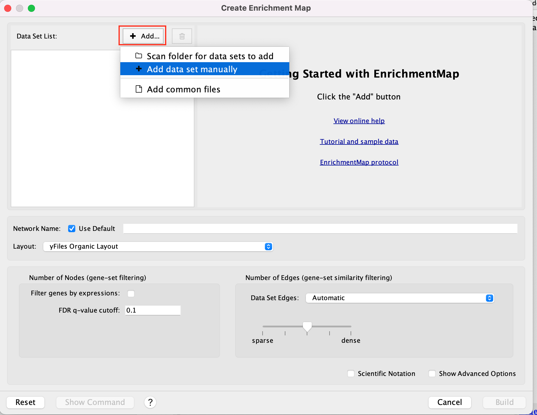
2a. In the ‘Create EnrichmentMap’ window, add a dataset of the GSEA type by clicking on the ‘+ADD…’ –> ‘+ add data set manually’.
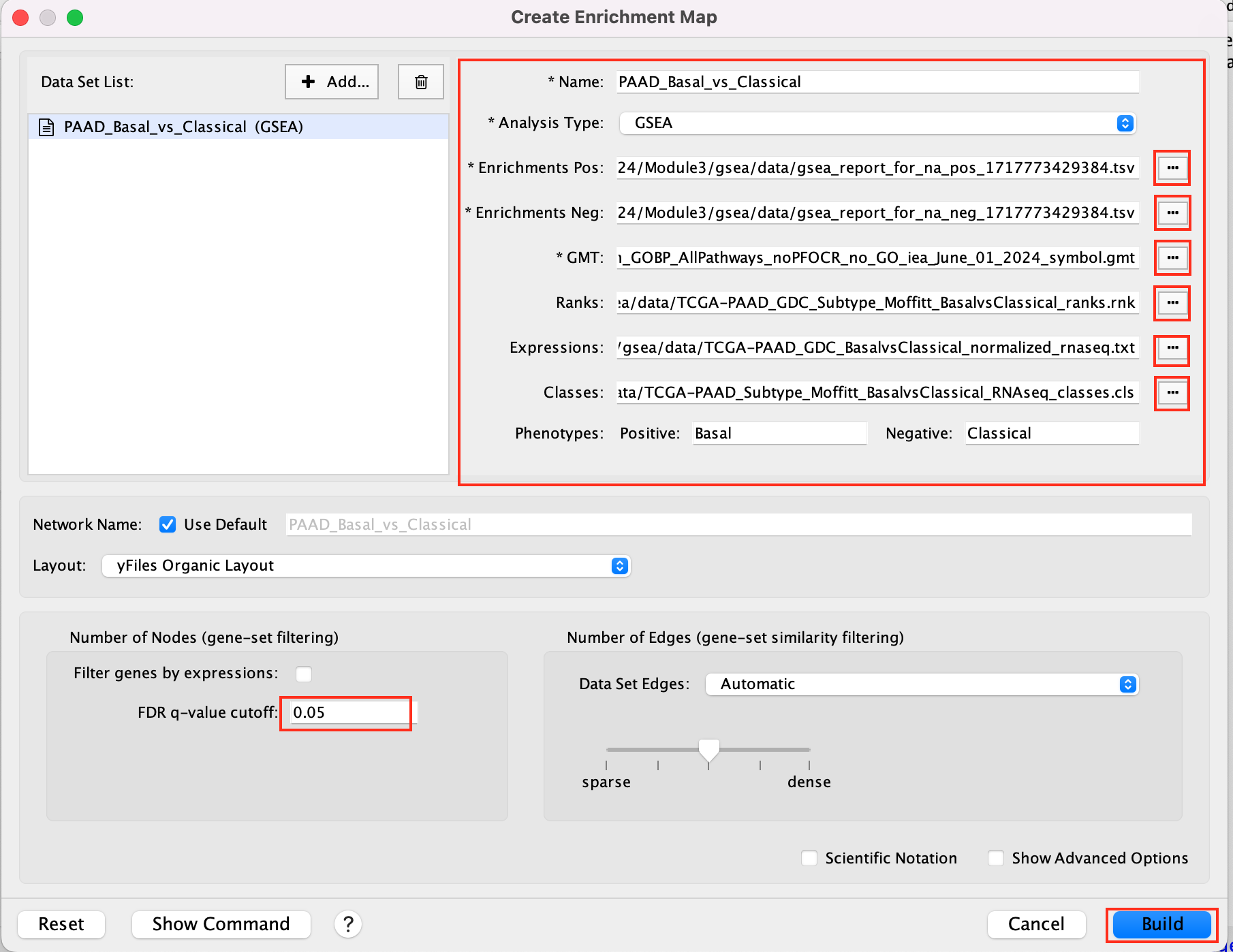
2b. Specify the following parameters and upload the specified files:
Name: leave default or a name of your choice like “GSEAmapPAAD_Basal_vs_Classical”
Analysis Type: GSEA
Enrichments Pos: gsea_report_for_na_pos_1717773429384.tsv
Enrichments Neg: gsea_report_for_na_neg_1717773429384.tsv
GMT : Human_GOBP_AllPathways_noPFOCR_no_GO_iea_June_01_2024_symbol.gmt
Ranks: TCGA-PAAD_GDC_Subtype_Moffitt_BasalvsClassical_ranks.rnk
Expressions : TCGA-PAAD_GDC_BasalvsClassical_normalized_rnaseq.txt
This field is optional but recommended.
Classes: TCGA-PAAD_Subtype_Moffitt_BasalvsClassical_RNAseq_classes.cls
This field is optional.
Phenotypes: In the text boxes place Basal as the Positive phenotype Classical as the Negative phenotype. Basal will be associated with red nodes because it corresponds to the positive phenotype and Classical will be associated with the blue nodes because it corresponds to the negative phenotype.
Set FDR q-value cutoff to 0.05 (= only gene-sets significantly enriched at a value of 0.05 or less will be displayed on the map).
If the cutoff is set to a very small number, for exaxmple 0.0001, it will be displayed as 1E-04 in the scientific notation.
2c. Click on Build
We populated the fields manually. If you work with your own data, a way to populate automatically the fields is to drag and drop your GSEA folder in the ‘Data Set’ window. You are encouraged to give it a try once you finished the lab with your own GSEA results.
Unformatted results:
layout will be different for each user (there is a random seed in the layout algorithm) but it does not change the results or interpretation (the connections are the same, only the display is different).
Step 3
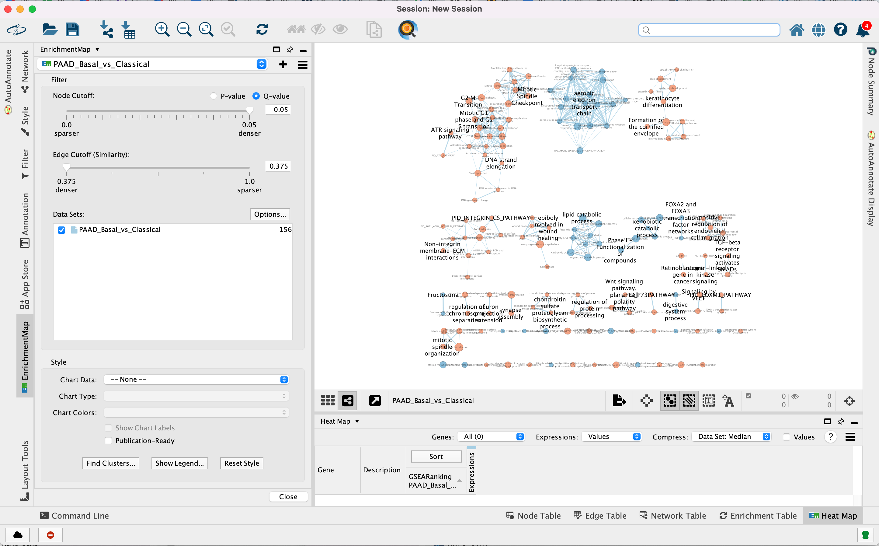
Navigate the enrichment map to gain a better understanding of a EnrichmentMap network.
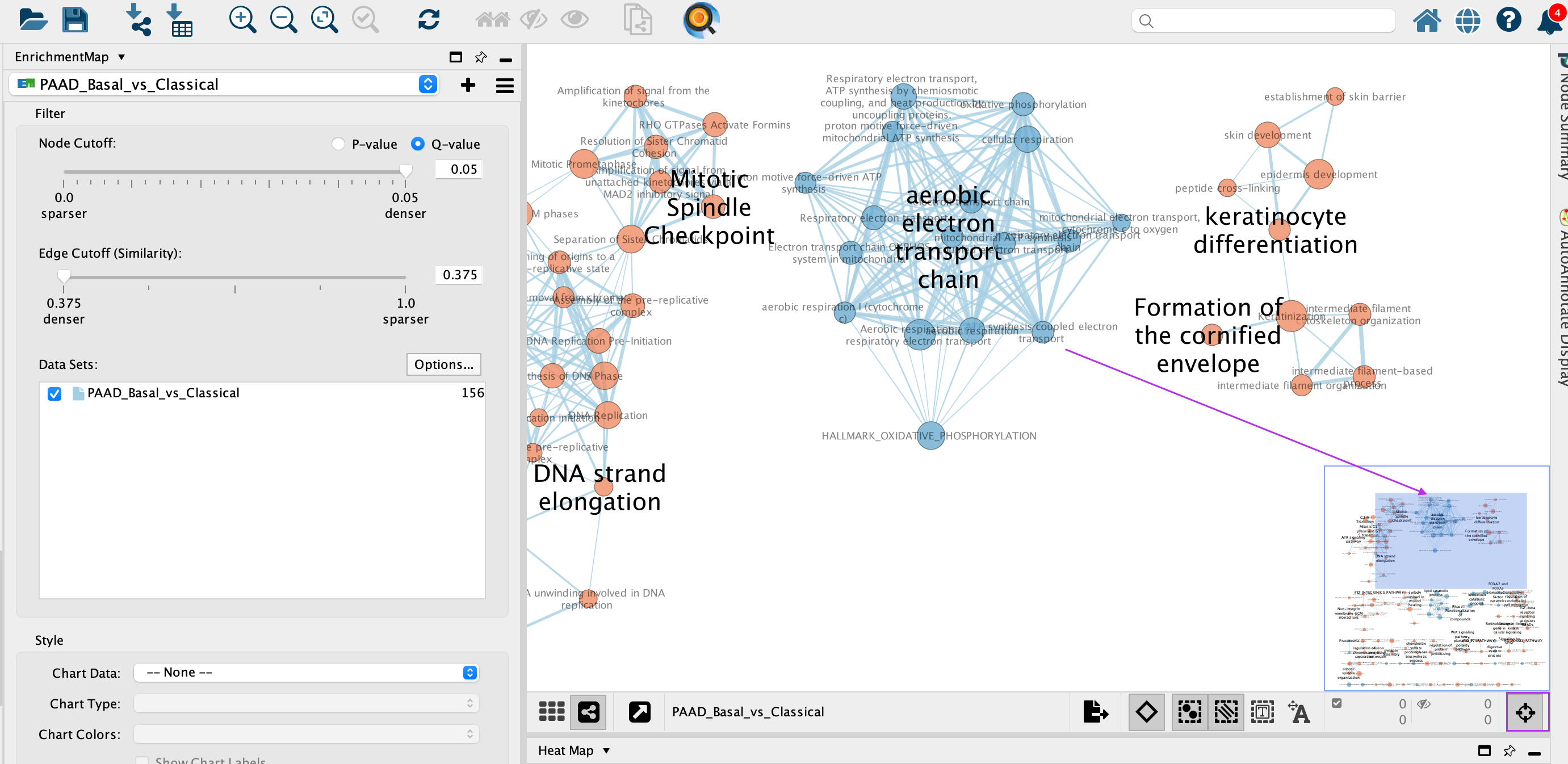
General layout of Cytoscape panel: In addition to the main window where the network is displayed, there are 2 panels: the Control Panel on the left side and the Table Panel at the bottom of the window.
Steps:
3a. In the Cytocape menu bar, select View and Always Show Graphic details. It will turn the squared nodes into circles and the gene-set labels will be visible.
3b: Zoom in or out using + or - in toolbar or scroll button on mouse until you are able to read the labels comfortably.
3c: Use the bird’s eye view (located at the bottom of the control panel) to navigate around the network by moving the blue rectangle using the mouse or trackpad.
3d: Click on an individual node of interest.
For this example, you could use TGF-BETA RECEPTOR SIGNALING ACTIVATES SMADS.
If you are unable to locate TGF-BETA RECEPTOR SIGNALING ACTIVATES SMADS, type “TGF-BETA RECEPTOR SIGNALING ACTIVATES SMADS” in the search box (quotes are important). Selected nodes appear yellow (or highlighted) in the network.
3e. In the Table Panel in the EM Heat map tab change:
Expressions: Row Norm
Compress: -None-
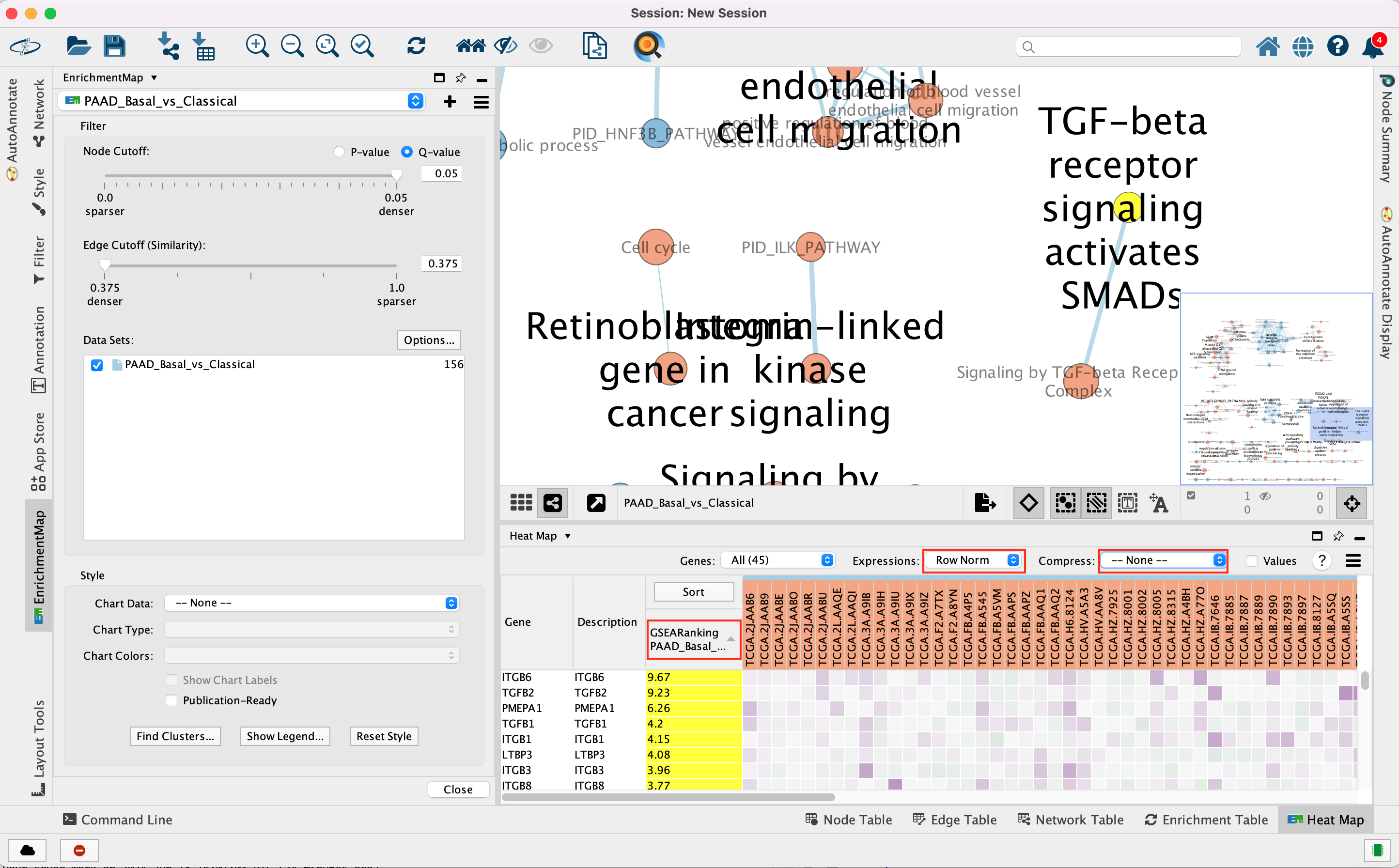
Genes in the heatmap that are highlighted yellow (rank column)
represent genes that are part of the leading edge for this gene set,
i.e. contributed the most to the enriched phenotype.
Leading edge
genes will only be highlighted if an individual node has been selected
and the Enrichment Map was created from GSEA results.
Troubleshooting: if you don’t see the sort column highlighted
in yellow, reselect the node of interest and click on the GSEARanking
Data Set 1 text in the EM Heatmap tab.
Step 4
Use Filters to automatically select nodes on the map: Move the blue nodes to the left side of the window and the red nodes to the right side of the window.
4a. Locate the Filter tab on the side bar of the Control Panel.
4b. Click on the + sign to view the menu and select Column Filter.
4c. From the Choose column … box, select Node: NES(PAAD_Basal_vs_Classical) and set filter values from -2.242 and 0 inclusive.
4d. The blue nodes are now automatically selected. Zoom out to be able to look at the entire network and drag all blue nodes to the left side of the screen.
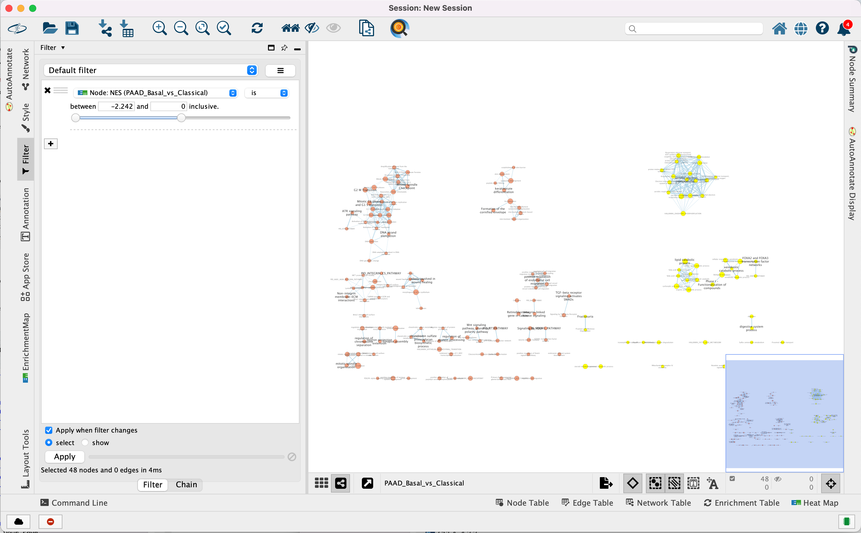
4e. Optional. Change is to is not to select the red nodes.
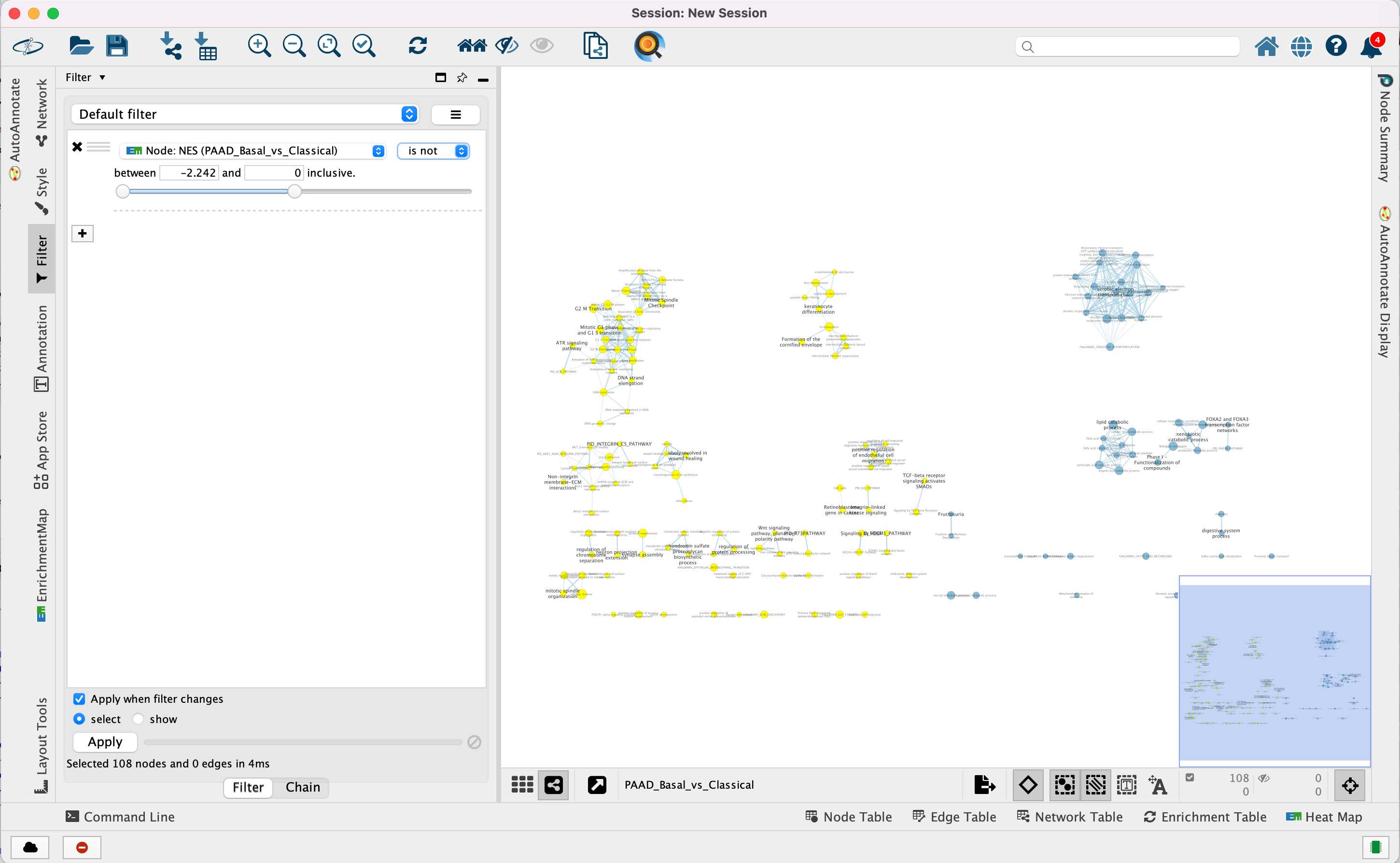
The red pathways (nodes) are specific to the Basal subtype. They were
listed in the pos table of the GSEA results. The enrichment
score (ES) values in this table are all positive values.
The blue pathways are specific to the Classical subtype and were
listed in the neg table of the GSEA results. The ES values in
this table are all negative values.
This is the information we used as the filtering criteria.
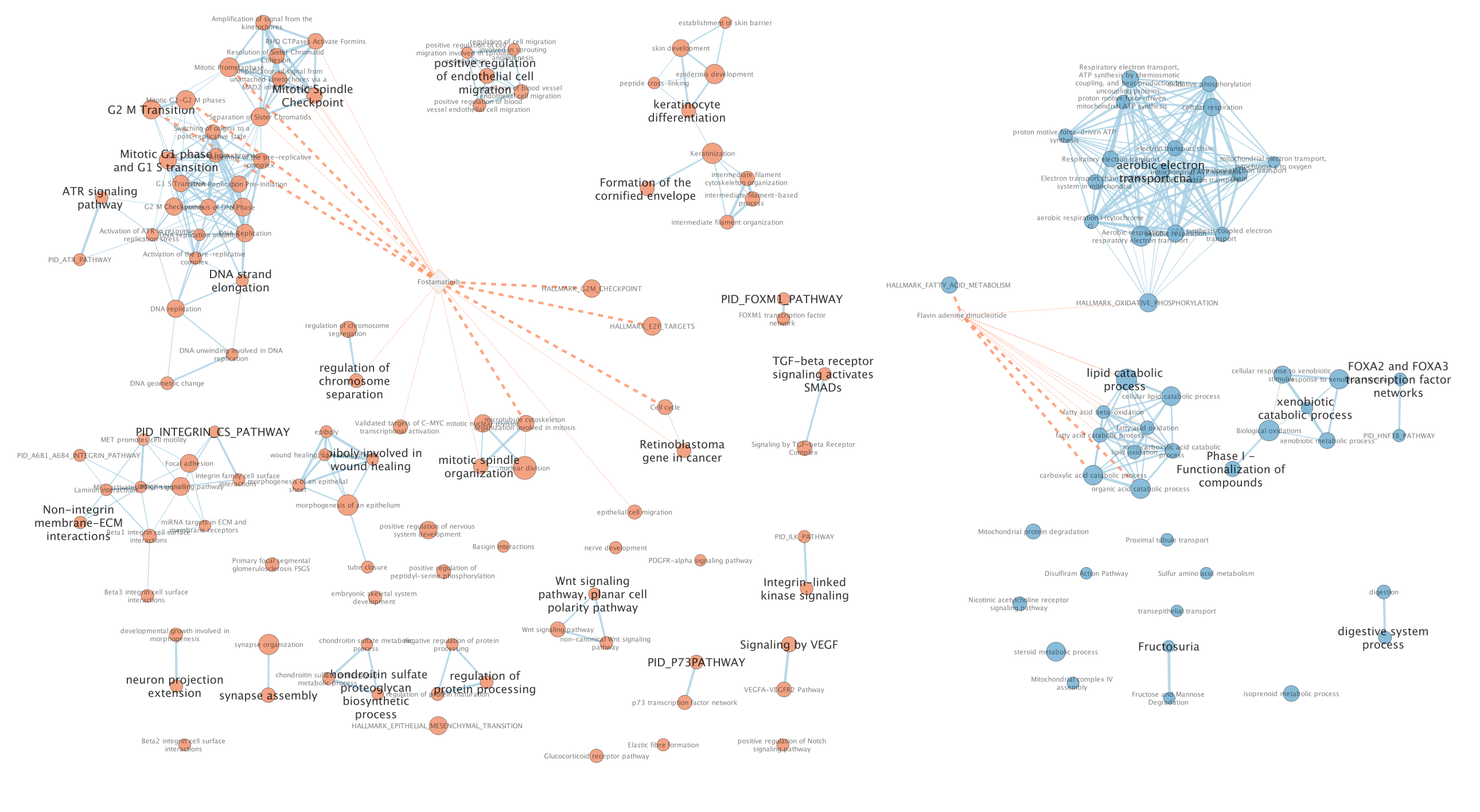
Exercise 2 - Post analysis (add drug target gene-sets to the network)
Step 5
Add drug target gene-sets to the network (Add Signature Gene-Sets…).
5a. In Control Panel, go to the EnrichmentMap tab and click on “Options…” located above the ‘Data Sets:’ box. Select “Add Signature Gene Sets…”. A window named “EnrichmentMap: Add Signature Gene Sets (Post-Analysis) is now opened.
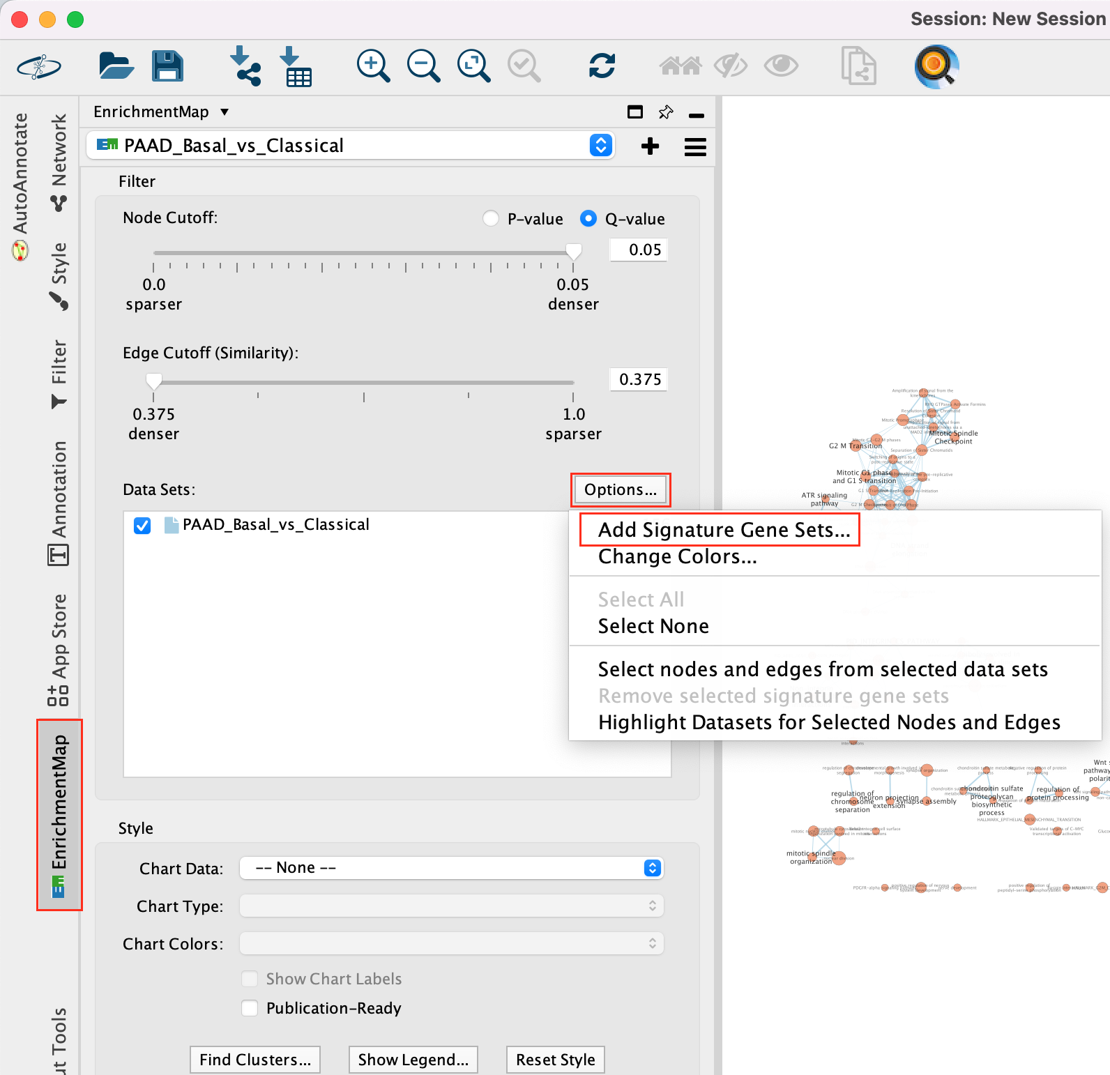
5b. Using the ‘Load from File…’ button, select the Human_DrugBank_approved_symbol_June_01_2024_selected.gmt file that you saved on your computer.
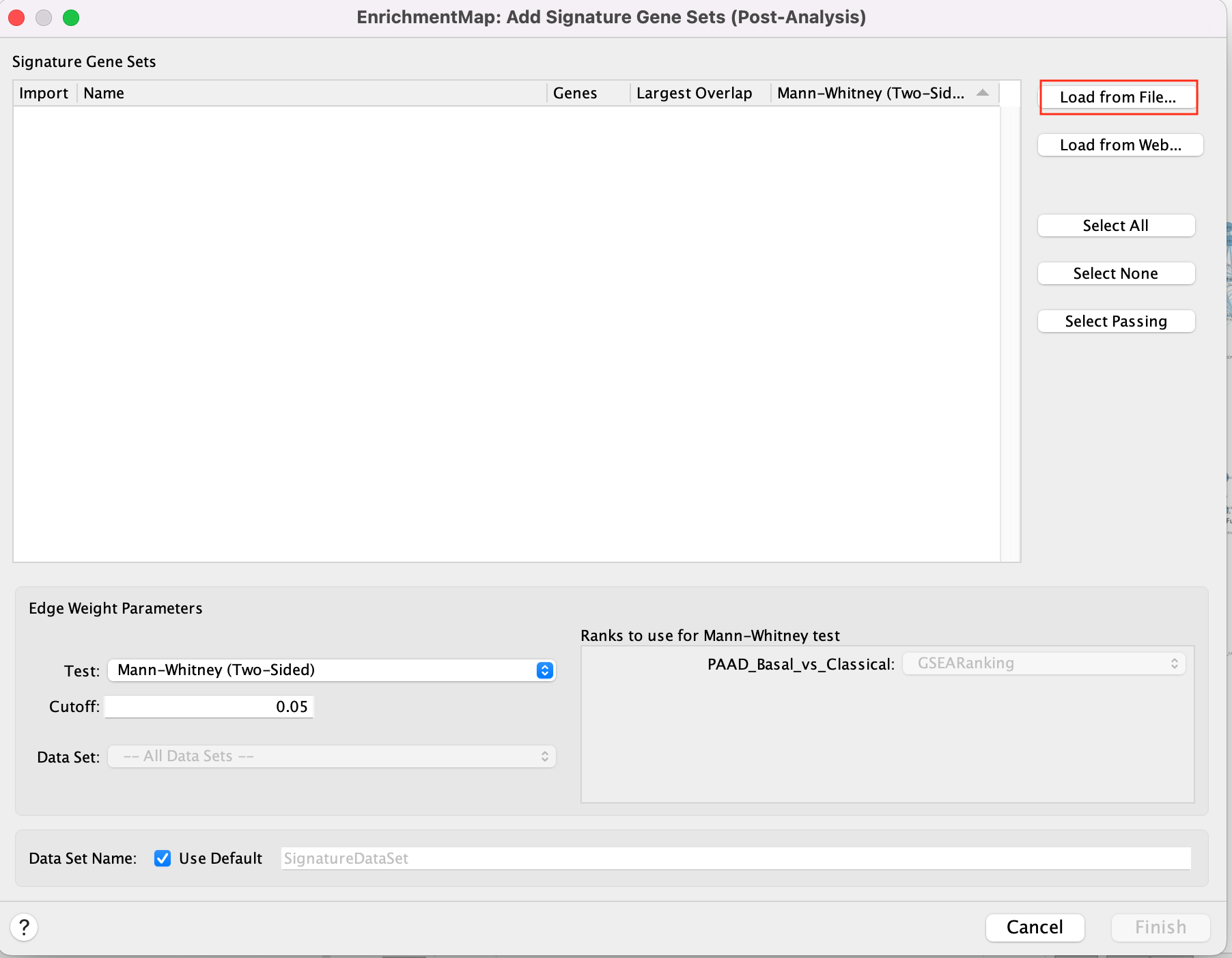
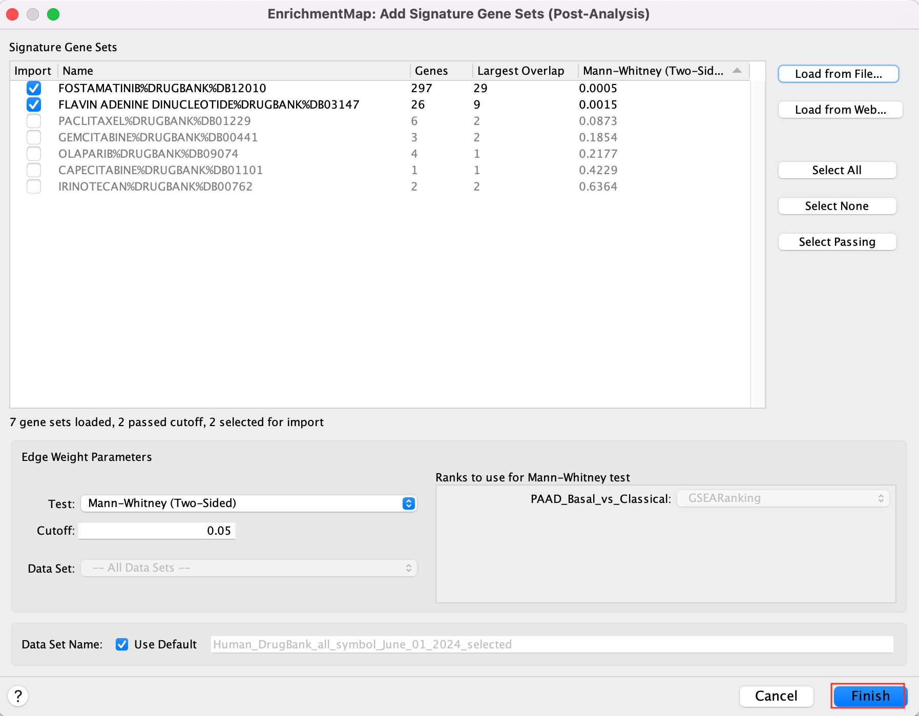
5c. Click on “Finish”.
Two additional nodes are now added to the network and visible as grey diamonds.
Dotted orange edges represent their overlap with the nodes of our network.
These additional nodes represent gene targets of some approved drugs and these genes are either specific of the basal type (dotted orange edges connected to red nodes) or specific of the classical type (dotted orange edges connected to blue nodes).
The remaining five drugs that do not pass the threshold in this map are other drugs currently used in treatment of pancreatic cancer.
more info using this link: https://enrichmentmap.readthedocs.io/en/latest/PostAnalysis.html
Exercise 3 - Autoannotate the Network
Step 6
By default, Enrichment map will Auto-annotate the network with cluster labels.
The Apps WordCloud, ClusterMaker and Autoannotate have to be installed. (they should have been installed during the pre-workshop set up)
if you ran step 5,
delete the drug targets diamond nodes and associated edge
before performing step 6:
* select the 4 nodes and
associated dotted orange edges by browsing the mouse and
* click
“delete” on your keyboard or
* in the Cytoscape menu, ‘Edit’,
‘Delete Selected Nodes and Edges’.
Alternately, in the Enrichment Map Input Panel in the Datasets box, un-select “Human_Drugbank_approved_symbol_June_01_2024_selected” to hide the post analysis nodes.
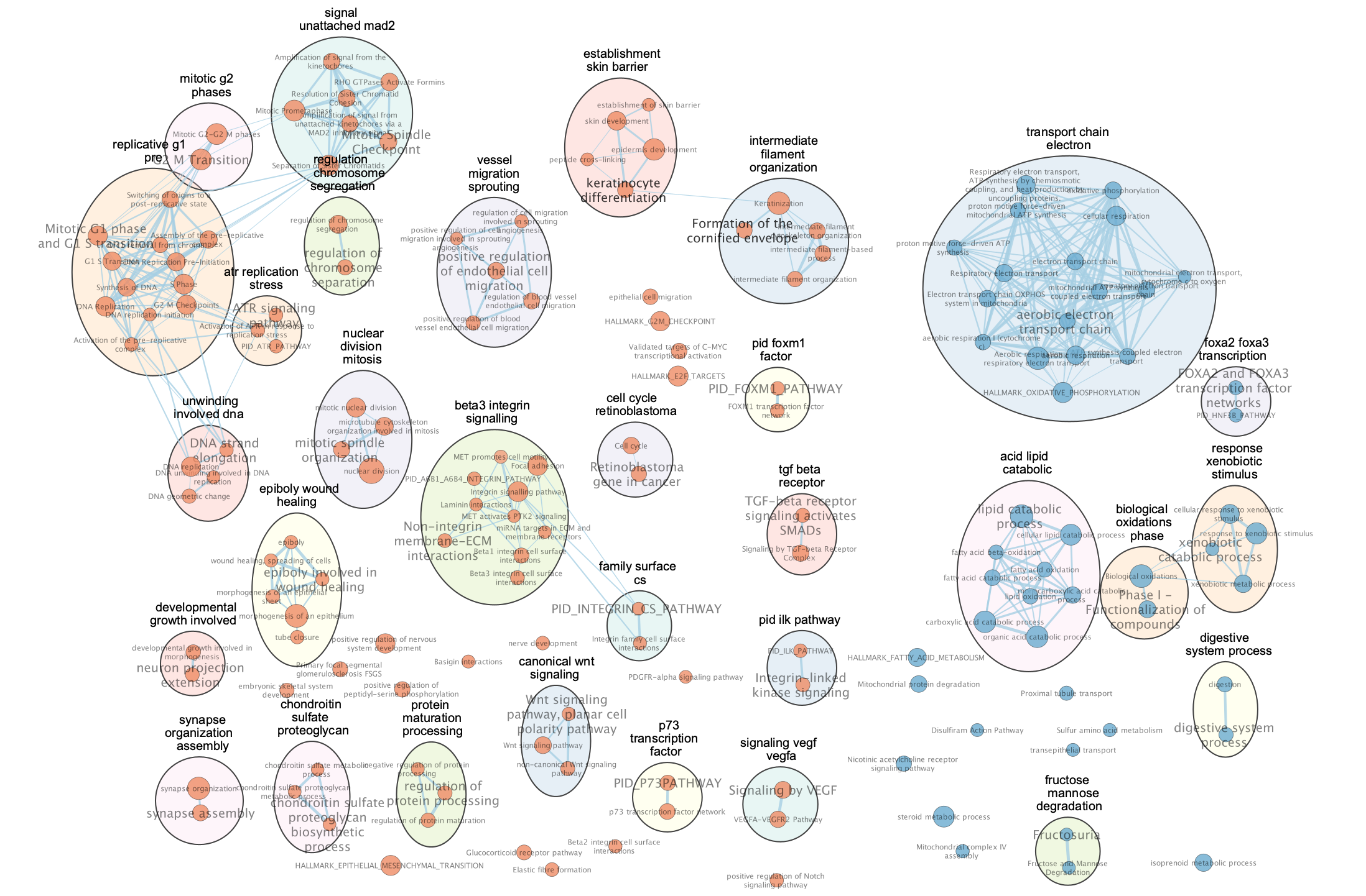
The “annotations” are hidden but the node of each computed cluster that has the most significant FDR value is shown with a larger node label.
6a. To modify these precomputed annotations find the Auto annotate display panel on the right or Auto annotate input panel on the left. The right panel will contain all the different settings you can set for the annotations. By default the annotations and their labels are hidden. The left panel allows you to see all the different clusters and their labels. You can select one of many of them, change their labels or recompute the clusters with predefined clusters or one of many avaialble methods amoungst other settings. See the docs for all the available features.
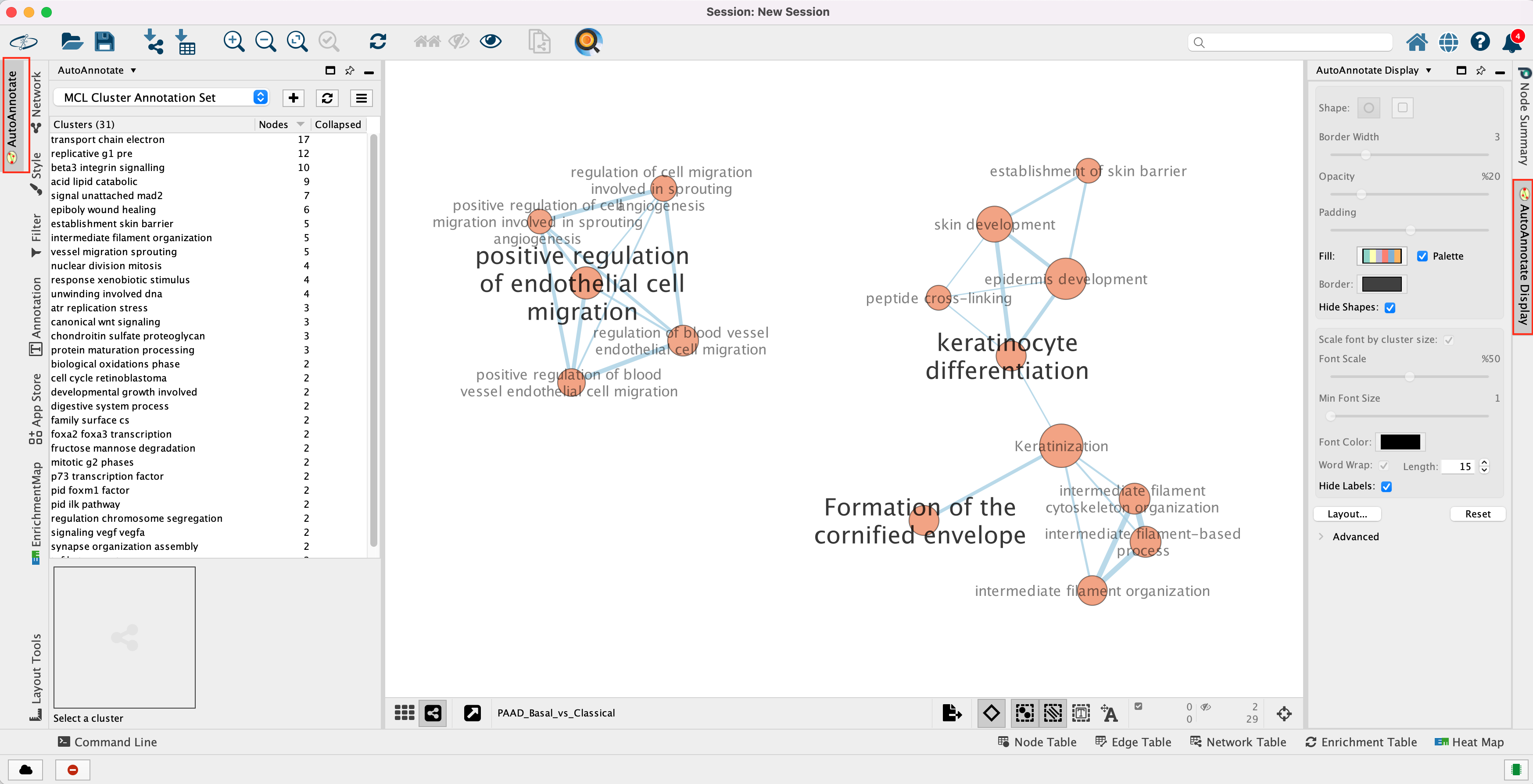
Unhide labels and shapes to see the underlying annotation for the network.
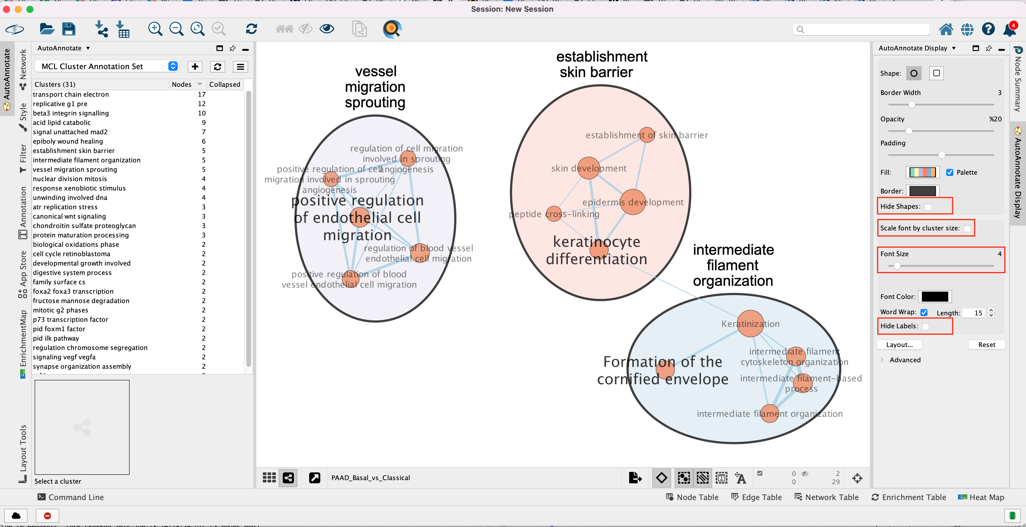
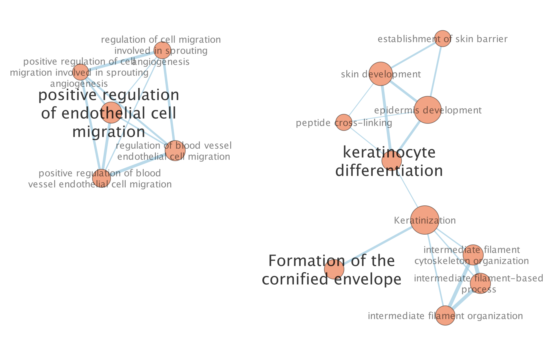
The network is now subdivided into clusters that are represented by ellipses. Each of these clusters are composed of pathways (nodes) interconnected by many common genes. These pathways represent similar biological processes. The app WordCloud take all the labels of the pathways in one cluster and summarize them as a unique cluster label displayed at the top of each ellipse.
Tip 1: further editing and formatting can be
performed on the AutoAnnote results using the AutoAnnotate
Display in the Results Panels located at the right side of
the window.
For example, it is possible to change Ellipse to
Rectangle, uncheck Scale font by cluster size and increase the
Font Scale using the scaling bar. It is also possible to reduce
the length of the cluster label by checking the “Word Wrap” option.
Tip 2: The AutoAnnotate window on the left side in Result Panel contains the list of all clusters. Clicking on a cluster label will highlight in yellow all nodes in this cluster. It is then easy to move the nodes using the mouse to avoid cluster overlaps.
Exercise 4 (Optional) - Explore results in GeneMANIA or STRING
Each node in the Enrichment map represents a biological process or pathway. It consists of a collection of genes. Often we want to know how the genes in that group interact. There are many different ways you can investigate the underlying interactions for the given group. Some involve searching online databases and others are directly integrated into cytoscape.
- GeneMANIA - an integrative database of gene connections including co-expression, protein interactions, genetic interactions, pathways and more. Cytoscape App
- String - an integrative database of gene connections including co-expression, protein interactions, genetic interactions, pathways and more. Cytoscape App
- Pathway Commons - a intergrative database of pathways. (There is a beta feature in EM to show your pathway in the painter app, a pathway common web page that overlays your expression data on the given pathway. Still in beta testing and requires expression data to work correctly so won’t work for this example)
Step 7
Visualize genes in a pathway/node of interest using the apps STRING and GeneMANIA. This will create a protein-protein interaction network using the genes included in the pathway. Note: We will go more in depth into GeneMANIA in module 5
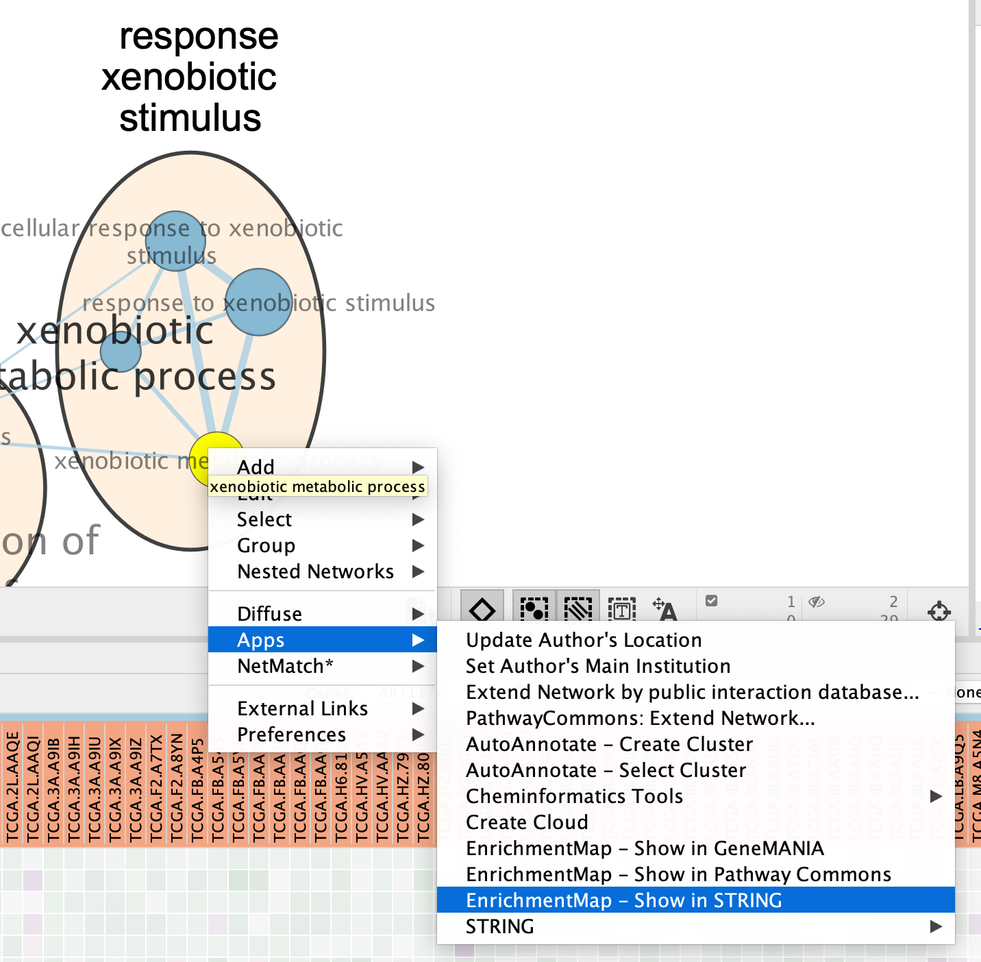
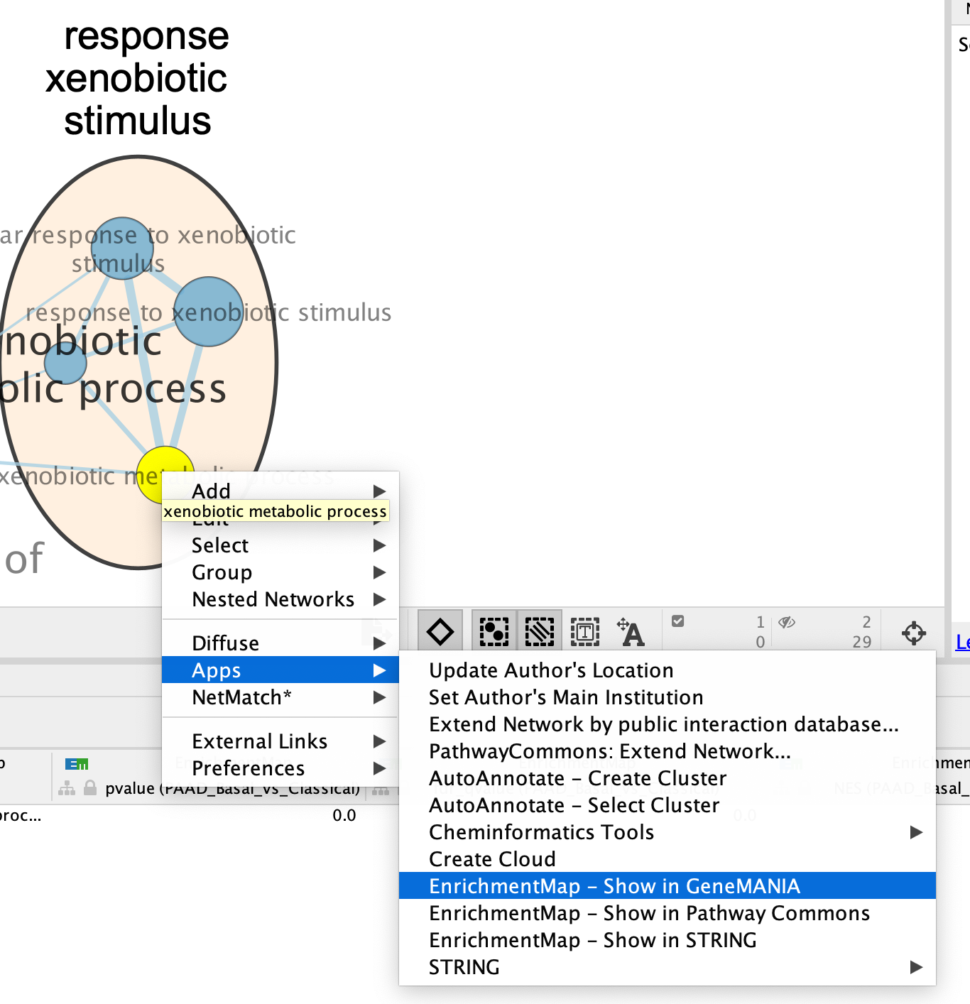
7a: Click on an individual node of interest.
For this example, you could use xenobiotic metabolic process.
If you are unable to locate xenobiotic metabolic process, type “xenobiotic metabolic process” in the search box (quotes are important). The selected node appears yellow (or highlighted) in the network. If you have annotated your network, it should be included in the response xenobiotic stimulus cluster.
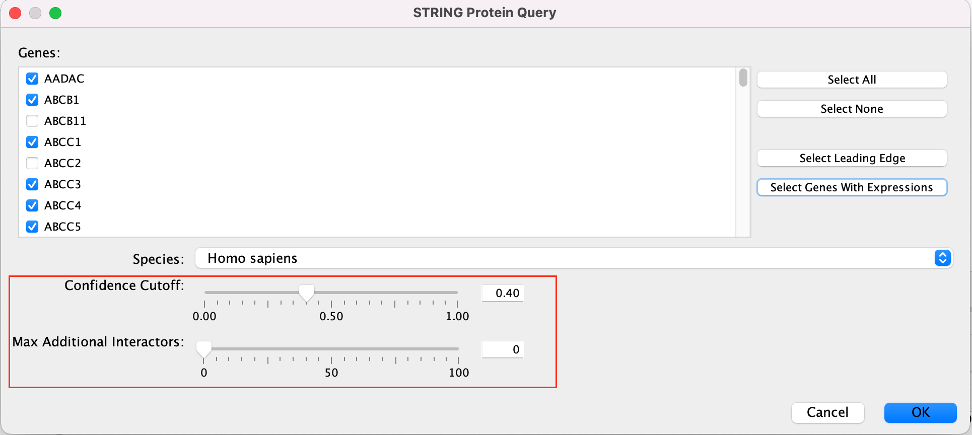
7b: Right Click on the node of interest to diplay the option menu. Select Apps,–> EnrichmentMap - Show in STRING
Patience. :) . It might take a few seconds for the String Protein Query window to open.
- A STRING Protein Query box appears.
- Select Select genes with expression.
- Click on OK.
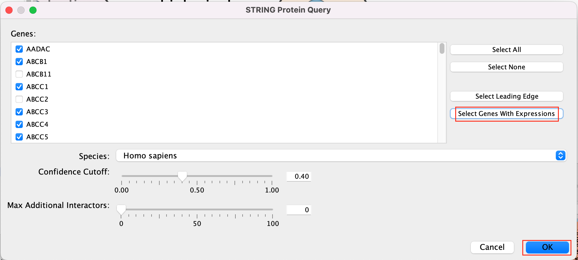
- The resulting network will look something like this.
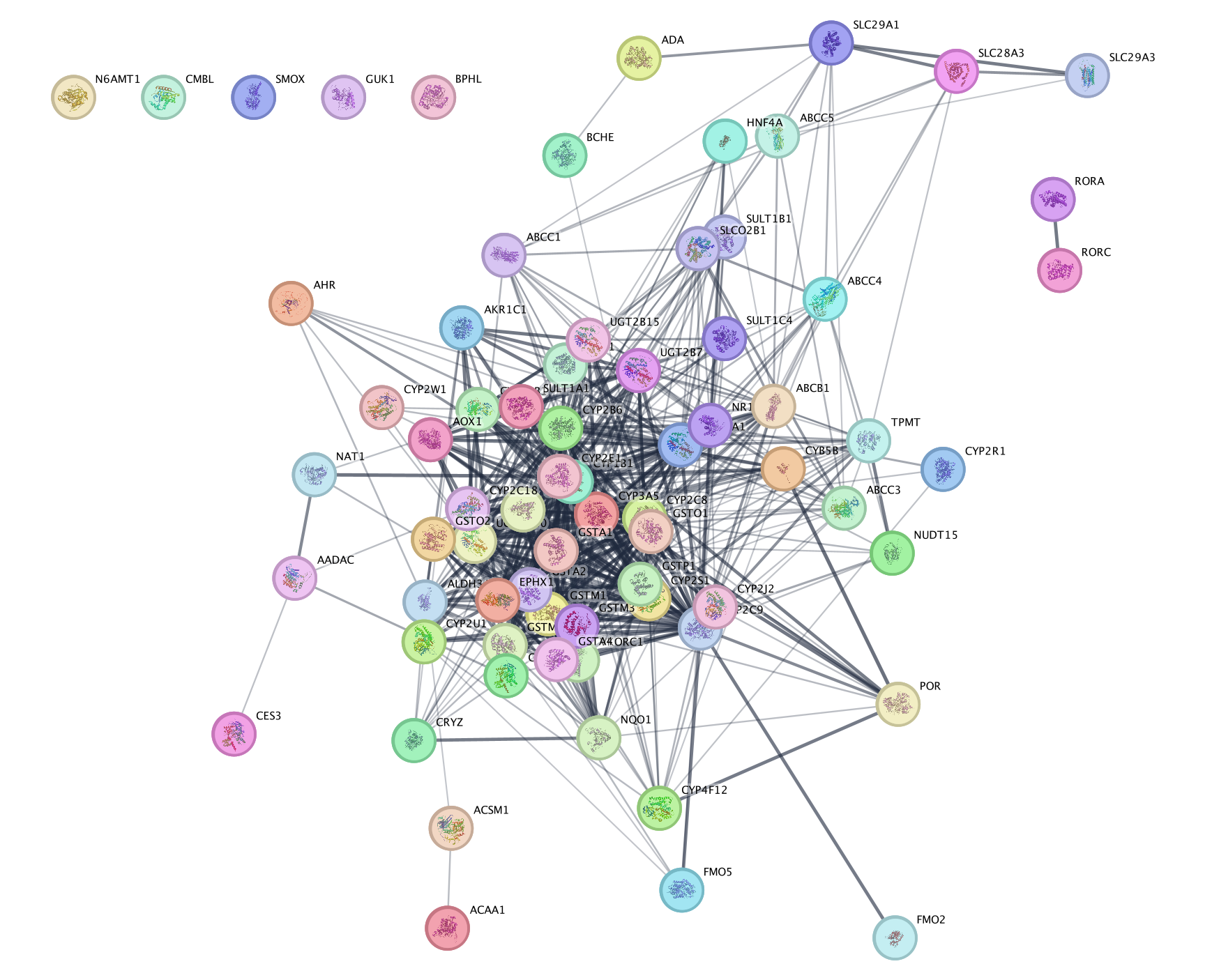
Explore the features and data of each Cytoscape app.
What happens
to the network if you change the initial parameters like Confidence
cutoff or Max Additional interactors
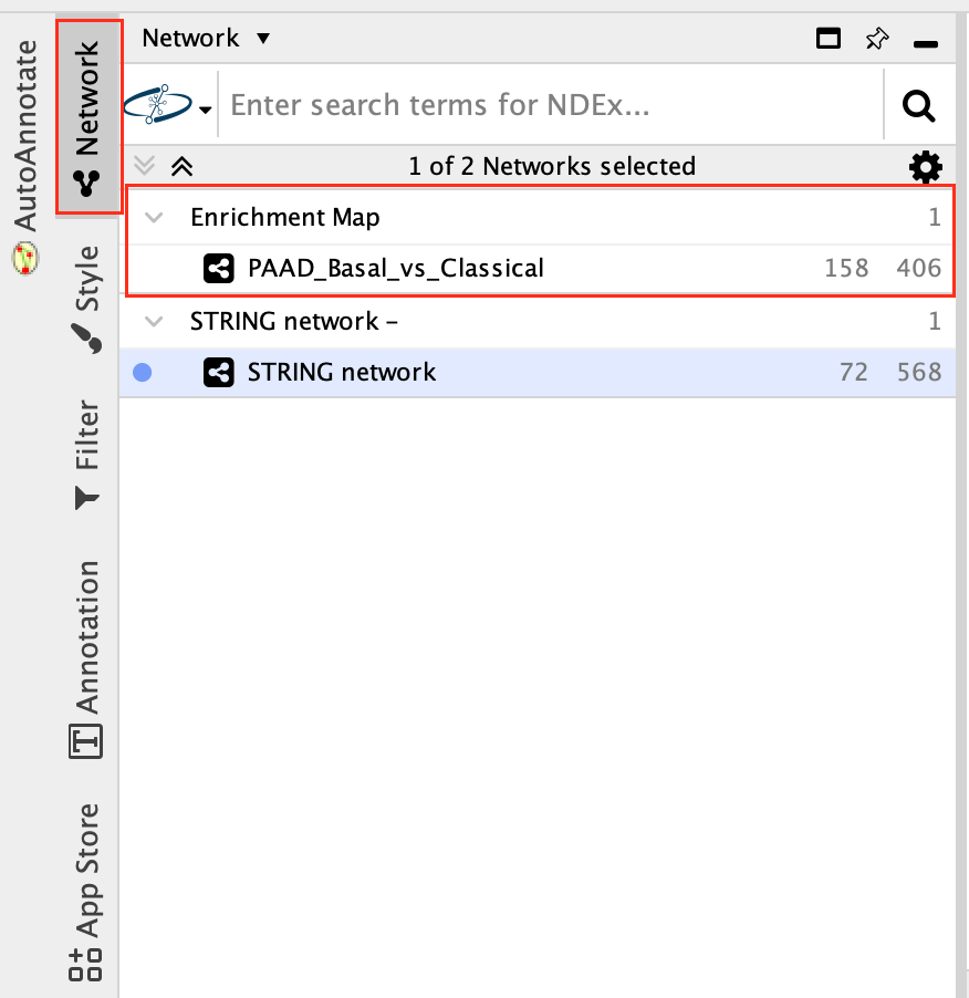
7c:Go back to enrichment map network.
- In Control Panel (left side of the window), select the “Network” tab and click on the Enrichment Map network as shown in below screenshot.
7d: Search again for the node labelled xenobiotic metabolic process (if it is not still selected) as in Step 7a.
- Right Click on the node of interest to diplay the option menu. Select Apps,–> EnrichmentMap - Show in GeneMANIA
- A GeneMANIA Query box appears.
- select Select genes with expression.
- Click on OK.
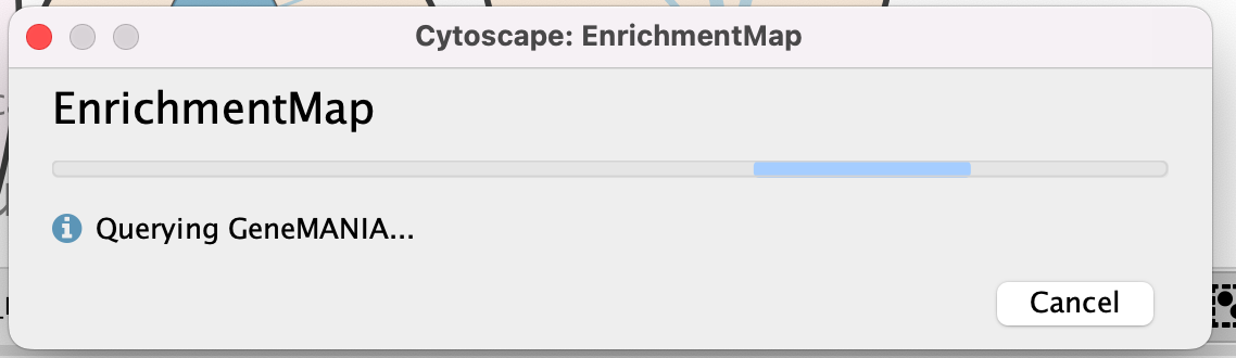
- A pop up will appear indicating that it is currenlty querying GeneMANIA
- The resulting network will look similiar to the below screenshot.
It is possible to view gene expression data for the nodes in the STRING network. See the section https://enrichmentmap.readthedocs.io/en/latest/Integration.html and try it out after the workshop.
SAVE YOUR SESSION FILE!
Bonus - Automation.
Run analysis directly from R for easy integration into existing pipelines.
Instead of creating an Enrichment map manually through the user interface you can create an enrichment map directly using the RCy3 bioconductor package or through direct rest calls with Cytoscape cyrest.
Follow the step by step instructions on how to run from R here - https://risserlin.github.io/CBW_pathways_workshop_R_notebooks/create-enrichment-map-from-r-with-gsea-results.html
First, make sure your environment is set up correctly by following there instructions - https://risserlin.github.io/CBW_pathways_workshop_R_notebooks/setup.html
Module 3 Lab: (Bonus) Automation
Although a lot of what we have demonstrated in Cytoscape up until now has been manual most of the features we use can be automated through multiple access points including:
- R/Rstudio using RCy3 - a bioconductor package that makes communicating with cytoscape as simple as calling a method.
- Python using py2cytoscape.
- directly through cyrest using rest calls - you can use any programming language with the rest API. See Cytoscape Automation
Automation becomes helpful when performing pipelines multiple times on similiar datasets or integrating cytoscape data into your other pipelines.
Below we demonstrate how to perform the enrichment map pipeline from R but automation is not limited to this access point. You can automate it from any flavour of programming.
Check out all the ways you can interact with Cytoscape here including directly through the cytoscape command window.
Goal of the exercise:
Run an enrichment analysis and Create an enrichment map automatically from R/Rstudio
During this exercise, you will apply what you have learnt in Module 2 labs and Module 3 labs but instead of performing them manually you will automate the process using R/Rstudio. We will use all the same data and programs we used in the previous labs but we will control them from R.
Before starting this exercise you need to set up R/Rstudio. You can do that directly on your machine or through docker.
Set Up - Option 1 - Install R/Rstudio
- Install R.
- Go to: https://cran.rstudio.com/
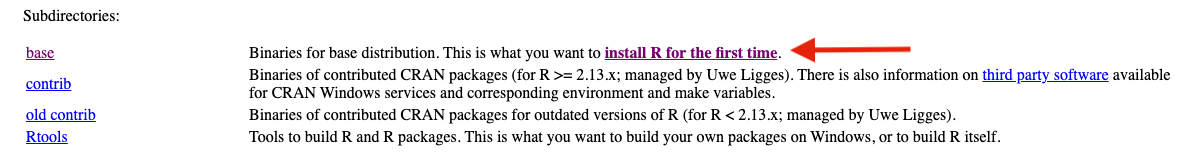
- If installing on Windows select “install R for the first time” to get to the required package.
RStudio is a free IDE (Integrated Development Environment) for R. RStudio is a wrapper1 for R and as far as basic R is concerned, all the underlying functions are the same, only the user interface is different (and there are a few additional functions that are very useful e.g. for managing projects).
Here is a small list of differences between R and RStudio.
pros (some pretty significant ones actually):
- Integrated version control.
- Support for “projects” that package scripts and other assets.
- Syntax-aware code colouring.
- A consistent interface across all supported platforms. (Base R GUIs are not all the same for e.g. Mac OS X and Windows.)
- Code autocompletion in the script editor. (Depending on your point of view this can be a help or an annoyance. I used to hate it. After using it for a while I find it useful.)
- “Function signaturtes” (a list of named parameters) displayed when you hover over a function name.
- The ability to set breakpoints for debugging in the script editor.
- Support for knitr, and rmarkdown; also support for R notebooks … (This supports “literate programming” and is actually a big advance in software development)
- Support for R notebooks.
cons (all minor actually):
- The tiled interface uses more desktop space than the windows of the R GUI.
- There are sometimes (rarely) situations where R functions do not behave in exactly the same way in RStudio.
- The supported R version is not always immediately the most recent release.
- Navigate to the RStudio download Website.
- Find the right version of the RStudio Desktop installer for your computer, download it and install the software.
- Open RStudio.
-
Focus on the bottom left pane of the window, this is the “console”
pane.
- Type getwd().
- This prints out the path of the current working directory. Make a (mental) note where this is. We usually always need to change this “default directory” to a project directory.
Set Up - Option 2 - Docker image with R/Rstudio
Changing versions and environments are a continuing struggle with bioinformatics pipelines and computational pipelines in general. An analysis written and performed a year ago might not run or produce the same results when it is run today. Recording package and system versions or not updating certain packages rarely work in the long run.
One the best solutions to reproducibility issues is containing your workflow or pipeline in its own coding environment where everything from the operating system, programs and packages are defined and can be built from a set of given instructions. There are many systems that offer this type of control including:
“A container is a standard unit of software that packages up code and all its dependencies so the application runs quickly and reliably from one computing environment to another.” (docker?)
Why are containers great for Bioiformatics?
- allows you to create environments to run bioinformatis pipelines.
- create a consistent environment to use for your pipelines.
- test modifications to the pipeline without disrupting your current set up.
- Coming back to an analysis years later and there is no need to install older versions of packages or programming languages. Simply create a container and re-run.
What is docker?
- Docker is a container platform, similar to a virtual machine but better.
- We can run multiple containers on our docker server. A container is an instance of an image. The image is built based on a set of instructions but consists of an operating system, installed programs and packages. (When backing up your computer you might taken an image of it and restored your machine from this image. It the same concept but the image is built based on a set of elementary commands found in your Dockerfile.) - for overview see here
- Often images are built off of previous images with specific additions you need for you pipeline. (For example, for this course we use a base image supplied by bioconductorrelease 3.11 and comes by default with basic Bioconductor packages but it builds on the base R-docker images called rocker.)
Container
- An instance of an image.
- the self-contained running system.
- There can be multiple containers derived from the same image.
Image
- An image contains the blueprint of a container.
- In docker, the image is built from a Dockerfile
Docker Volumes
- Anything written on a container will be erased when the container is erased ( or crashes) but anything written on a filesystem that is separate from the contain will persist even after a container is turned off.
- A volume is a way to assocaited data with a container that will persist even after the container. * maps a drive on the host system to a drive on the container.
- In the above docker run command (that creates our container) the statement:
- maps the directory ${PWD} to the directory /home/rstudio/projects on the container. Anything saved in /home/rstudio/projects will actually be saved in ${PWD}
- An example:
- I use the following commmand to create my docker container:
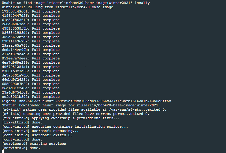
docker run -e PASSWORD=changeit --rm \
  -v /Users/risserlin/code:/home/rstudio/projects \
  -p 8787:8787 \
risserlin/workshop_base_image- I create a notebook called task3.Rmd and save it in /home/rstudio/projects.
Note: Do not save it in /home/rstudio/ which is the default directory RStudio will start in
- On my host computer, if I go to /Users/risserlin/code I will find the file task3.Rmd
Install Docker
- Download and install docker desktop.
- Follow slightly different instructions for Windows or MacOS/Linux
Windows
- it might prompt you to install additional updates (for example - https://docs.Microsoft.com/en-us/windows/wsl/install-win10#step-4---download-the-linux-kernel-update-package) and require multiple restarts of your system or docker.
- launch docker desktop app.
- Open windows Power shell
- navigate to directory on your system where you plan on keeping all your code. For example: C:\USERS\risserlin\code
- Run the following command: (the only difference with the windows command is the way the current directory is written. ${PWD} instead of "$(pwd)")
docker run -e PASSWORD=changeit --rm \
  -v ${PWD}:/home/rstudio/projects -p 8787:8787 \
  risserlin/workshop_base_image
- Windows defender firewall might pop up with warning. Click on Allow access.
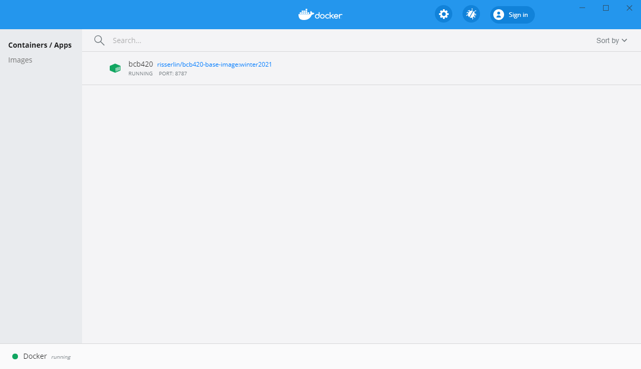
- In docker desktop you see all containers you are running and easily manage them.
MacOS / Linux
- Open Terminal
- navigate to directory on your system where you plan on keeping all your code. For example: /Users/risserlin/code
- Run the following command: (the only difference with the windows command is the way the current directory is written. ${PWD} instead of "$(pwd)")
docker run -e PASSWORD=changeit --rm \
  -v "$(pwd)":/home/rstudio/projects -p 8787:8787 \
  risserlin/workshop_base_image
Create your first notebook using Docker
Start coding!
- Open a web browser to localhost:8787
- enter username: rstudio
- enter password: changeit
- changing the parameter -e PASSWORD=changeit in the above docker command will change the password you need to specify
- Make sure your docker container is running. (If you rebooted your machine you will need to restart the container on reboot.)
- Make sure you got the right port.
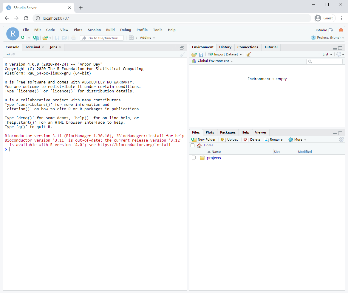
After logging in, you will see an Rstudio window just like when you install it directly on your computer. This RStudio will be running in your docker container and will be a completely separate instance from the one you have installed on your machine (with a different set of packages and potentially versions installed).
Make sure that you have mapped a volume on your computer to a volume
in your container so that files you create are also saved on your
computer. That way, turning off or deleting your container or image will
not effect your files.
- The parameter -v ${PWD}:/home/rstudio/projects maps your current directory (i.e. the directory you are in when launching the container) to the directory /home/rstudio/projects on your container.
- You do not need to use the ${PWD} convention. You can also specify the exact path of the directory you want to map to your container.
- Make sure to save all your scripts and notebooks in the projects directory.
- Create your first notebook in your docker Rstudio.
- Save it.
- Find your newly created file on your computer.
Start using automation
- Download example R notebooks from https://github.com/risserlin/CBW_pathways_workshop_R_notebooks.
This repository contains example R Notebooks that automate the CBW pipeline.
There are two ways you can download this collection:
- If you are familiar with git then we recommend you fork the repo and use it like you would use any github repo.

- download the collection as a zip file - unzip folder and place in CBW working directory
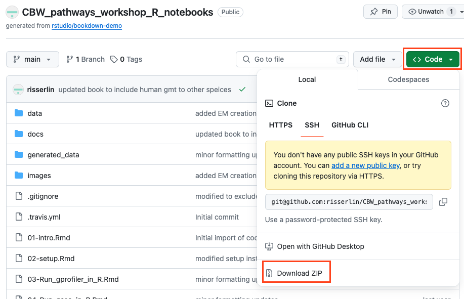
If you are new to git and want to learn more about code versioning then we recommend you read the following tutorial And check out Github Desktop - a desktop application to communicate with github.
Running example notebooks in local RStudio
Highly recommended to use docker instead of local RStudio. If you are using local RStudio, versions of R and associated packages may be different than the ones used in the example notebooks and might require installing updated versions and additional packages.
Step 2 - create a new project
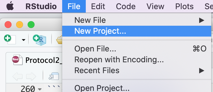
- Create a new project - File -> New R Project …
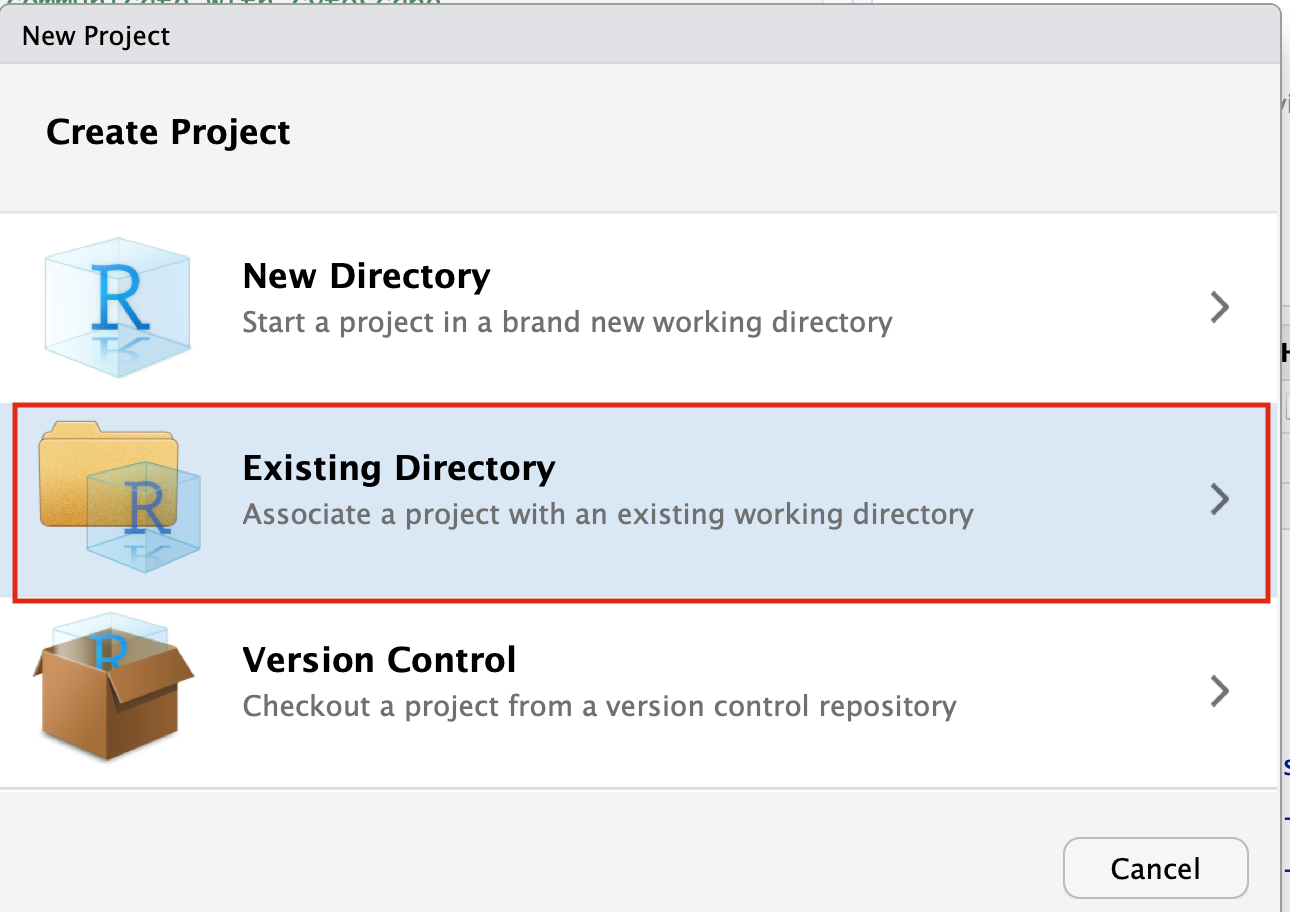
- Select Create project from - “Existing Directory”
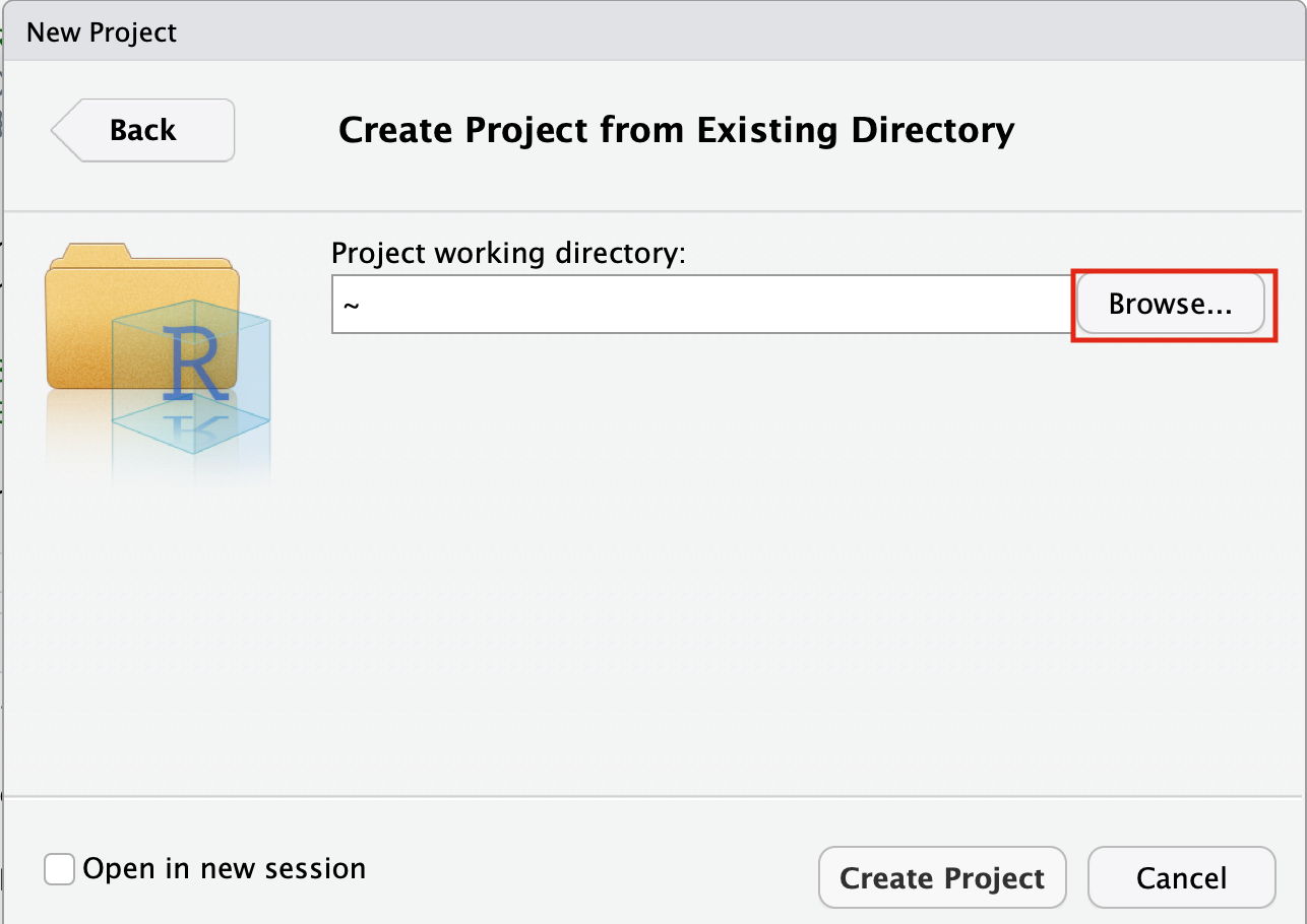
- Click on the Browse button
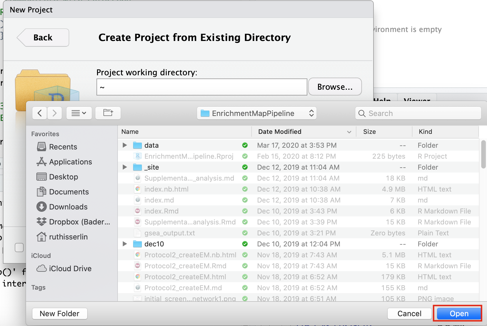
- Navigate to the CBW_pathways_workshop_R_notebooks directory that is found in the directory you downloaded and unzipped from github. (for example, if it is still in your downloads directory go to ~/Downloads/Cytoscape_workflows/CBW_pathways_workshop_R_notebooks)
Step 3 - Open example RNotebook
Open the RNotebook 07-Create_EM_from_GSEA_results.Rmd
Go to File –> Open File …
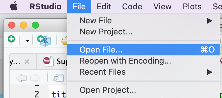
Click on 07-Create_EM_from_GSEA_results.Rmd
If the file is not found in the first directory that RStudio opens up then go back and make sure that you created an Rproject from an “Existing directory” in the previous step.
Step 4 - Step through notebook to run the analysis
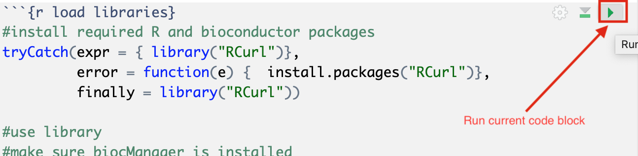
The RNotebook is a mixture of markdown text and code blocks.
Read through the notebook to understand what each section is doing and sequentially run the code blocks by clicking on the play button at the top right of each code block.
Run analysis directly from R for easy integration into existing pipelines.
Instead of creating an Enrichment map manually through the user interface you can create an enrichment map directly using the RCy3 bioconductor package or through direct rest calls with Cytoscape cyrest.
Follow the step by step instructions on how to run from R here - https://risserlin.github.io/CBW_pathways_workshop_R_notebooks/create-enrichment-map-from-r-with-gsea-results.html
First, make sure your environment is set up correctly by following there instructions - https://risserlin.github.io/CBW_pathways_workshop_R_notebooks/setup.html
Exercises
Once you have run through the notebook and created your enrichment map automatically try the following:
- change the fdr threshold and create a new network (without rerunning the whole notebook) with the lower FDR threshold.
- change the similarity coeffecient and create a new network (without rerunning the whole notebook) with the lower FDR threshold.
- re-run the notebook using the GSEA results you created on the first run without running GSEA.
- Modify notebook to run with a different gmt file. (Downloaded from somewhere else or a different file found on baderlab genesets download site)
- Open the notebook Supplementary_Protocol5_Multi_dataset_theme_analysis.Rmd and run through it to create a multi dataset enrichment map.
Additional resources
Check out all the different notebooks available here
A “wrapper” program uses another program’s functionality in its own context. RStudio is a wrapper for R since it does not duplicate R’s functions, it runs the actual R in the background.↩︎