Module 6
scRNA lab praticals
scRNA-lab1_PBMC
This lab starts from scRNA data from peripheral blood mononuclear cells.
The cells from similar cell types were grouped into clusters.
We extracted the gene lists corresponding to each cluster and run pathway analysis on it using g:Profiler.
We also created pseudobulk from the data, ran GSEA and created an enrichment map.
scRNAlab2_Glioblastoma
Similar to lab1, we extracted gene lists from scRNA clustering from glioblastoma data.
We created a mastermap by uploading in EnrichmentMap the pathway enrichment results for all the cluster gene lists.
scRNAlab_CellPhoneDB
- Similar to lab1 , we start from scRNA data from peripheral blood mononuclear cells and we are going to study the cell-cell communication between different cell types using CellPhoneDB.
scRNAlab_NEST
- In this lab, we are exploring cell-cell communication in spatial trancriptomic of a pancreatic cancer (PDAC) tissue section using the tool NEST.
Lab 1: PMBC
As an example of applying pathway and network analysis using single cell RNASeq, we are using the Seurat tutorial as starting point. This dataset consists of Peripheral Blood Mononuclear Cells (PBMC) and is a freely available dataset from 10X Genomics. There are 2,700 single cells that have been sequenced on the Illumina NextSeq 500 (https://satijalab.org/seurat/articles/pbmc3k_tutorial.html).
Pmbc3k Seurat Pipeline
The R code below was used to generate the gene lists used in the downstream analysis. It is for your reference.
YOU DON’T NEED TO RUN THIS CODE FOR THE PRACTICAL LAB.
ALL NECESSARY FILES ARE PROVIDED IN THE DATA SECTION BELOW.
Start of R code example - Jump to Tutorial start
Process the dataset
This is basic processing steps for the purpose of this practical lab. Please look at external tutorials to process scRNA. For example, pre-processing can include methods to remove doublets and ambient RNA. This is out of scope for this meeting.
pbmc[["percent.mt"]] <- PercentageFeatureSet(pbmc, pattern = "^MT-")
pbmc <- NormalizeData(pbmc, normalization.method = "LogNormalize",
scale.factor = 10000)
pbmc <- NormalizeData(pbmc)
pbmc <- FindVariableFeatures(pbmc, selection.method = "vst",
nfeatures = 2000)
all.genes <- rownames(pbmc)
pbmc <- ScaleData(pbmc, features = all.genes)
pbmc <- RunPCA(pbmc, features = VariableFeatures(object = pbmc))
pbmc <- FindNeighbors(pbmc, dims = 1:10)
pbmc <- FindClusters(pbmc, resolution = 0.5)
pbmc <- RunUMAP(pbmc, dims = 1:10)
DimPlot(pbmc, reduction = "umap")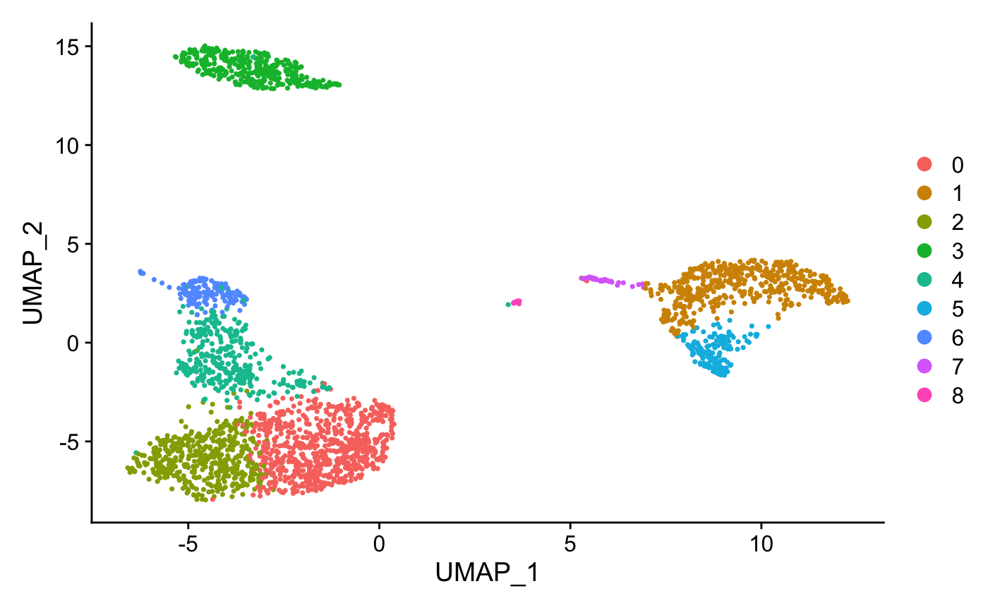
Assign cell type identity to clusters
For this dataset, we use canonical markers to match clusters to known cell types:
new.cluster.ids <- c("Naive CD4 T", "CD14+ Mono",
"Memory CD4 T", "B", "CD8 T",
"FCGR3A+ Mono","NK", "DC", "Platelet")
names(new.cluster.ids) <- levels(pbmc)
pbmc <- RenameIdents(pbmc, new.cluster.ids)
DimPlot(pbmc, reduction = "umap", label = TRUE, pt.size = 0.5)
+ NoLegend()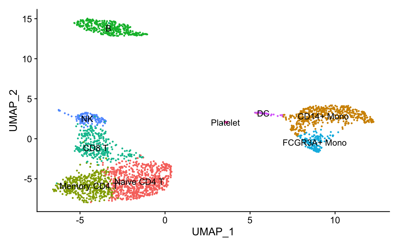
Find differentially expressed features (cluster biomarkers)
Find markers for every cluster compared to the remaining cells and report only the genes with positive scores, ie. genes specific to the cluster and not the rest of the cells. The list of genes specific to each cluster will be used in the downstream analysis.
#Use the FindAllMarkers seurat function to find all the genes
#associated with each cluster
pbmc.markers <- FindAllMarkers(pbmc, only.pos = TRUE, min.pct = 0.25,
logfc.threshold = 0.25)
pbmc.markers %>%
group_by(cluster) %>%
slice_max(n = 2, order_by = avg_log2FC)
#plot graphs for a subset of the genes
FeaturePlot(pbmc, features = c("MS4A1", "GNLY", "CD3E",
"CD14", "FCER1A", "FCGR3A", "LYZ", "PPBP","CD8A"))
write.csv(pbmc.markers, "pbmc.markers.csv")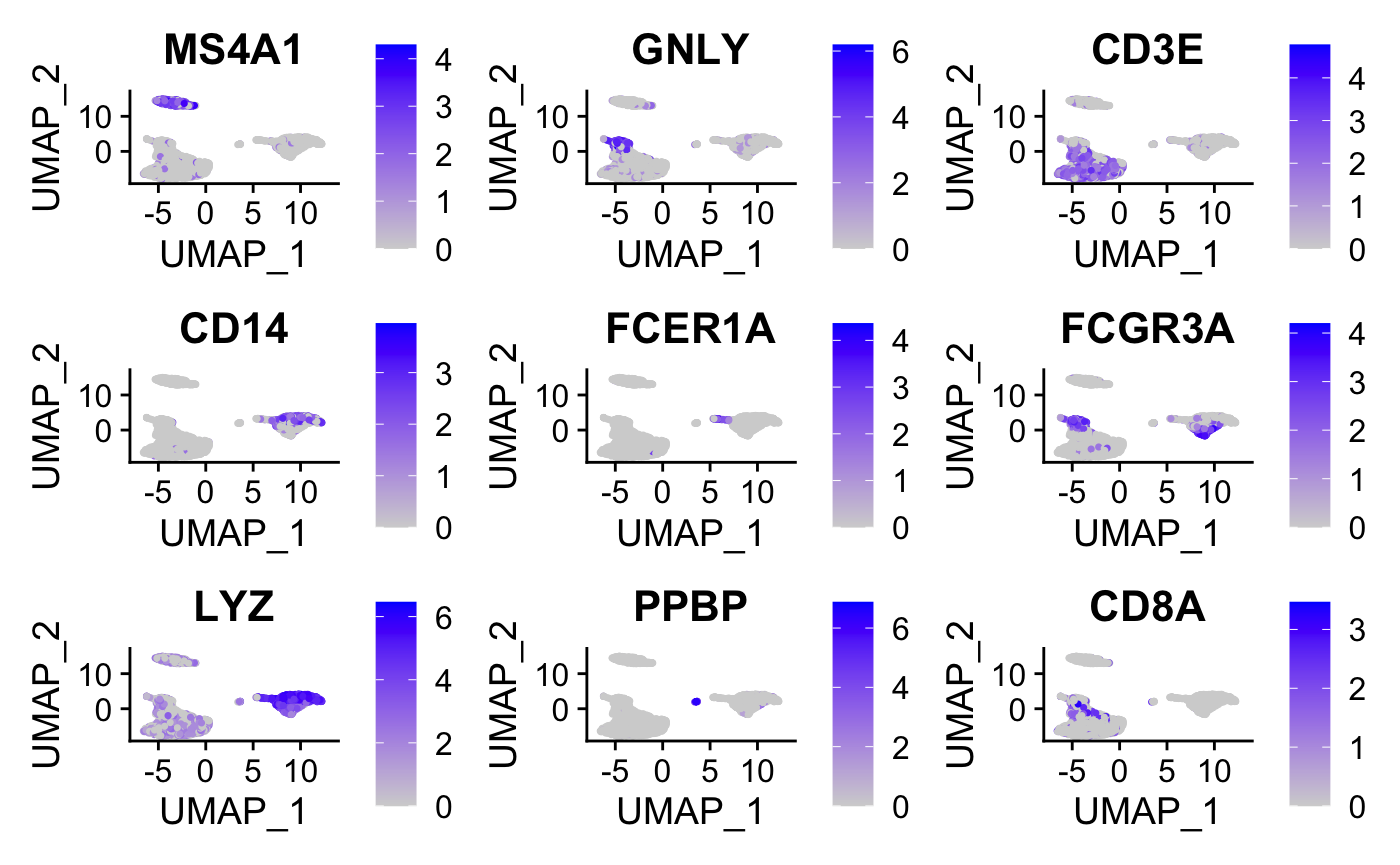
Create Gene list for each cluster to use with g:Profiler
Now that we have the list of genes that are specific to each cluster, it would be useful to perform pathway analysis on each list. It could provide a deeper understanding on each cluster. In some cases, it might help to adjust the labels associated with the clusters using marker genes.
In order to do that, we have extracted each cluster gene list from the pbmc.markers.csv file.
#modify the names of some of the clusters to get rid of spaces and symbols
pbmc.markers$cluster = gsub("Naive CD4 T", "Naive_CD4_T",
pbmc.markers$cluster)
pbmc.markers$cluster = gsub("CD14\\+ Mono", "CD14pMono",
pbmc.markers$cluster)
pbmc.markers$cluster = gsub("Memory CD4 T", "Memory_CD4_T",
pbmc.markers$cluster)
pbmc.markers$cluster = gsub("CD8 T", "CD8_T", pbmc.markers$cluster)
pbmc.markers$cluster = gsub("FCGR3A\\+ Mono", "FCGR3Ap_Mono",
pbmc.markers$cluster)
#get the set of unique cluster names
cluster_list = unique(pbmc.markers$cluster)
#go through each cluster and create a file of its associated genes.
# output the genes associated with each cluster into a file named by the
# cluster name
for (a in cluster_list){
print(a)
genelist = pbmc.markers$gene[which( pbmc.markers$cluster == a)]
print(genelist)
write.table(genelist, paste0(a, ".txt"), sep= "\t", col.names = F,
row.names = F, quote=F)
}End of R code example
Run pathway enrichment analysis using g:Profiler
For this practical lab, we will use the platelet gene list to enriched pathways and processes using g:Profiler.
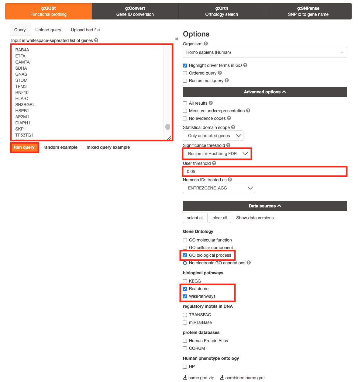
- Open the g:Profiler website at g:Profiler in your web browser.
- Open the file (Platelet.txt) in a simple text editor such as Notepad or Textedit. Select and copy the list of genes.
- Paste the gene list into the Query field in top-left corner of the g:Profiler interface.
- Click on the Advanced options tab to expand it.
- Set Significance threshold to “Benjamini-Hochberg FDR”
- Select 0.05
- Click on the Data sources tab to expand it:
- UnSelect all gene-set databases by clicking the “clear all” button.
- In the Gene Ontology category, check GO Biological Process and No electronic GO annotations.
- In the biological pathways category, check Reactome and check WikiPathways.
- Click on the Run query button to run g:Profiler.
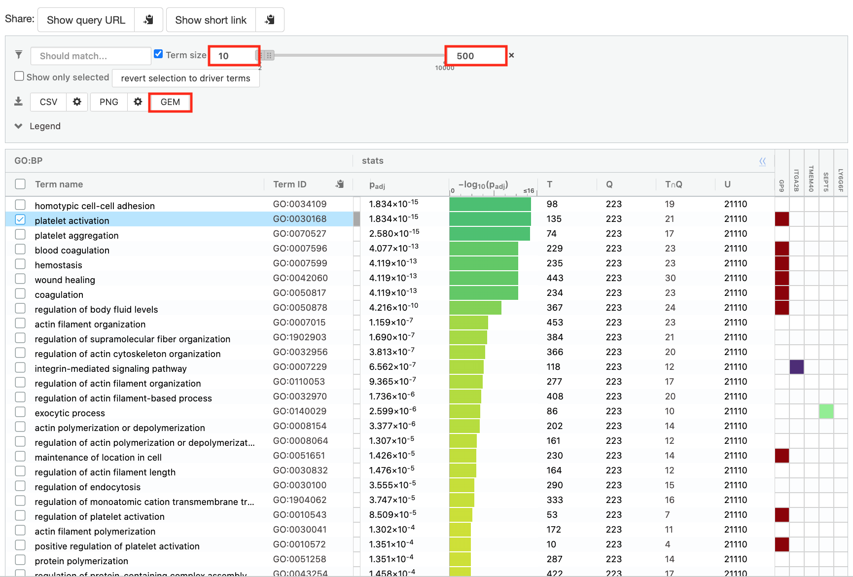
- Save the results
- In the Detailed Results panel, select “GEM” .
- keep the minimum term size set to 10
- set maximum term size to 500
- This will save the results in a text file in the “Generic Enrichment Map” format that we will use to visualize in Cytoscape.
- Download the pathway database files.
- Go to the top of the page and expand the “Data sources” tab. Click on the ‘combined name.gmt’ link located at bottom of this tab. It will download a file named combined name.gmt containing a pathway database gmt file with all the available sources.
- Rename the file to gProfiler_platelet.txt
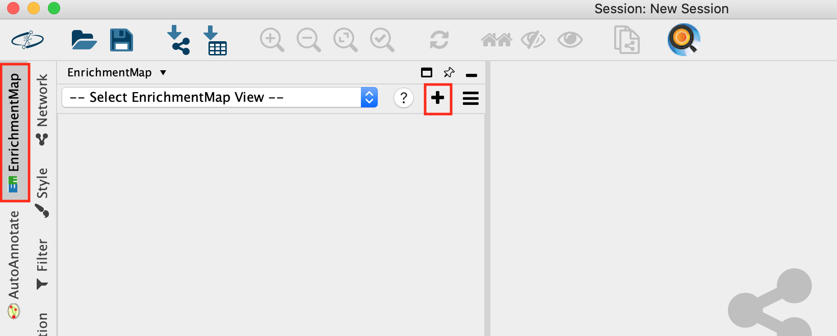
Create an enrichment map in Cytoscape
- Open Cytoscape
- Go to Apps -> EnrichmentMap
- Select the EnrichmentMap and click on the + sign to open the app.
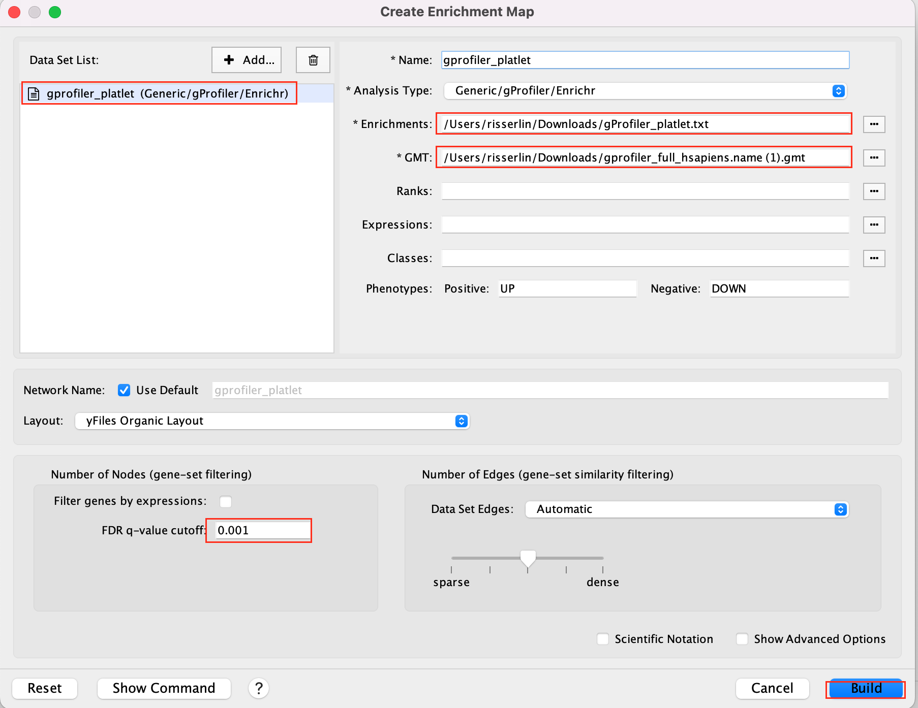
- Drag and drop the g:Profiler file (gProfiler_platelet.txt) and the gmt file (gprofiler_full_hsapiens.name.gmt)
- Set FDR q-value cutoff to 0.001
- Click on Build
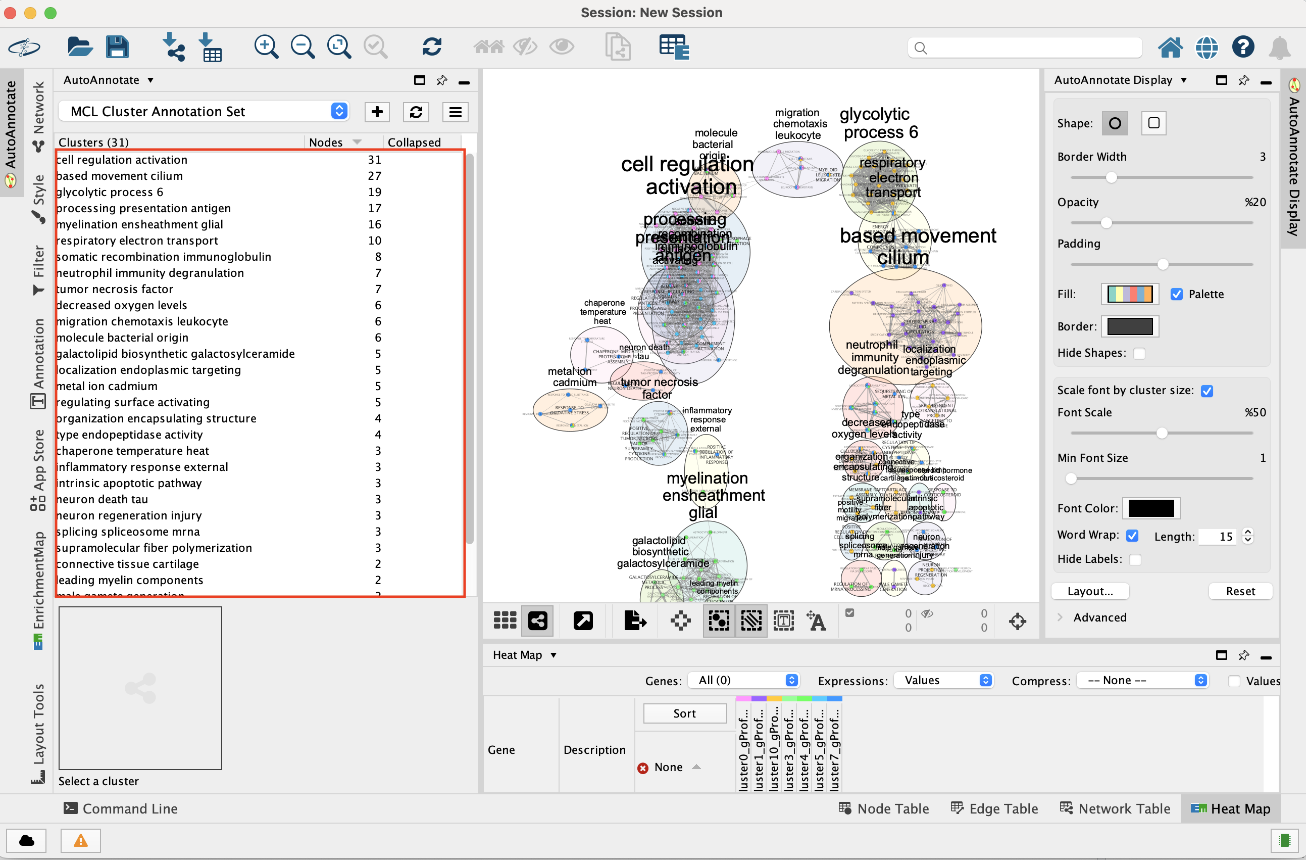
- An enrichment map is created:
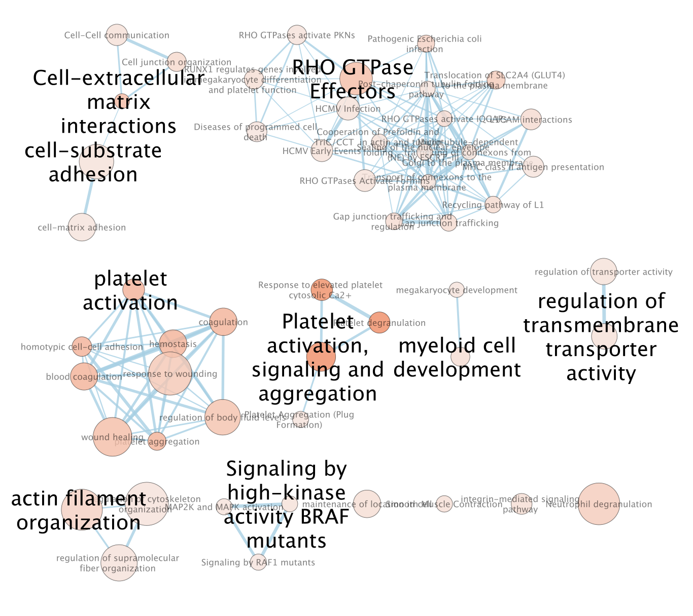
- For clarity, show annotations for the clustes in the enrichment map.
- Find the Autoannotate and AutoAnnotate Display panels on the left and right side panels, respectively,
- Unhide the shapes and labels to more clearly see the groupings. Adjust settings to your liking.
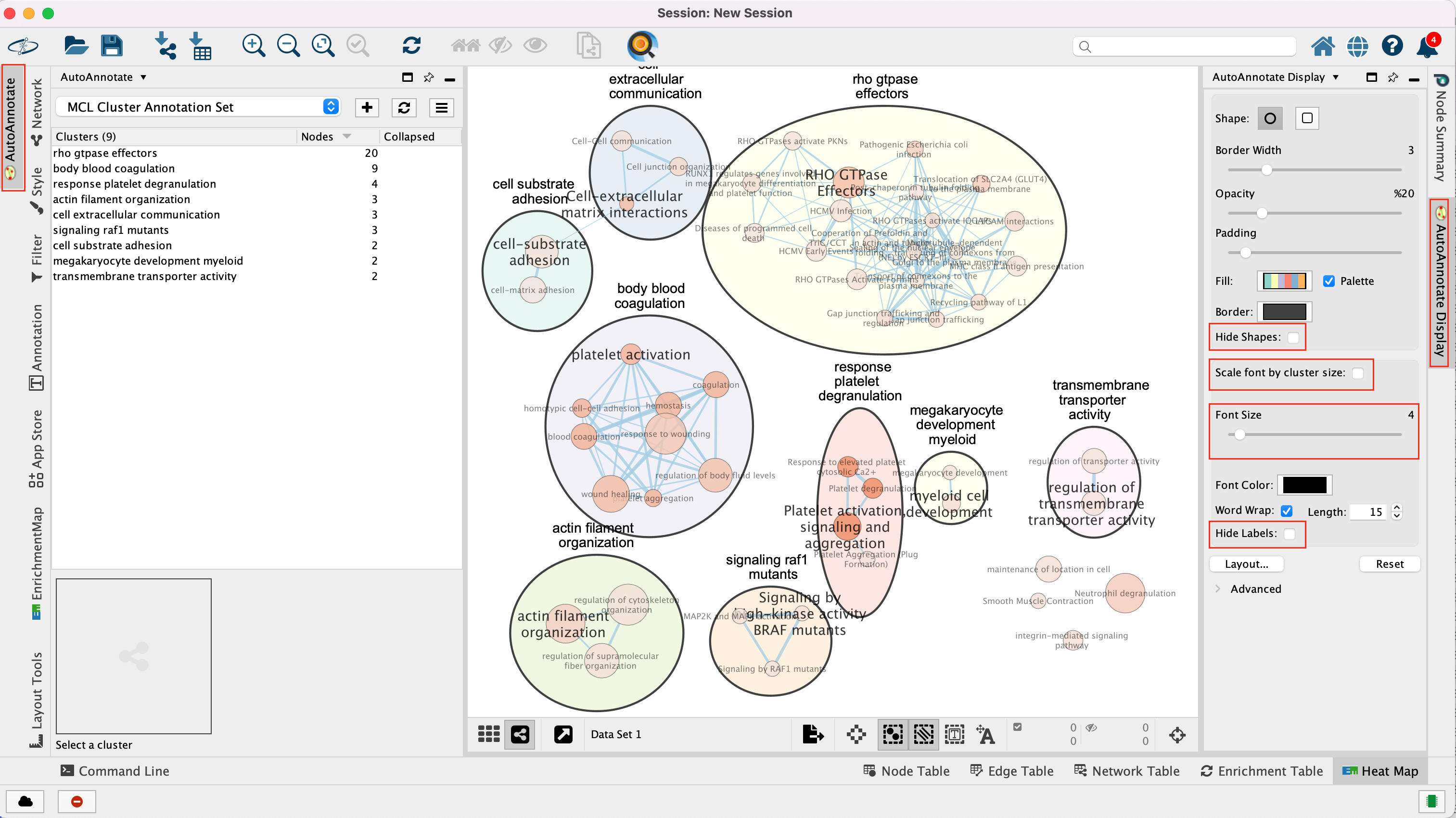
The boxes Palette, Scale Font by cluster size and Word Wrap have been selected. The clusters have been moved around for clarity.
GSEA from pseudobulk
pseudobulk creation, differential expression and rank file
We also can create pseudobulk data from the scRNA data by summing all cells into defined groups. We used the clusters to group the cells and we calculate differential expression using edgeR. We compare the CD4 cells (Naive CD4 T and Memory CD4 T) and the monocytic cells (CD14+ Mono and “FCGR3A+ Mono) .
As shown in module 3, in order to perform pathway analysis,we prepare a rank file, run GSEA and create an enrichment map in Cytoscape.
- Data:
- rank file: CD4vsMono.rnk
- gmt file: Human_GOBP_AllPathways_noPFOCR_no_GO_iea_June_01_2024_symbol.gmt
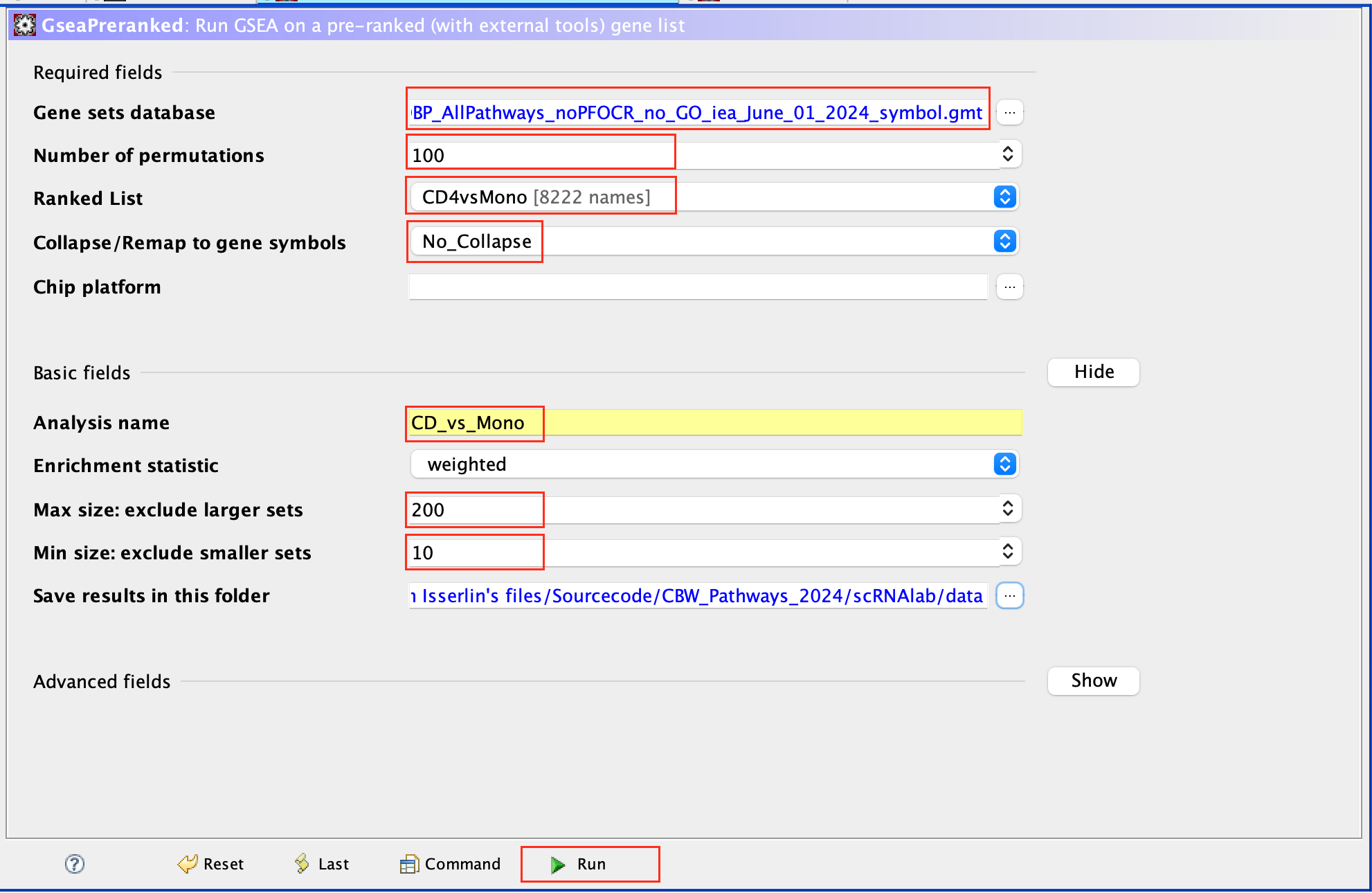
run GSEA:
- Open GSEA
- Select Load Data
- Drag and Drop the rank CD4vsMono.rnk and gmt * Human_GOBP_AllPathways_noPFOCR_no_GO_iea_June_01_2024_symbol.gmt files.
- Click on Load these files
- Click on Run GSEAPreranked
- In Gene sets database, click on the 3 dots, select Local GMX/GMT , select the gmt file, click on OK.
- Set the Number of permutations to 100
- Select the rank file: CD4vsMono.rnk
- Expand Basic Fields
- In the field Collapse/Remap to gene symbols, select No_Collapse
- Add an analysis name of your choice
- Set Max size to 200 and Min size to 10.
- Click on Run
Use 2000 permutations and MAX_Size to 1000 for your own analysis. You can decide to further reduce MAX_Size to 500 or 200.
Create an EnrichmentMap:
- Open Cytoscape
- Go to Apps -> EnrichmentMap
- Select the EnrichmentMap tab, click on the + sign. A Create Enrichment Map windows pops up.
- Drag and drop the GSEA folder in the Data Sets window. It automatically populates the fields.
- Set the FDR q-value cutoff to 0.01
- Click on Build
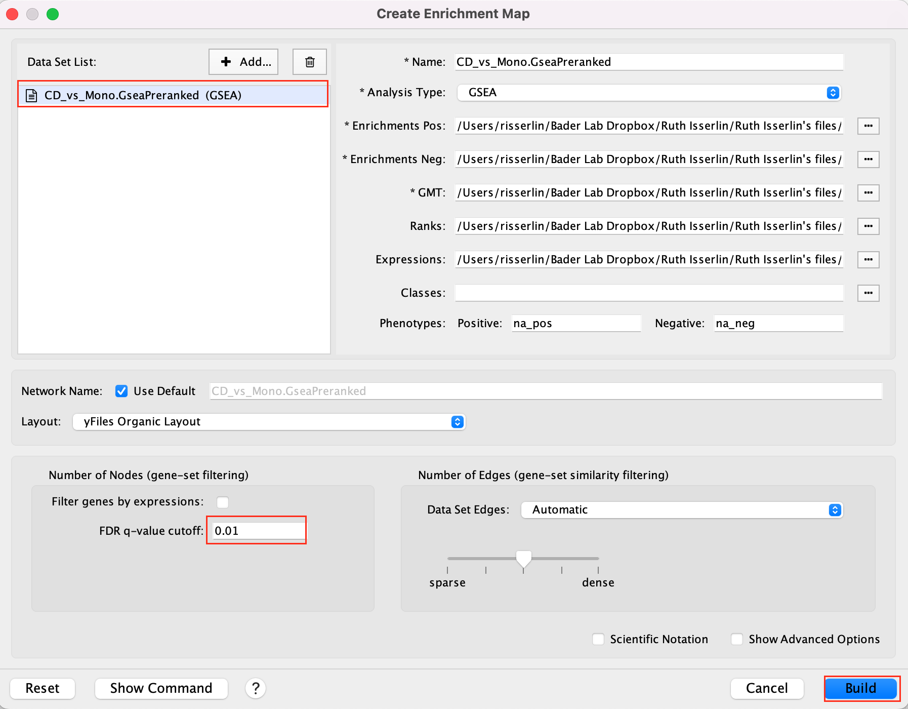
- The enrichment map is now created. The red nodes are pathways enriched in genes up-regulated in CD4 cells when compared to the monocytic cells. The blue nodes are pathways enriched in genes up-regulated in monocytic cells.
See code below for your reference ( pseudobulk, differential expression and rank file).
library(dplyr)
library(Seurat)
library(patchwork)
library(ggplot2)
library(AUCell)
library(RColorBrewer)
library(scuttle)
library(SingleCellExperiment)
library(edgeR)
library(affy)
names(new.cluster.ids) <- levels(pbmc)
pbmc <- RenameIdents(pbmc, new.cluster.ids)
counts <- pbmc@assays$RNA@counts
metadata <- pbmc@meta.data
sce <- SingleCellExperiment(assays = list(counts = counts), colData = metadata)
sum_by <- c("seurat_clusters")
summed <- scuttle::aggregateAcrossCells(sce, id=colData(sce)[,sum_by])
raw <- assay(summed, "counts")
colnames(raw) = c("Naive_CD4_T", "CD14p_Mono", "Memory_CD4_T", "B", "CD8_T",
"FCGR3Ap_Mono","NK", "DC", "Platelet")
saveRDS(raw, "raw.rds")
count_mx = as.matrix(raw)
myGroups = c("CD4","Mono" ,"CD4","B" , "CD8_T","Mono","NK", "DC","Platelet" )
y <- DGEList(counts=count_mx,group=factor(myGroups))
keep <- filterByExpr(y)
y <- y[keep,keep.lib.sizes=FALSE]
y <- calcNormFactors(y)
design <- model.matrix(~0 + myGroups )
y <- estimateDisp(y,design)
my.contrasts <- makeContrasts(CD4vsMono=myGroupsCD4-myGroupsMono,
levels = design )
mycontrast = "CD4vsMono"
fit <- glmQLFit(y,design)
qlf <- glmQLFTest(fit,coef=2, contrast = my.contrasts[])
table2 = topTags(qlf, n = nrow(y))
table2 = table2$table
table2$score = sign(table2$logFC) * -log10(table2$PValue)
myrank = cbind.data.frame(rownames(table2), table2$score)
colnames(myrank) = c("gene", "score")
myrank = myrank[ order(myrank$score, decreasing = TRUE),]
write.table(myrank, paste0(mycontrast, ".rnk"), sep="\t", row.names = FALSE,
col.names = FALSE, quote = FALSE)Some methods like AddModuleScore or AUCell do pathway enrichment analysis of each of cells and the enrichment results are usually display on the UMAP using a color code. It involves R coding and is out of the scope for this workshop.
Lab 2: Glioblastoma
This lab uses scRNA from brain cancer (glioblastoma). The scRNA shows the heterogeneity of the sample, with varying cell types originating from cancer tissues and other cell types like immune cells. We will perform Over-Representation Analysis (ORA) using the gene list of each cluster type in g:Profiler to uncover the function of each cluster.
Goal
The goal is to show how to build a master enrichment map from the results of scRNA. The scRNA is composed of different cell types. The cells are clustered, and annotated to different cell types which can be visualized as a UMAP, 2 dimensional plot. Pathways enrichment is run on the gene lists from each cluster followed by the creation of a single enrichment map containing all the results.
Note: This lab also shows the use of a custom background set in g:Profiler.
Data
High-quality single-cell suspensions were generated by dissociating biopsied tissues in accutase and DNase fron patientGBM tumors. Library preparation was carried out as per the 10X Genomics Chromium single-cell protocol using the v2 chemistry reagent kit and sequencing was run on an Illumina 2500.
Overview
The practical lab contains 3 parts. The first part uses g:Profiler to perform gene-set enrichment analysis. The second part uses Cytoscape and EnrichmentMap to help interpret the results created in part 1. The third part is the one that we are going to practise during the lab and it consists of uploading the pathway results for each cluster on a same enrichment map.
Part 1 - run g:Profiler [OPTIONAL]
g:Profiler requires a list of genes, one per line, in a text file or spreadsheet, ready to copy and paste into a web page: for this, we use genes identified in the glioblastoma scRNA dataset (Richards et al, Nat Cancer, 2021). 14 cell clusters (0 to 14) were identified.

The 14 clusters were further further classified into 5 cell types using specific gene markers.

The gene lists for each cluster were obtained from differential gene expression (DGE) analyses comparing cells from each cluster vs. the rest of the cells using Seurat’s function ‘FindAllMarkers(…, only.pos=T, min.pct = 0, return.thresh = 1, logfc.threshold = 0)’. For each cluster, the top 250 genes with FDR value equal or less than 0.05 were retrieved. All genes present in at least 1 cluster will be used as background (16066 genes) for the pathway enrichment analysis.

DGE: Table (top genes of cluster 3 versus all clusters)

link to file: Richards_NatCancer_2021_DGE_GlobalClustering_SCT_wilcox.tsv.bz2
For this part of the lab, our goal is to copy and paste the list of genes into g:Profiler, adjust some parameters (e.g selecting the pathway databases), run the query and explore the results.
g:Profiler performs a gene-set enrichment analysis using a hypergeometric test (Fisher’s exact test). The Gene Ontology Biological Process, Reactome and Wiki pathways are going to be used as pathway databases. The results are displayed as a table or downloadable as an Generic Enrichment Map (GEM) output file.
Before starting this exercise, download the required files:
Right click on link below and select “Save Link As…”.
Place it in a folder on your computer : for example create a pathway_analysis folder and save all the files needed for this module in this directory.
We recommend saving all these files in a personal project data folder before starting. We also recommend creating an additional result data folder to save the files generated while performing the protocol.
Step 1 - Launch g:Profiler.
Open the g:Profiler website at g:Profiler in your web browser.
Step 2 - input query
Paste the gene list (cluster3.txt) into the Query field in top-left corner of the screen.

The gene list can be space-separated or one per line.
The
organism for the analysis, Homo sapiens, is selected by default.
The
input list can contain a mix of gene and protein IDs, symbols and
accession numbers.
Duplicated and unrecognized IDs will be removed
automatically, and ambiguous symbols can be refined in an interactive
dialogue after submitting the query.
Open the file in a simple text editor such as Notepad or Textedit to
copy the list of genes.
Or right click on the file name above and
select Open link in new tab
Step 3 - Adjust parameters.
3a. Click on the Advanced options tab (black rectangle) to expand it.
Upload the custom background: Set Statistical domain scope to Custom and Upload the background.txt text file.
Set Significance threshold to “Benjamini-Hochberg FDR”
User threshold - select 0.05 if you want g:Profiler to return only pathways that are significant (FDR < 0.05).

3b. Click on the Data sources tab (black rectangle) to expand it.
- UnSelect all gene-set databases by clicking the “clear all” button.
- In the Gene Ontology category, check GO Biological Process and No electronic GO annotations.
No electronic GO annotations option will discard less reliable GO annotations (inferred from electronic annotations (IEAs)) that are not manually reviewed.
If g:Profiler does not return any results: uncheck the No electronic GO annotation option to expand annotations used in the test.
- In the biological pathways category, check Reactome and WikiPathways.

Step 4 - Run query
Click on the Run query button to run g:Profiler.
Scroll down page to see results.
If after clicking on Run query button the analysis completes but there is the following message above results file - Select the Ensembl ID with the most GO annotations (all). For each ambiguous gene select its correct mapping. Ambiguous mapping is often caused by multiple ensembl ids for a given gene and are easy to resolve as a user. To choose the correct mapping, check the option that has the correct gene name and/or then that has the most GO annotations. Rerun query.
Step 5 - Explore the results.
Step 5a:
- After the query has run, the results are displayed at the bottom of the page, below the input parameters.
- By default, the “Results” tab is selected. A global graph displays gene-sets that passed the significance threshold of 0.05 for the 3 gene-set databases that we have selected, GO Biological Process(GO:BP) and Reactome(REAC) and Wikipathways(WP). Numbers in parentheses are indicating the number of gene-sets that passed the threshold (0 gene-sets passed the 0.05 threshold for Reactome).

Step5b:
- Click on “Detailed Results” to view the results in more depth. Two tables are displayed, one for each of the data sources selected. (If more than 2 data sources are selected there will be additional tables for each datasource) Each row of the table contains:
- Term name - gene-set name
- Term ID - gene-est identifier
- Padj - FDR value
- -log10(Padj) - enrichment score calculated using the formula -log10(padj)
- variable number of gene columns (One for each gene in the query set) - If the gene is present in the current gene-set its cell is colored. For any data source besides GO the cell is colored black if the gene is found in the gene-set. For the GO data source cells are colored according to the annotation evidence code. Expand the legend tab for detailed coloring mapping of GO evidence codes.
- Above the GO:BP result table, locate the slide bar that enables to select for the minimum and maximum number of genes in the tested gene-sets (Term size).
- Change the maximum Term size from 10000 to 500 and change the minimum Term size to 10 and observe the results in the detailed stats panel:

- Without filtering term size, the top terms were GO terms containing that could contain 4000 or 5000 genes and that were located high in the GO hierarchy (parent term).
- With filtering the maximum term size to 500, the top list contains pathways of larger interpretative values. However, please note that the adjusted pvalues was calculated using all gene-sets without size filtering.
The first table displays the gene-sets significantly enriched at FDR 0.05 for the GO:BP database.The second table displays the results corresponding to the Reactome database and the third table displays the results corresponding to the Wikipathways database.
You might get slighlty different results as the ones presented here because of the g:Profiler updated the pathway database.
g:Profiler archived databases can be found using this link: https://biit.cs.ut.ee/gprofiler/page/archives.
Step 6: Expand the stats tab
Expand the stats tab by clicking on the double arrow located at the right of the tab.

It displays the gene set size (T), the size of our gene list (Q) , the number of genes that overlap between our gene list and the tested gene-set (TnQ) as well as the number of genes in the background (U).
Step 7: Save the results
7a. In the Detailed Results panel, select “GEM” . It will save the results in a text file in the “Generic Enrichment Map” format that we will use to visualize using Cytoscape.
- Click on the GEM button. A file is downloaded on your computer. (change the name to Cluster3.gem.txt)
7b: Open the file that you saved using Microsoft Office Excel or in an equivalent software.
Observe the results included in this file:
- Name of each gene-set
- Description of each gene-set
- significance of the overlap (pvalue)
- significance of the overlap (adjusted pvalue/qvalue)
- Phenotype
- Genes included in each gene-set
Which term has the best corrected p-value?
Which genes in our
list are included in this term?
Observe that same genes can be
present in several lines (pathways are related when they contain a lof
of genes in common).
The table is formatted for the input into Cytoscape EnrichmentMap. It is called the generic format. The p-value and FDR columns contain identical values because g:Profiler directly outputs the FDR (= corrected p-value) meaning that the p-value column is already the FDR. Phenotype 1 means that each pathway will be represented by red nodes on the enrichment map (presented during next module).

The terms myelin and axon ensheathment are the most significant gene-sets (=the lowest FDR value). Many gene-sets from the top of this list are related to each other and have genes in common.

Step 8 (Optional but recommended)
8a. Download the pathway database files.
- Go to the top of the page and expand the “Data sources” tab. Click on the ‘combined name.gmt’ link located at bottom of this tab. It will download a file named combined name.gmt containing a pathway database gmt file with all the available sources.

you will be using this optional gprofiler_full_hsapiens.name.gmt file in Cytoscape EnrichmentMap.
Part 2 - Cytoscape/EnrichmentMap [OPTIONAL]
Goal of the exercise
Create an enrichment map and navigate through the network
During this exercise, you will learn how to create an enrichment map from gene-set enrichment results. The enrichment results chosen for this exercise are generated using g:Profiler but an enrichment map can be created directly from output from GSEA, g:Profiler, GREAT, BinGo, Enrichr or alternately from any gene-set tool using the generic enrichment results format.
Data
The data used in this exercise is pathway enrichment result from the list of genes that we found in cluster 3 in part 1. Pathway enrichment analysis has been run using g:Profiler and the results have been downloaded as a GEM format.
EnrichmentMap
A circle (node) is a gene-set (pathway) enriched in genes that we used as input in g:Profiler (frequently mutated genes).
edges (lines) represent genes in common between 2 pathways (nodes).
A cluster of nodes represent overlapping and related pathways and may represent a common biological process.
Clicking on a node will display the genes included in each pathway.
Description of this exercise
We run and saved g:Profiler result. An enrichment map represents the result of enrichment analysis as a network where significantly enriched gene-sets that share a lot of genes in common will form identifiable clusters. The visualization of the results as these biological themes will ease the interpretation of the results.
The goal of this exercise is to learn how to:
- upload g:Profiler results into Cytoscape EnrichmentMap to create a map.
- learn how to navigate through Cytoscape EnrichmentMap and interpret the results.
Start the exercise
Two files are needed for this exercise:
- Enrichment result: Cluster3_noEIA_gProfiler.gem.txt
- In g:Profiler, the parameters that we used to generate this file were:
- GO_BP no electronic annotation,
- Reactome,
- Wikipathways
- Benjamini-HochBerg FDR 0.05
- gene-set size from 10 to 500 Note: this file is similar to the one that you have created in exercise 1. Use this link to follow exercise 2.
- Pathway database 1 (.gmt):gprofiler_full_hsapiens.name.gmt
Right click on link below and select “Save Link As…”.
Place it in the corresponding module directory of your pathway_analysis folder on your computer.
Step 1
Launch Cytoscape and open the EnrichmentMap App
1a. Double click on Cytoscape icon
1b. Open EnrichmentMap App
In the Cytoscape top menu bar:
Click on Apps -> EnrichmentMap

- A ‘Create Enrichment Map’ window is now opened.
Step 2
Create an enrichment map from 1 dataset and with a gmt file.
2a. In the ‘Create Enrichment Map’ window, drag and drop the enrichment file Cluster3_noEIA_gProfiler.gem.txt. Tip: if drag and drop does not work, you can click ‘…’ next to enrichments and upload the file. The analysis type needs to be set to generic/gprofiler.

2b. On the right side, go to the GMT field, click on the 3 radio button (…) and locate the file gprofiler_full_hsapiens.name.gmt that you have saved on your computer to upload it.
2c. Locate the FDR q-value cutoff field and set the value to 0.01
2d. Click on Build.

- a status bar should pop up showing progress of the Enrichment map build.

Step 3: Explore Detailed results
- In the Cytoscape menu bar, select ‘View” and ’Show Graphic Details’ to display node labels.
Make sure you have unselected “Publication Ready” in the EnrichmentMap control panel.
Zoom in to be able to read the labels and navigate the network using the bird eye view (blue rectangle).
Select a node and visualize the Table Panel
- Click on a node; Click on Dummy column. Genes with a green box are genes in the Cluster3 gene list and the selected pathway.
Step 4 [OPTIONAL]: AutoAnnotate the enrichment map
move the the nodes and clusters apart of each other by selecting them and moving them around.
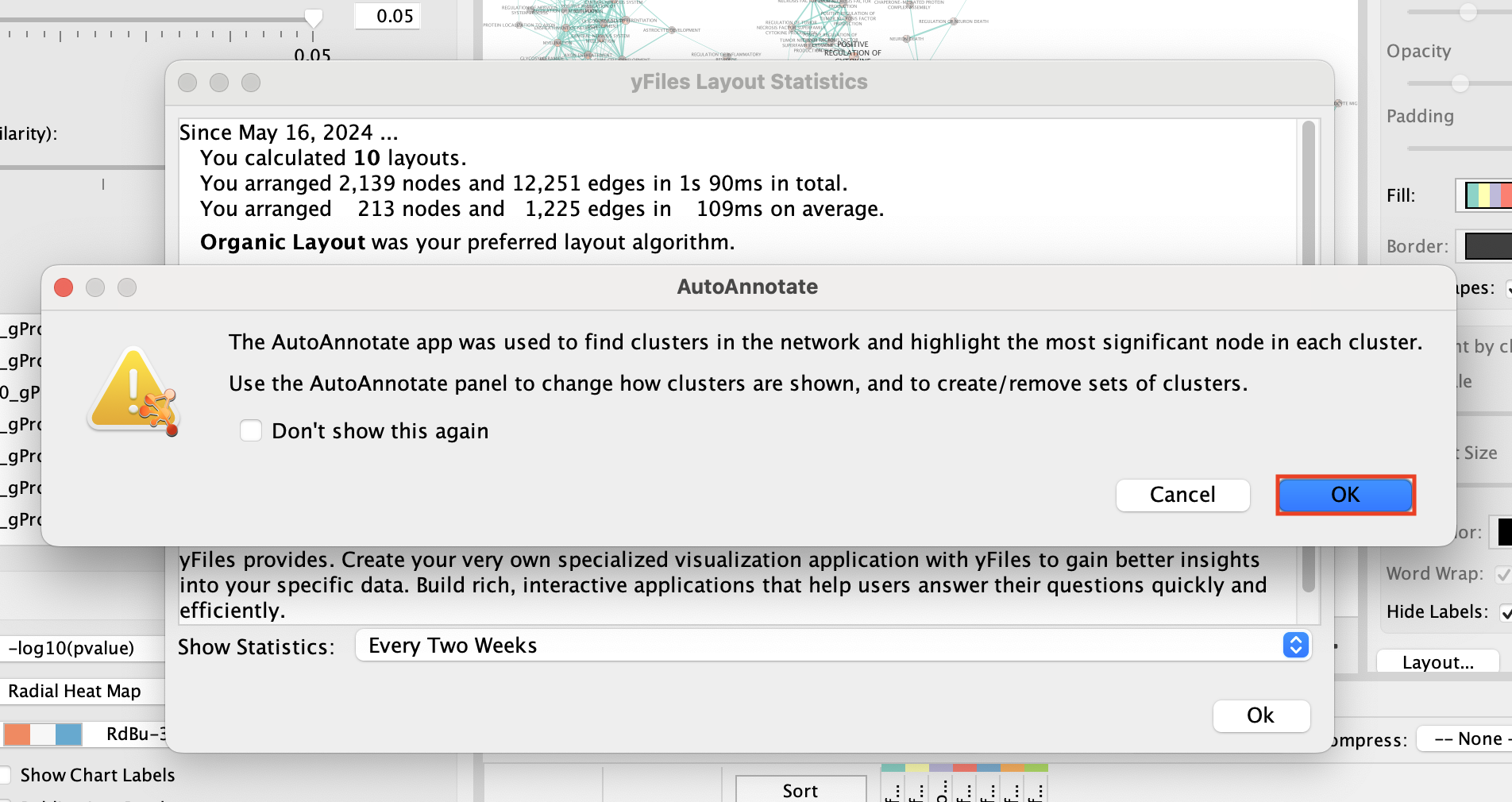
In the Cytoscape menu bar, select Apps –> AutoAnnotate –> New Annotation Set…
An “AutoAnnotate: Create Annotation Set” window opens. In “Advanced” tab, check “Create singleton clusters” and click on “Create Annotations”.

Tips for formatting:
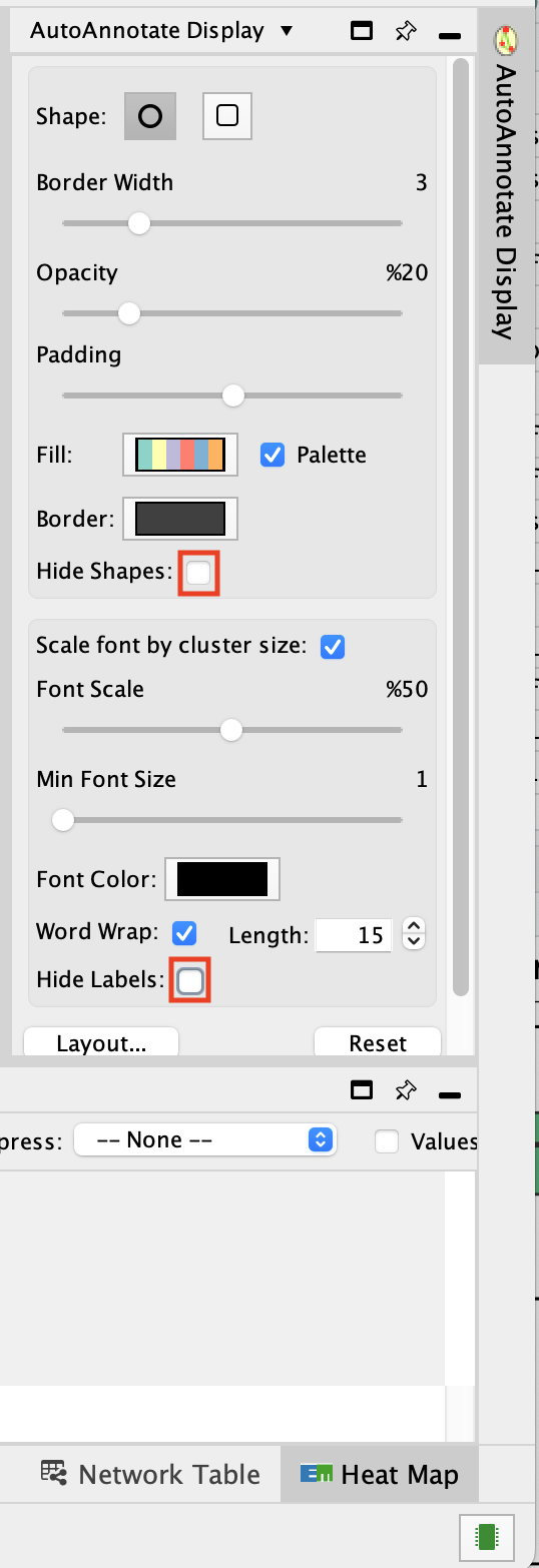
- In the AutoAnnotate Display window located on the right side, uncheck Scale font by cluster size and check Word Wrap.

Tip: if you are having difficulty separating nodes/clusters, you can hold shift and click and drag a square around a nodes of interest to highlight them, then move them all at once.
SAVE YOUR CYTOSCAPE SESSION (.cys) FILE !
Part 3 - Master map using multiple datasets
Goal
Create an enrichment map and navigate through the network
During this lab, you will learn how to create an enrichment map from multiple gene-set enrichment results generated using g:Profiler.
Data
The data used in this exercise is the enrichment results from the list of genes of clusters that we found in clusters 0, 1, 3, 4, 5, 7, and 10 from the single cell RNAseq data.
Pathway enrichment analysis has been run using g:Profiler and the results have been downloaded as a GEM format.
The gene lists were obtained from differential gene expression analyses comparing cells from each cluster vs. the rest of the cells using Seurat’s function ‘FindAllMarkers(…, only.pos=T, min.pct = 0, return.thresh = 1, logfc.threshold = 0)’. For each cluster, the top 250 genes with FDR value equal or less than 0.05 were retrieved.
In g:Profiler, the parameters that we used to generate this file were:
GO_BP no electronic annotation,
Reactome,
Wikipathways
Benjamini-HochBerg FDR 0.05
gene-set size from 10 to 500
Top 50 pathways were selected for further analysis.
Start the exercise
Download the files needed for this exercise on your computer:
- Cluster0_gProfiler50.gem.txt
- Cluster1_gProfiler50.gem.txt
- Cluster3_gProfiler50.gem.txt
- Cluster4_gProfiler50.gem.txt
- Cluster5_gProfiler50.gem.txt
- Cluster7_gProfiler50.gem.txt
- Cluster10_gProfiler50.gem.txt
Launch Cytoscape and open the EnrichmentMap App
Step 1
1a. Open Cytoscape.
1b. Open EnrichmentMap App:
In the Cytoscape top menu bar:
Click on Apps -> EnrichmentMap
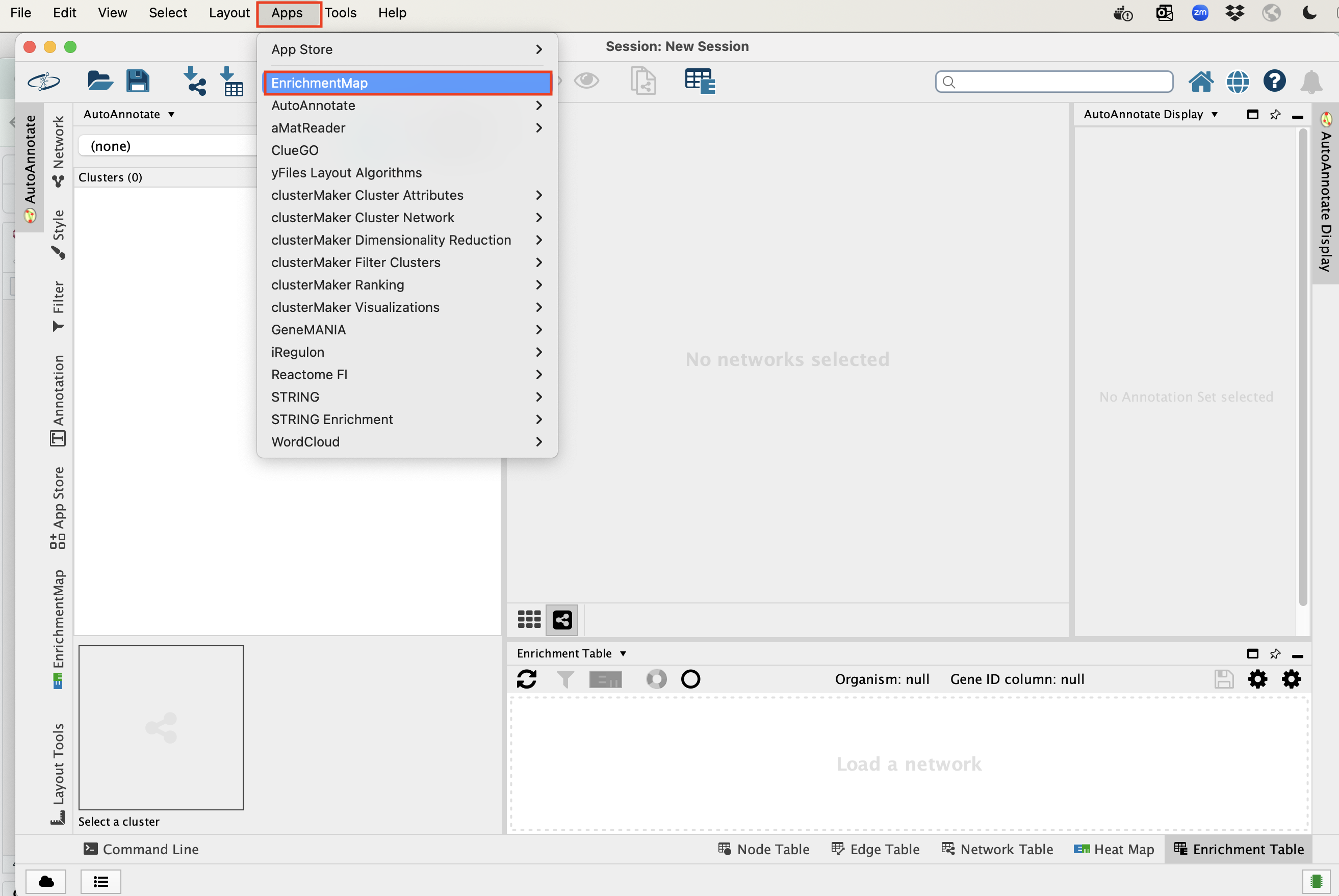
- A ‘Create Enrichment Map’ window is now opened.
Step 2
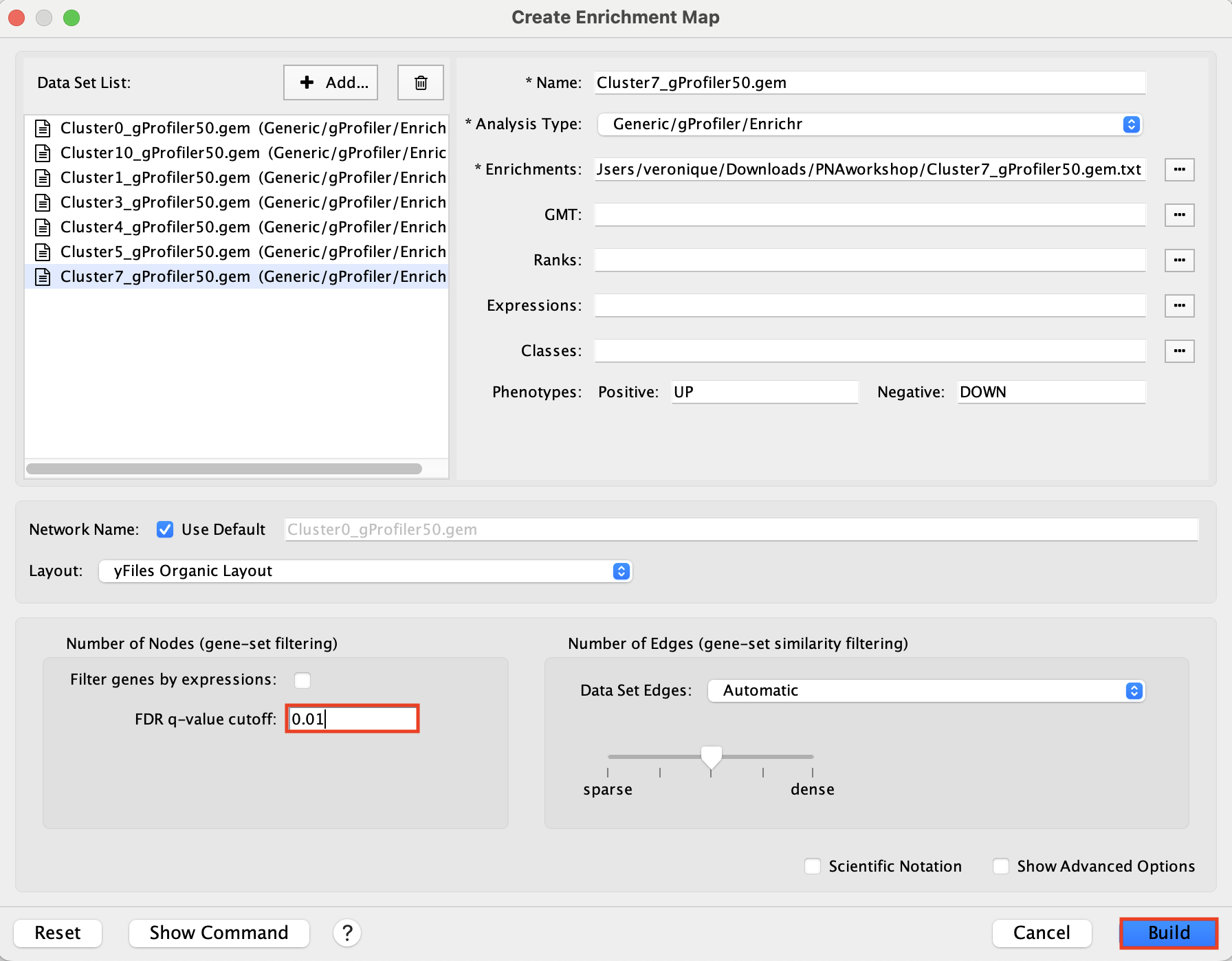
Create an enrichment map from multiple datasets.
2a. In the ‘Create Enrichment Map’ window, drag and drop the enrichment files
- Cluster0_gProfiler50.gem.txt
- Cluster1_gProfiler50.gem.txt
- Cluster3_gProfiler50.gem.txt
- Cluster4_gProfiler50.gem.txt
- Cluster5_gProfiler50.gem.txt
- Cluster7_gProfiler50.gem.txt
- Cluster10_gProfiler50.gem.txt
2b. Locate the FDR q-value cutoff field and set the value to 0.01
2c. Click on Build.
A status bar should pop up showing progress of the Enrichment map build.
Click “ok” on the 2 next messages:
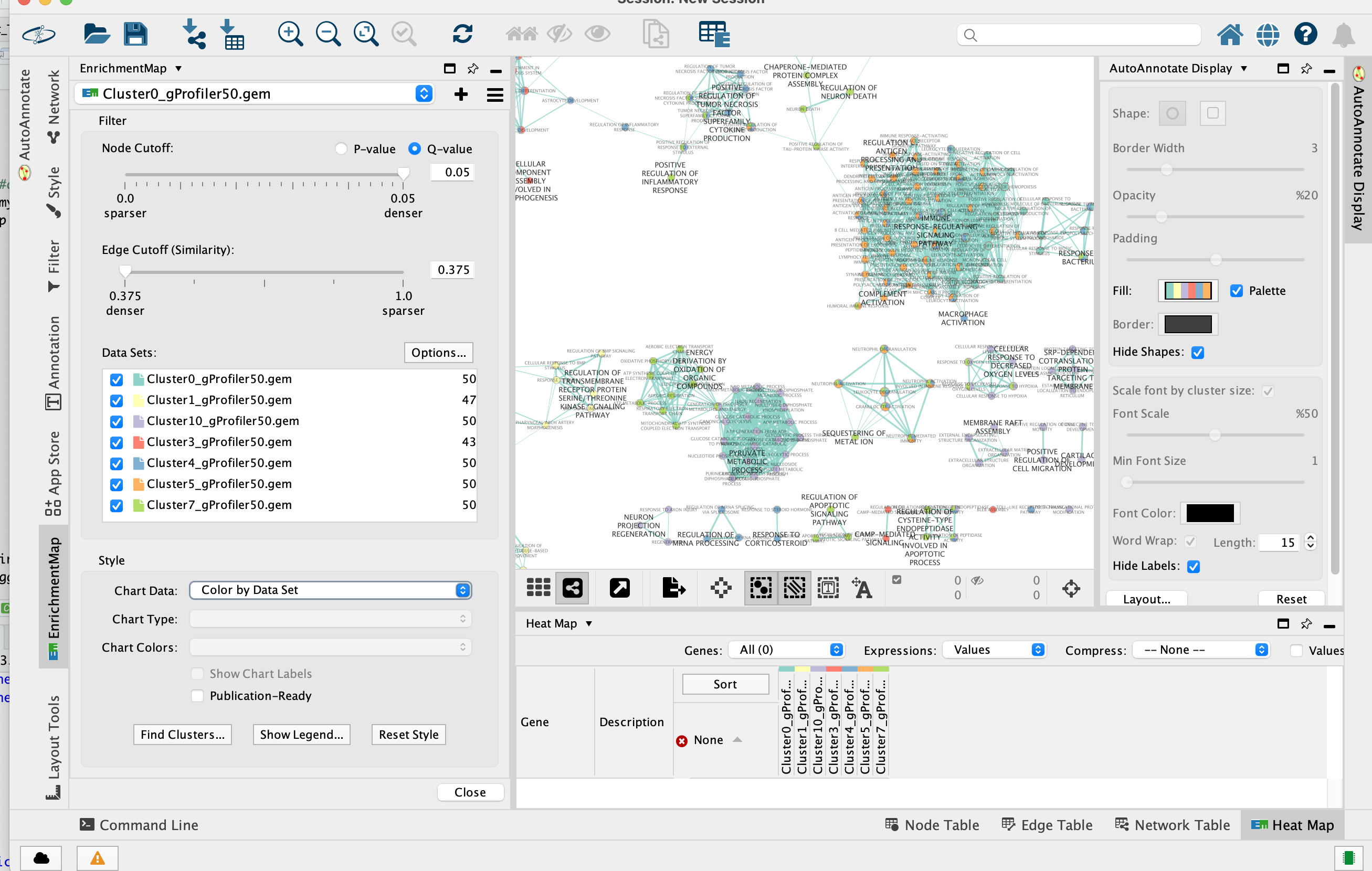
2d. Once the map is build, locate the EnrichmentMap tab on the right and set Chart Data to Color by Data Set.
Tip: You can also check “publication ready” to remove node labels.
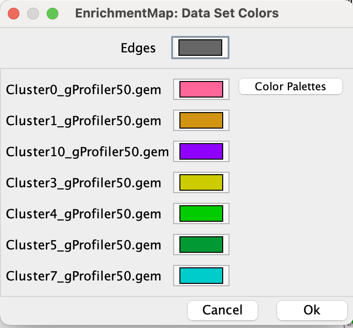
2e. Change the color of each data set so it corresponds to the single cell RNAseq UPMAP plot * Locate the EnrichmentMap tab on the right and click on Change colors…
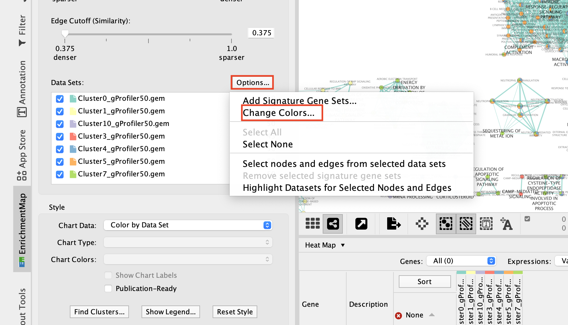
- Adjust the colors so it corresponds approximately to the single cell RNAseq UMAP plot (see top of the document for reference).
- Go to the AutoAnnotate tab on the right and uncheck “Hide labels” and “Hide shapes”.
It will make visible the AutoAnnotate ellipses and automatic labels. You can further adjust the style of these annotations.
At that step, the layout is not optimal and the ellipses are overlapping. It is possible to click on the annotations on the left bar to select all nodes of a cluster and move the annotations.
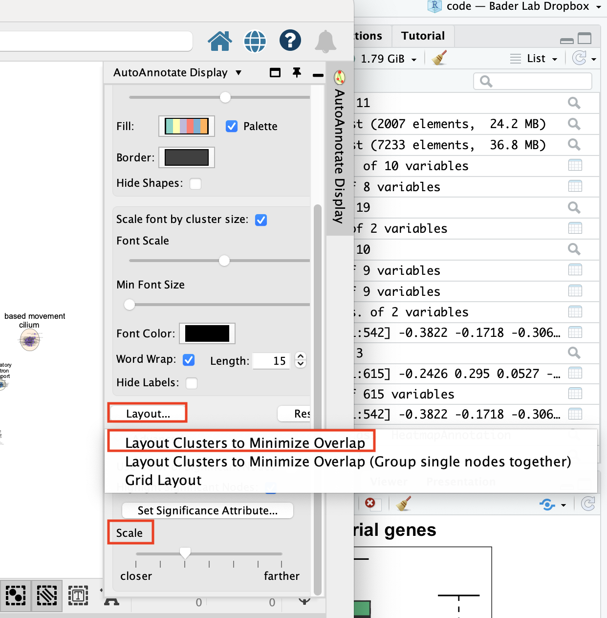
To get a layout that is not overlapping, you can do: - Go the AutoAnnotate tab on the right.
-
Click on “Layout…” and select “Layout Clusters to Minimize Overlap”
-
Play with the “Scale” slidebar to get the clusters closer together.
-
Finish by adjusting manually.
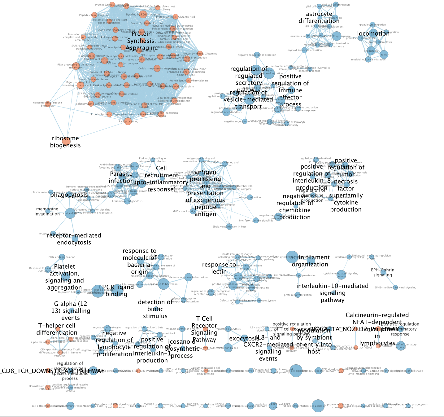
- Final Map:
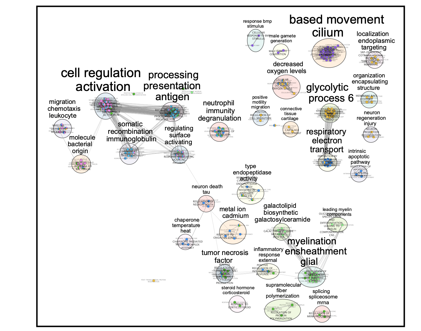
Legend:
Clusters:
0: macrophage
1: malignant
3: macrophage
4: oligodendrocyte
5: undefined
7: T cell
10: undefined
The master map can help to identify functions related to interesting clusters in the data like the “undefined” cluster. It also can highlight similarities between clusters.
SAVE YOUR CYTOSCAPE SESSION (.cys) FILE !
Cytoscape file:
Lab 3: cellPhoneDB
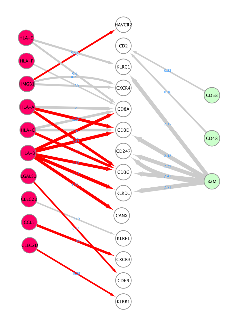
- Learning objectives: learn how to take the result of CellPhoneDB and build a Cytoscape network.
Presentation
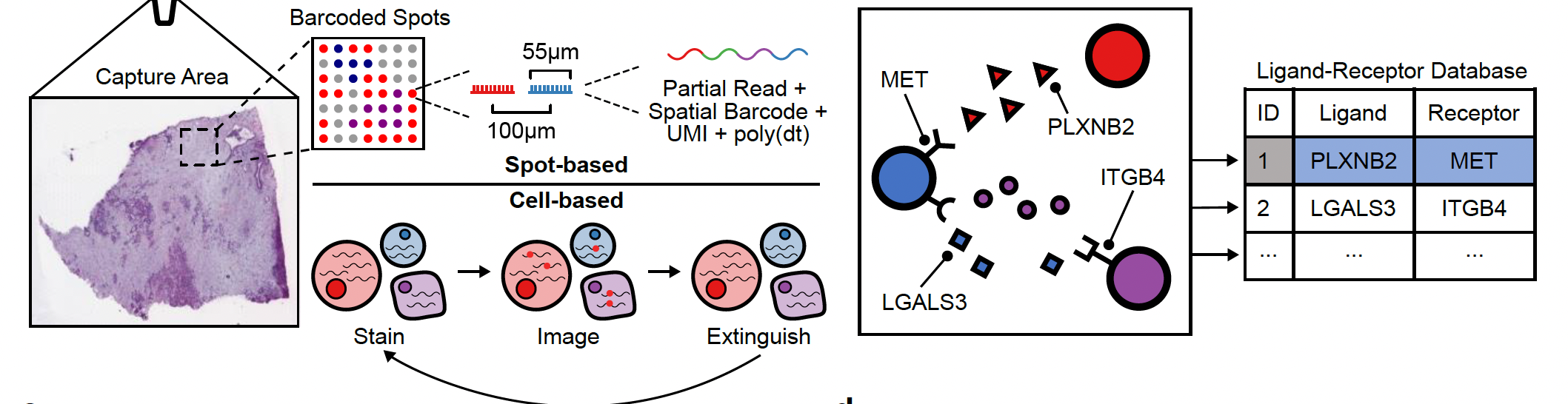
CellPhoneDB is a repository of ligands, receptors and their interactions. CellPhoneDB database takes into account the subunit architecture of both ligands and receptors, representing heteromeric complexes accurately. A statistical framework is integrated that predicts enriched cellular interactions between two cell types from single-cell transcriptomics data
CellPhoneDB database: public resources to annotate receptors and ligands, as well as manual curation of specific families of proteins involved in cell–cell communication
possibility of using own list of ligand–receptor interactions
Method
CellPhoneDB input data consist of a scRNA-seq counts file and cell-type annotation.
Enriched receptor–ligand interactions between two cell types are derived on the basis of expression of a receptor by one cell type and a ligand by another cell type. The member of the complex with the minimum average expression is considered for the subsequent statistical analysis.
A null distribution of the mean of the average ligand and receptor expression in the interacting clusters is generated by randomly permuting the cluster labels of all cells.
The p value for the likelihood of cell-type specificity of a given receptor–ligand complex is calculated on the basis of the proportion of the means that are as high as or higher than the actual mean (=empirical pvalue).
Ligand–receptor pairs are ranked on the basis of their total number of significant p values across the cell populations.
Summary of the steps:
The dataset consists of ~25k peripheral blood mononuclear cell (PBMCs) from 8 pooled lupus patients, each before and after IFN-β stimulation.
Preparing the scRNA using your method of choice: Standard preprocessing consists of filtering out bad quality cells, normalizing, clustering and annotating the cells. In this case, the cells are different types of blood cells and they were annotated using specific cell markers for these different cell types.
Let’s explore the UMAP:
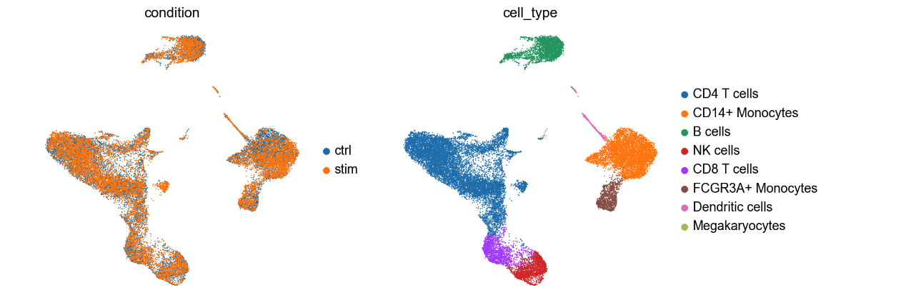
UMAP (Uniform Manifold Approximation and Projection) is frequently used in scRNA to display the data in 2 dimensions. The UMAP on the right displays all the cells that are clustered based on cell types. It helps visualizing groups of cells that are close together. The colors on the UMAP represent clusters of cells that were annotated into distinct blood cell types. The UMAP on the left shows that the cells are coming from different samples: untreated PBMC cells and cells treated with interferon beta (IFN-β). For this exercise, we are only examinig the cells that are IFN-β stimulation (labelled as stim the above UMAP).
The scRNA data is available from the Jupyter notebook but are also here in case it is needed: scRNA_25PBMC.h5ad
Examining the results
In this case study, we filtered the results to include only interactions where the source are the CD8 T cells sending communication signals to CD4 T and NK cells. We retained significant results with p-value less than 0.05. The choice to include just CD4 and NK cells only was an arbitrary threshold for this lab that was based on the observation of robust ligand signals for the CD8 T cells. In real life, we suggest that you look at all the possible significant interactions in each pair of cells and also consider the biological question under investigation.
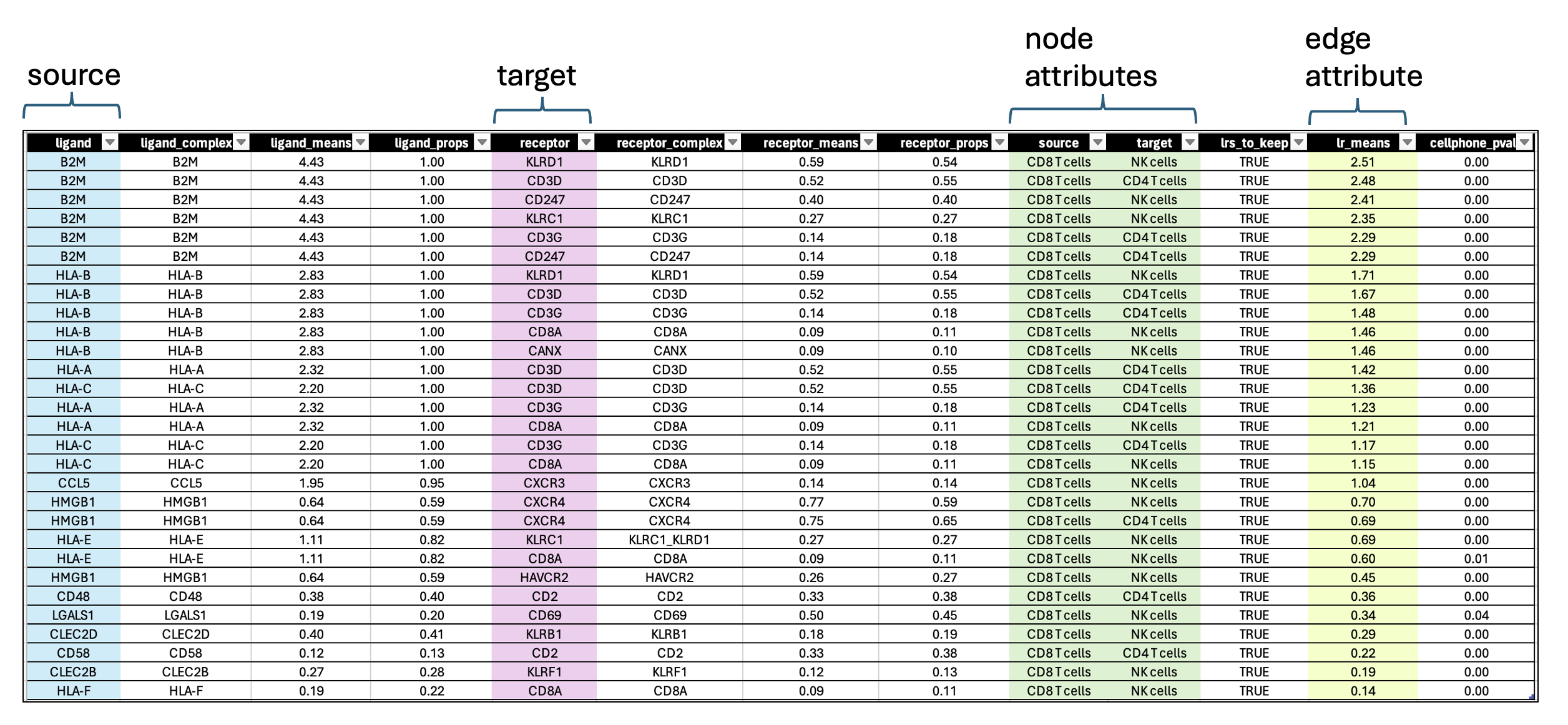
- each row contains a ligand-receptor pair with a different combination of source and target for each row.
- lr_means : (ligand-receptor means) is the average of ligand and receptor expression means.
- pvalue : indicates if this mean is far away from the mean of the null distribution.
- lrs_to_keep : indicates rows (ligand-receptor pairs) to keep based on the pvalue
- props : represents the proportion of cells that express the entity
Visualization using Cytoscape
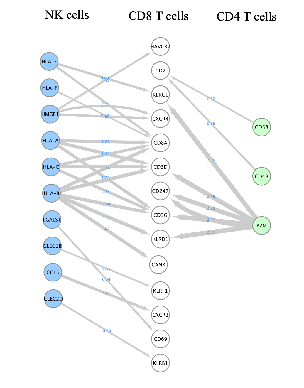
A network is aimed to ease the visualization of relationships between entities. We will construct a directed network using the ligands from the CD8 T cells as source nodes and the detected receptors from CD4 T cells and NK cells as target nodes. The ligand and receptor entities will be represented as nodes on the network and we will color the nodes based on the cell types. The edge width will be proportional to the lr_means which represents the average of ligand and receptor mean expression and which is our measure of interaction strength.
To create this network, we don’t need any particular Cytoscape app. We will upload the CellPhoneDB result table as a custom network.
STEPS TO FOLLOW:
The filtered result from the Liana method can be found here: cellphoneDB_source_CD8_target_CD4_NK_p_0_05.csv Please download the file as you need it to create the network.
- Open Cytoscape.
- Go to the menu bar –> File –> Import –> Network from File …
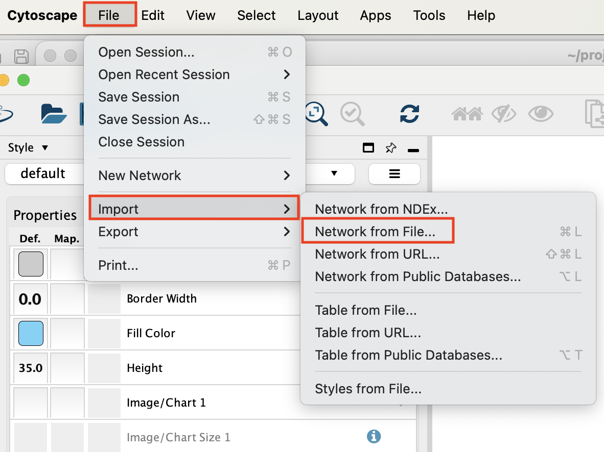
Select the file ‘cellphoneDB_source_CD8_target_CD4_NK_p_0_05.csv’ and click on ‘open’.
An ‘Import from Network table’ opens.
Set ‘ligand’ as source node.
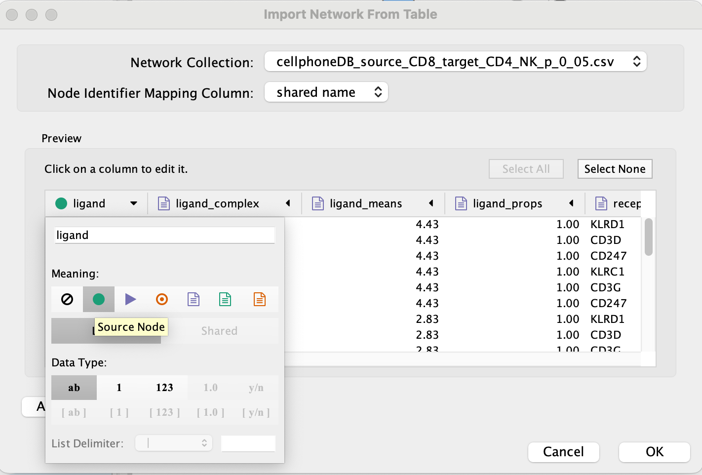
- Set ‘receptor’ as target node.
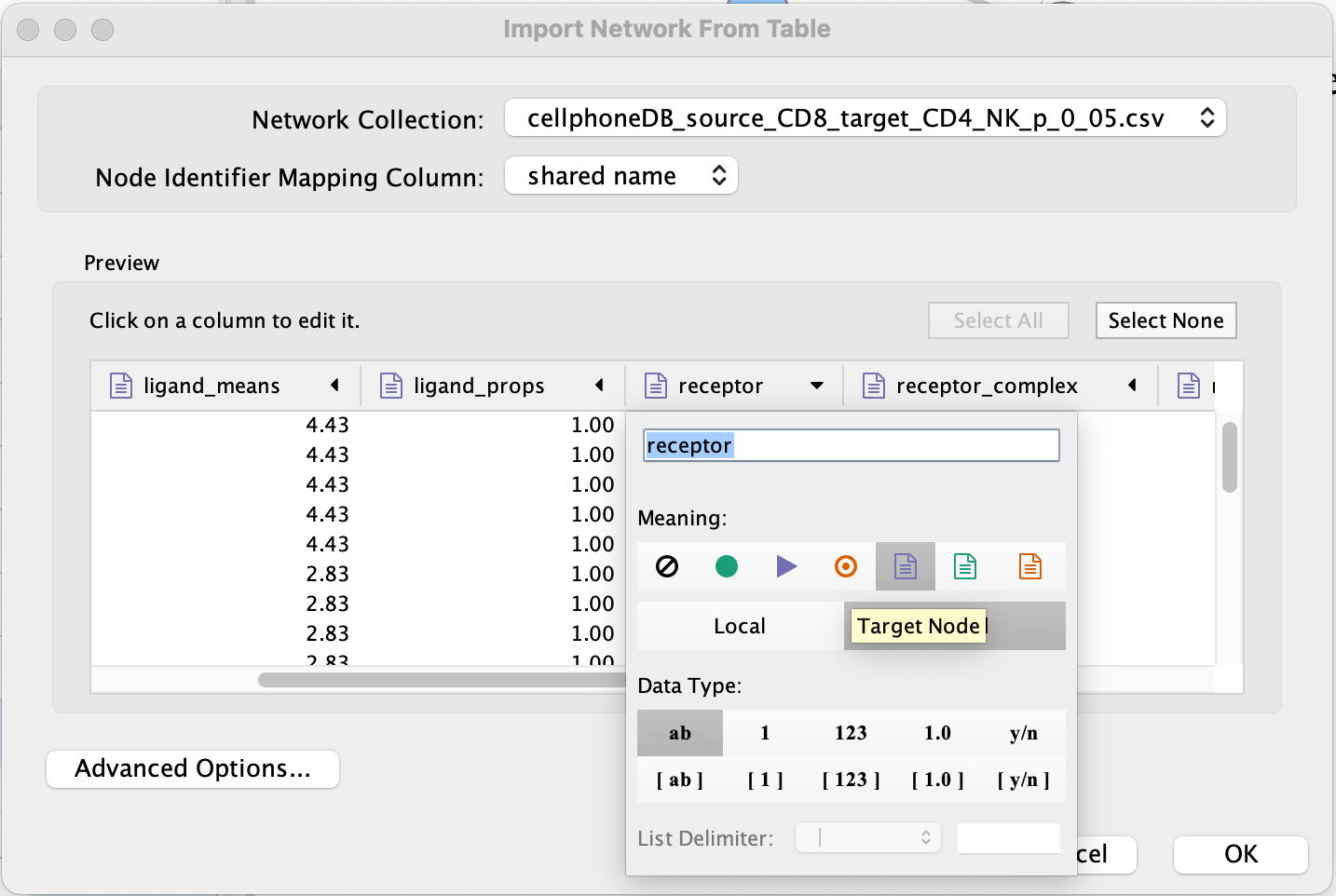
- Set source and target as ‘Source Node Attribute’.
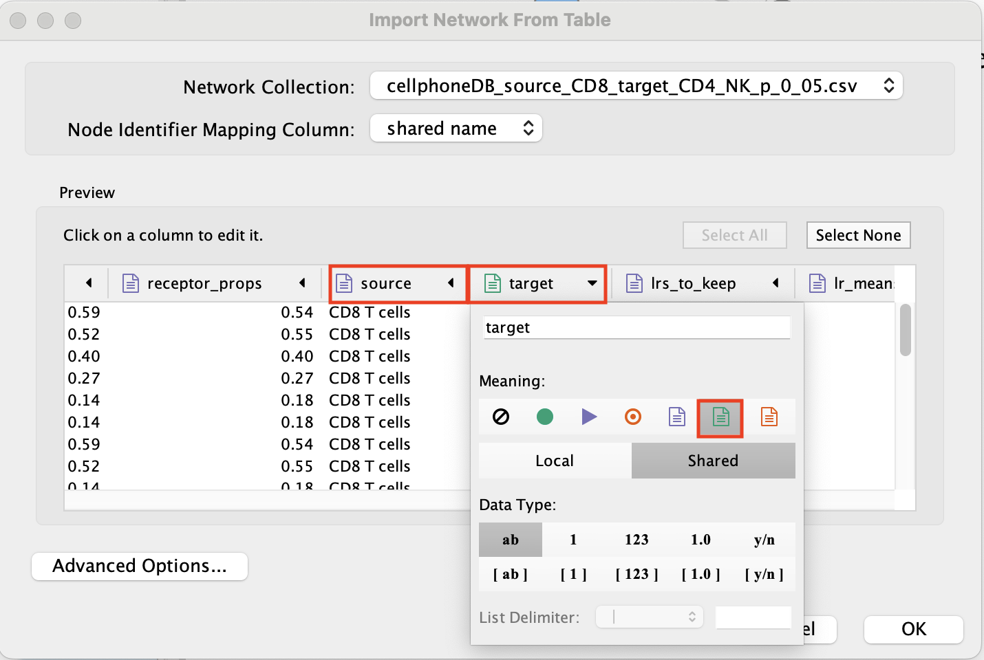
Click on ‘OK’.
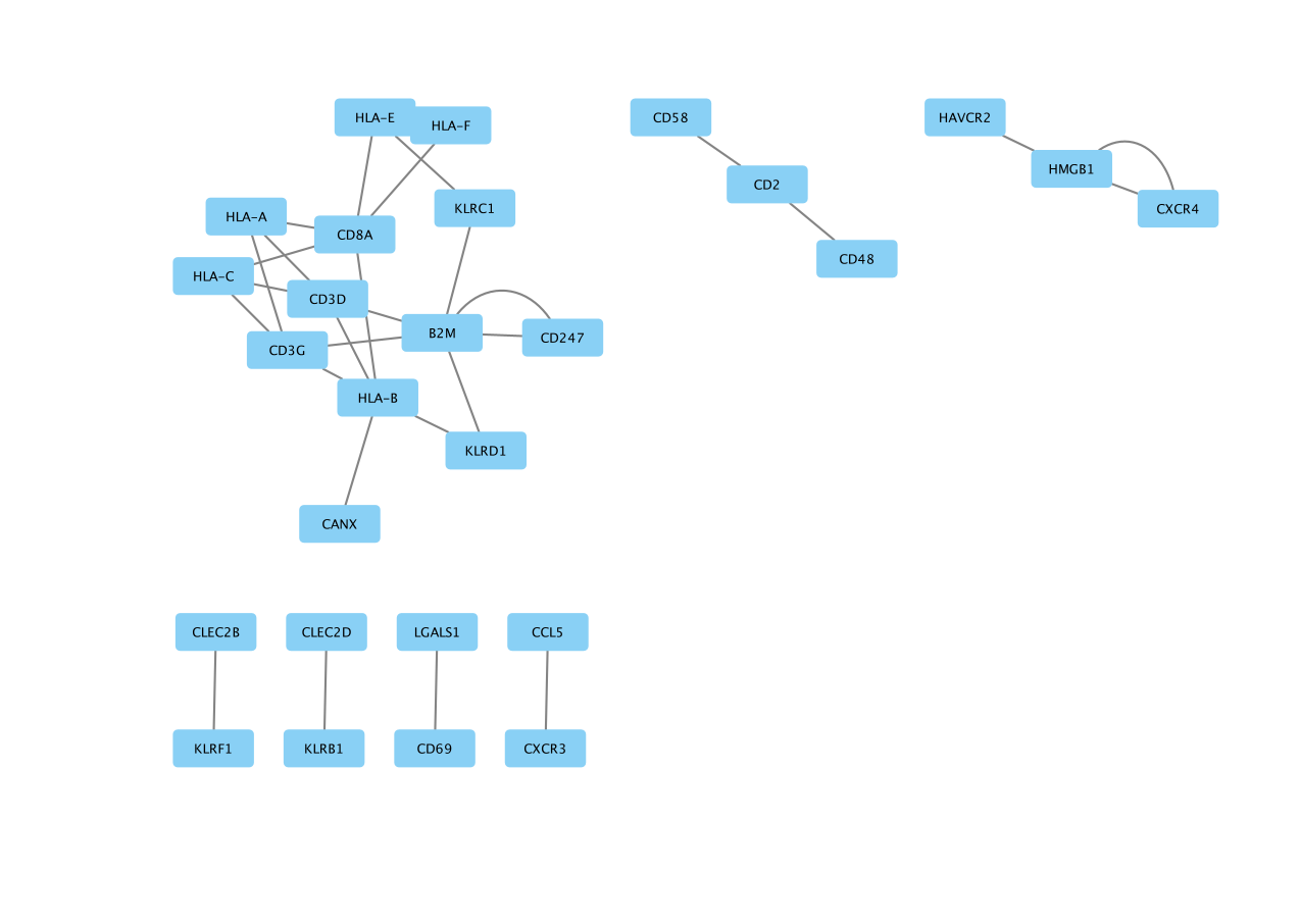
The network is created with the default style.
- Go to the ‘Style’ tab and change ‘Style’ from ‘Default’ to ‘Directed’.
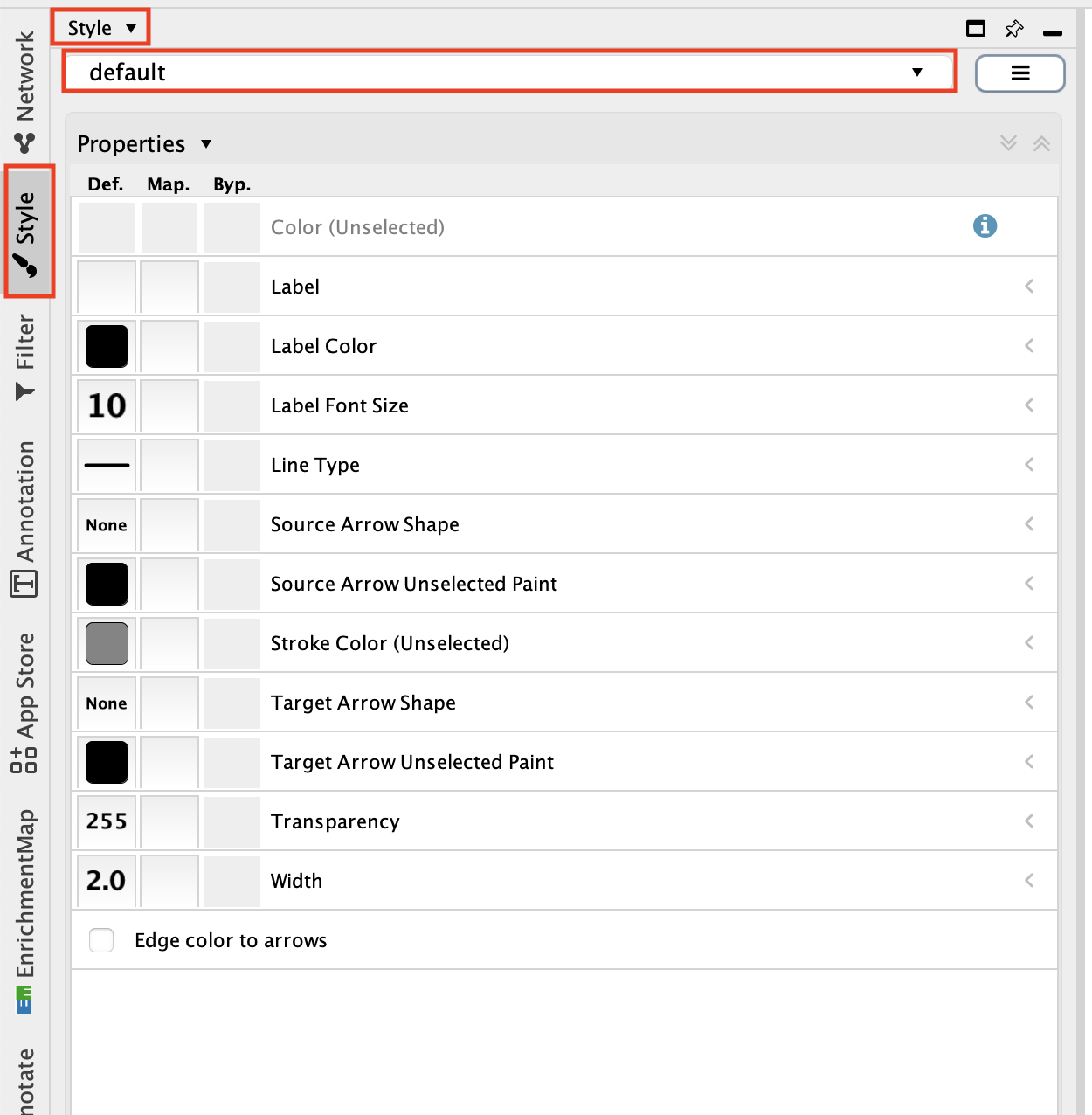
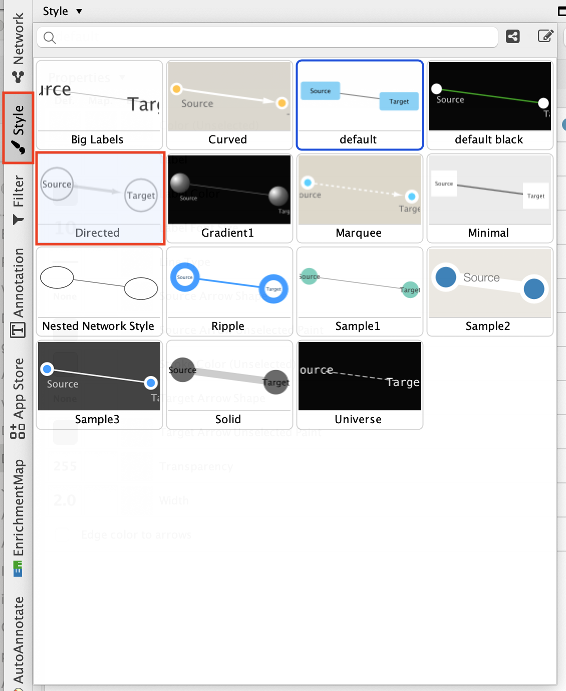
Adjust the node style.
Go to the ‘Style’ tab and make sure that the ‘Node’ tab is selected.
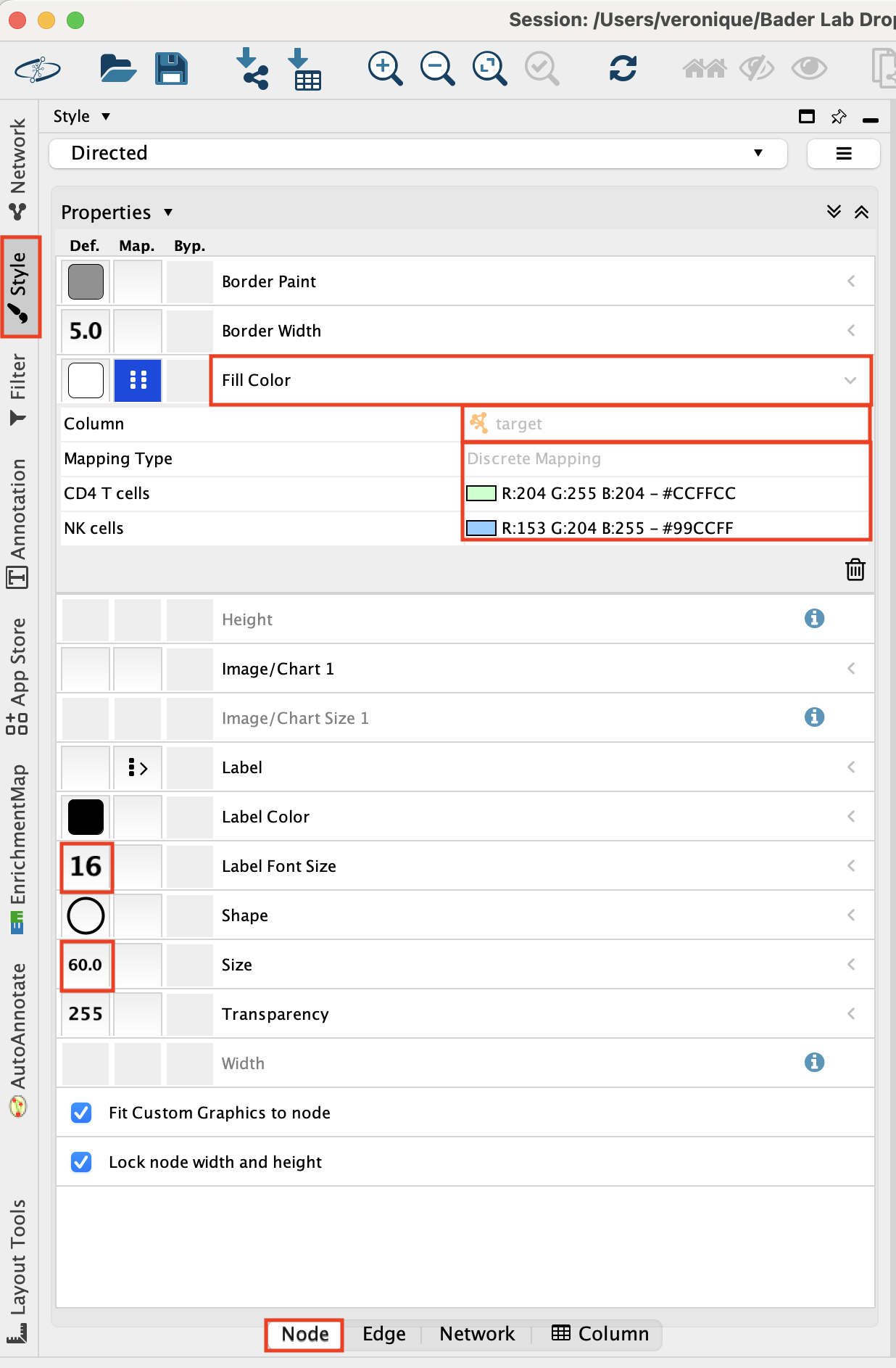
Adjust the ‘Fill Color’:
- Click on “Fill Color”.
- Click on the down arrow.
- Set ‘Column’ to ‘target’.
- Set ‘Mapping Type’ to “Discrete Mapping’ and click on the blanck space and on the”…” to set a color.
Set ‘Label Font Size’ to ‘16’.
Set ‘Size’ to ‘60’.
- Adjust the edge style.
- Go to the ‘Style’ tab and make sure that the ‘Edge’ tab is selected.
- Set “Label” to “lr_means”.
- Set “Width” to “lr_means”.
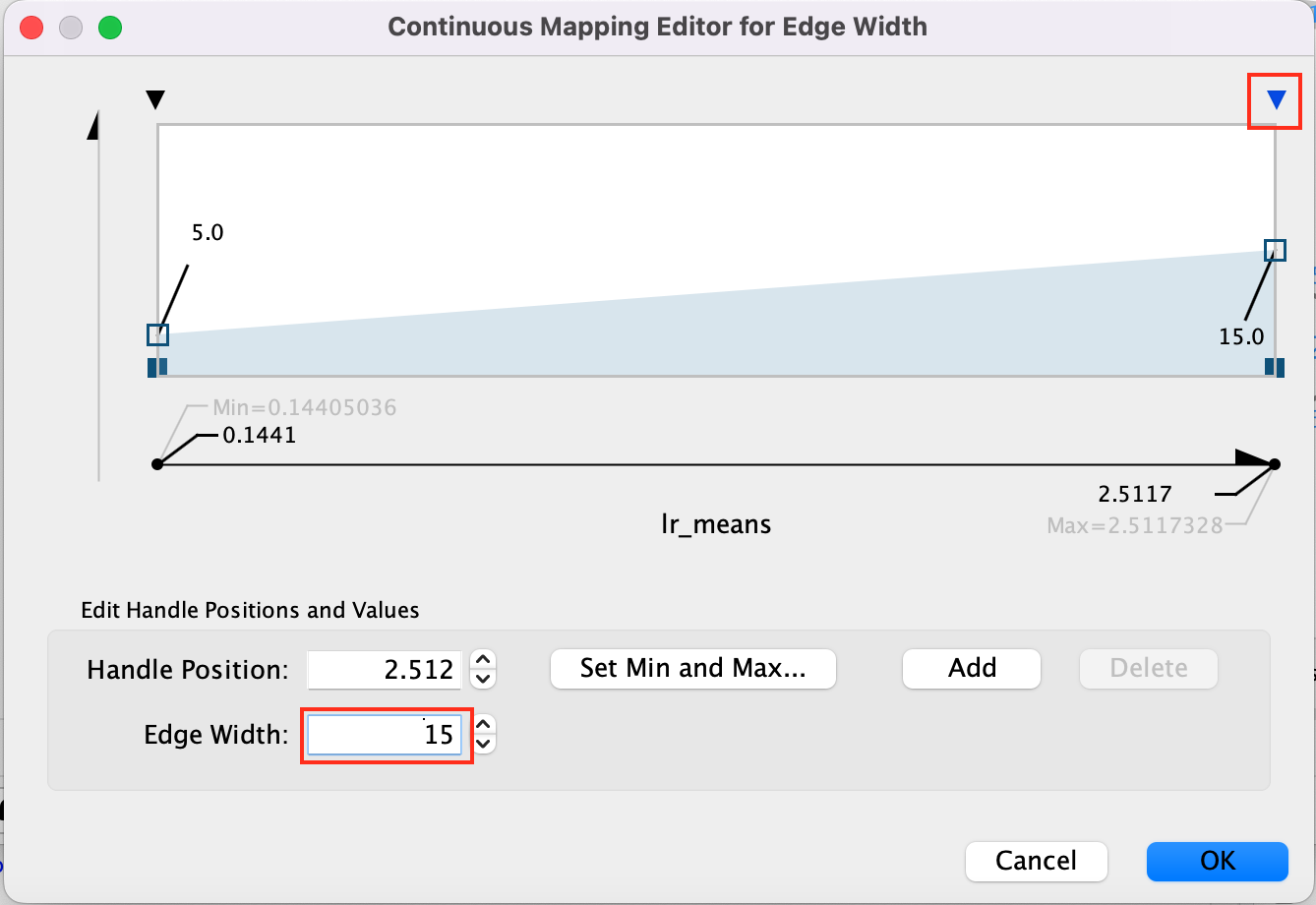
- Set “Width” - “Mapping type” to ‘Continuous Mapping’
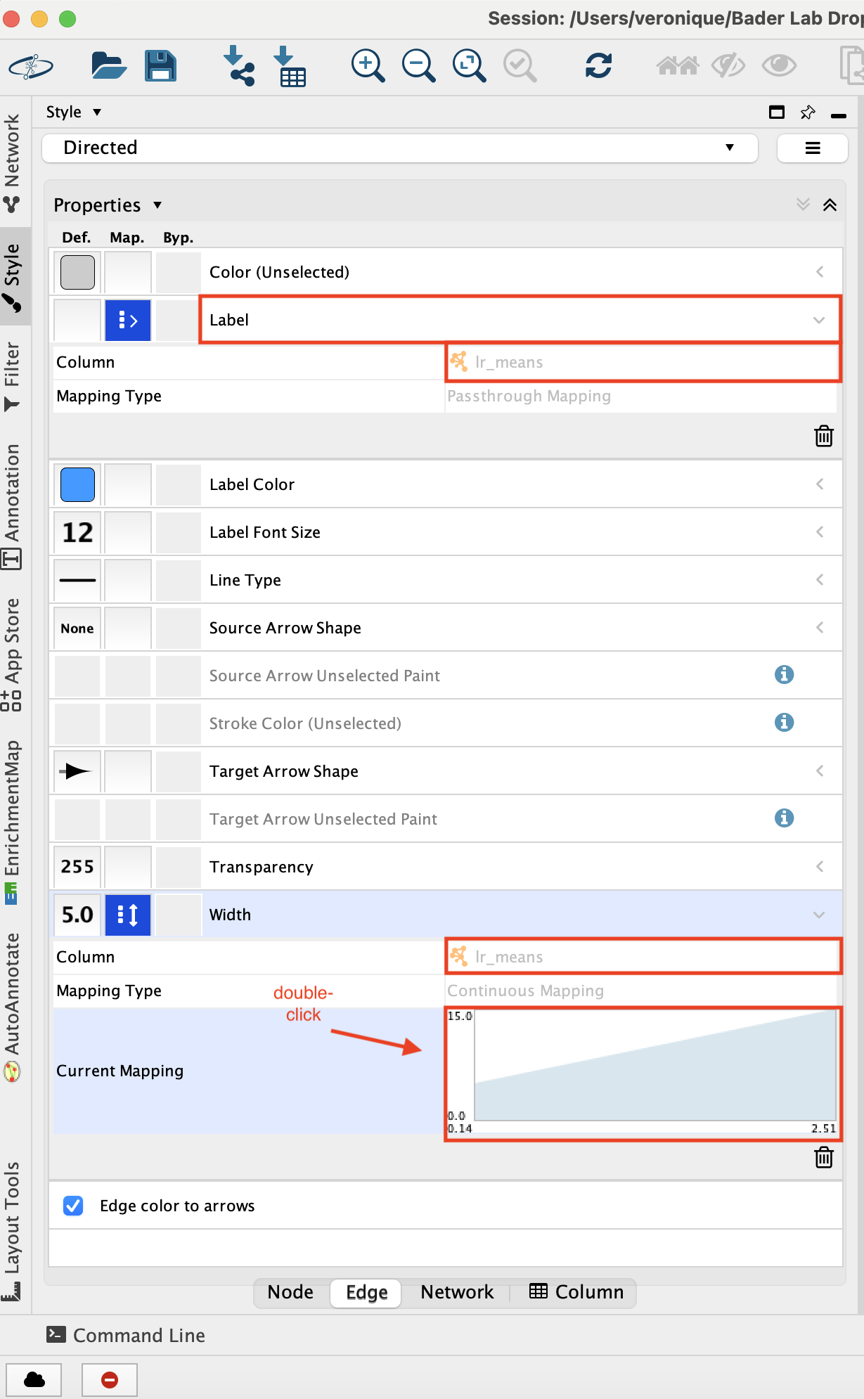
- Double click on the chart that shows up to adjust the parameters.
- Adjust minimum width to 5 adn maximum width to 15 -
- Click on the top arrow and then set the edge width to 5. Press enter to register the change.
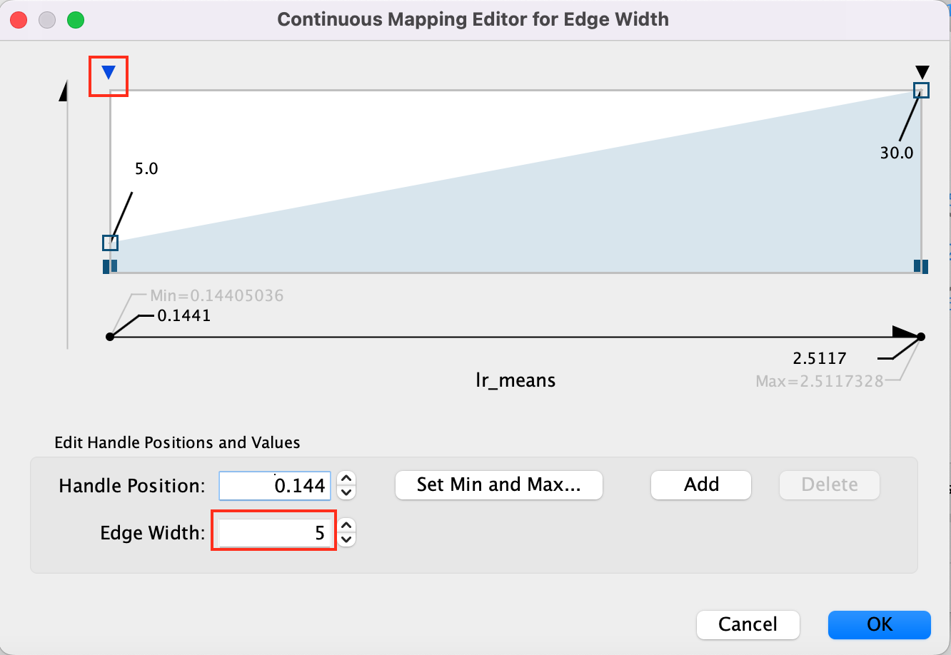
- Click on the top right arrow and then set the edge width to 15. Press enter to register the change.
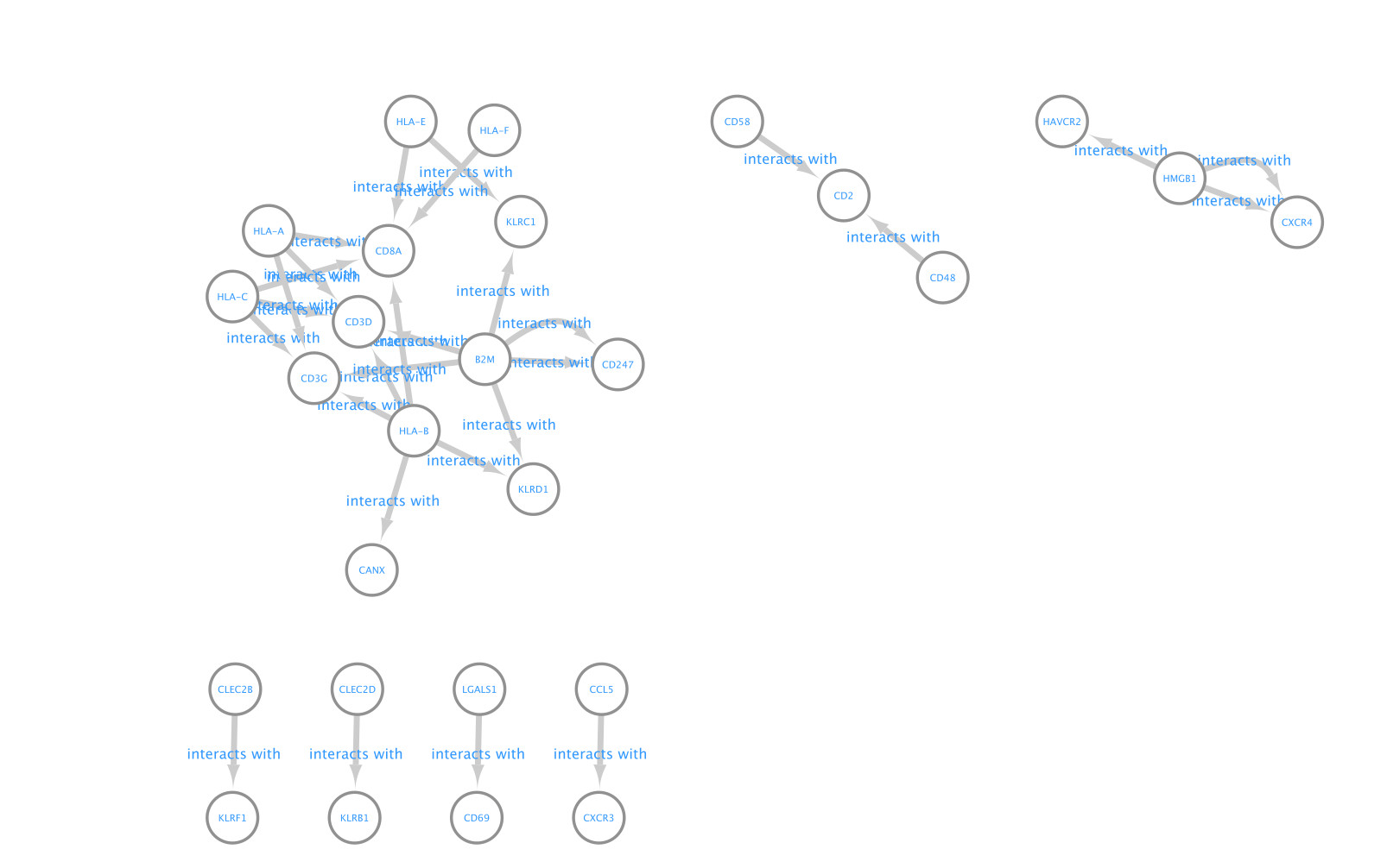
- Here is the resulting network:
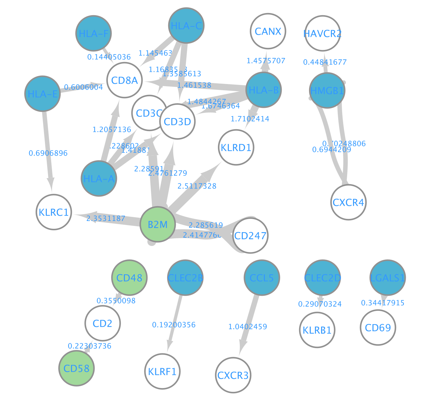
- Align the nodes so that the ligands from the CD8 cells are in the middle and the receptors from NK and CD4 cells on the left and right side.
- You can do it manually. Alternatively, you can use the layout tools.
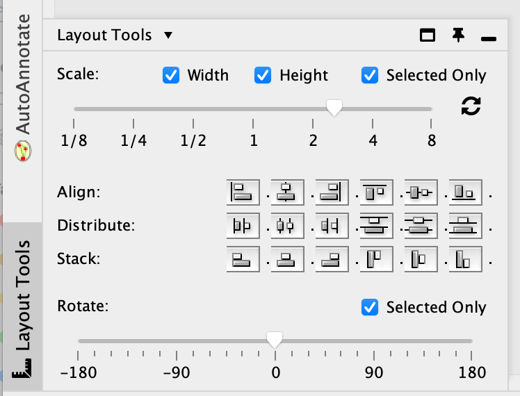
- Select the nodes of interest, go to the ‘layout tools’ and click on a align or distribute option.
- Add annotation:
- Right click on a blank space and add an annotation.
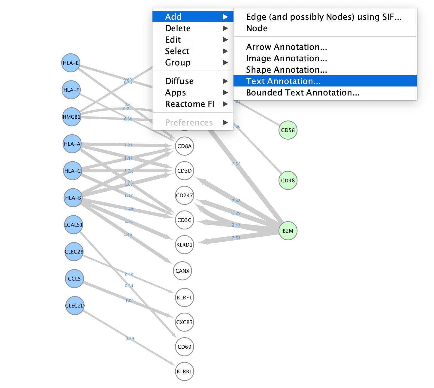
- Right click on a blank space and add an annotation.
- Here is the final result:
- Do not forget to save your session. You can also export the network as an image.
Dataset and references
Reference paper: Multiplexed droplet single-cell RNA-sequencing using natural genetic variation. Kang et al. Nat Biotechnol. 2018 Jan;36(1):89-94., PMID: 29227470
References used to build the Jupyter notebook and run CellPhoneDB:
Dataset preprocessing and running CellPhoneDB
Do not run during practical lab. This is for your information only.
CellPhoneDB is a python package. Running CellPhoneDB is out of score for this lab but the annotated code is included in totality in this Jupyter notebook and is available for download using these links :
CellPhoneDB_jupyter_notebook.pdf
CellPhoneDB_jupyter_notebook.ipynb
Some installation instructions are placed at the top of the document.
- Running CellPhoneDB: The provided Jupyter notebook contains 2 methods to run CellPhoneDB. The first method is to run CellPhoneDB using the Liana package. This method is simple and allows for the comparison with other cell-cell communication tools also included in the Liana package. (See part 1 of the notebook). The second approach is to run it directly from the CellPhoneDB package. It offers the advantage to choose the version of the ligand-receptor database and to run it from 3 offered methods: basic, statistical and DEG-based. This is part 2 of the notebook.
Please consult the CellPhoneDB webpage and gihub links provided at the top of the document as they contain detailed information and tutorials.
Lab 4: NEST
The presentation and processing of spatial transcriptomics is out of scope for this lab. Please refer to the CBW Spatial Transcriptomics workshop or to this review article or this one for additional information.
This lab uses examples from the 10X Visium technology
NEST (NEural network on Spatial Transcriptomics)
NEST reference paper (bioRXIv): Spatially-mapped cell-cell communication patterns using a deep learning-based attention mechanism:
Cells can communicate in 3 ways through direct contact, local chemical signaling or long-distance hormonal signaling. Paracrine signaling acts on nearby cells, endocrine signaling uses the circulatory system to transport ligands, and autocrine signaling acts on the signaling cells.
Cell-cell communication (CCC) between neighbouring cells occur via soluble signals. Cells utilize a system of surface-bound protein receptors and ligand pairs to communicate. The ligand from Cell A (source) will bind to the receptor of Cell B (target). It will trigger a signaling cascade that helps Cell B to adapt to its environment.
Spatial transcriptomics offers an advantage for studying cell-cell communication as it preserves cellular neighborhoods and tissue microenvironments.
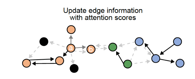
The goal of NEST is to predict probable cell cell communication interactions using a deep learning approach. It uses ligand-receptor pairs information and NEST goal is to discover re-occuring CCC patterns in the data.
It uses a graph attention network (GAT) paired with an unsupervised contrastive learning approach to decipher patterns of communication while retaining the strength of each signal. It then uses Depth first Search (DFS) to define subgraphs to be retained after filtering the top edges using the attention score from GAT.
Input data:
 NEST needs two types of information as input data:
- The first is the transcriptomics data with the spatial information from our biological sample (left side) and is composed of a feature matrix containing the gene expression raw counts and the postion matrix of the cells or spots.
- The second is a database of all known ligand-receptor pairs. This database is precomputed by NEST.
Step1:
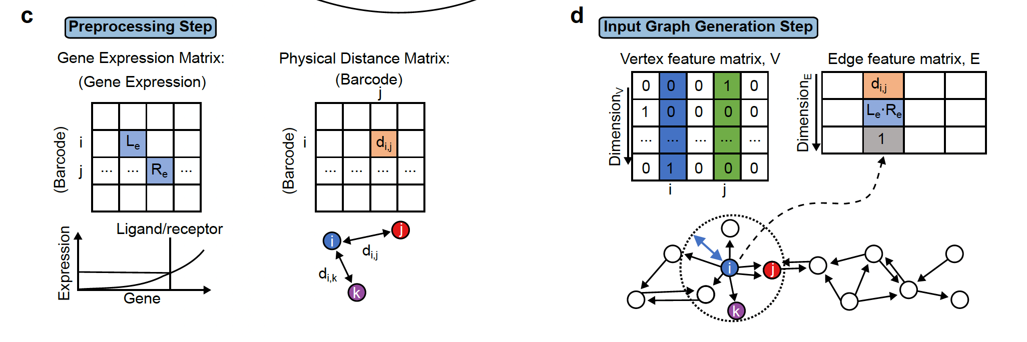 The first step is preprocessing step which includes filtering cells/spots and quantile normalization.
Step2: Two important pieces information are collected:
- The physical distance between all cells are collected and if 2 cells are close to each other, they are linked by an edge in the resulting network.
- the presence of ligand-receptor interaction for each pair of cells. The graph (network)connects all cells that are physically close and this edge stores the ligand-receptor information between the 2 cells.
Step3:
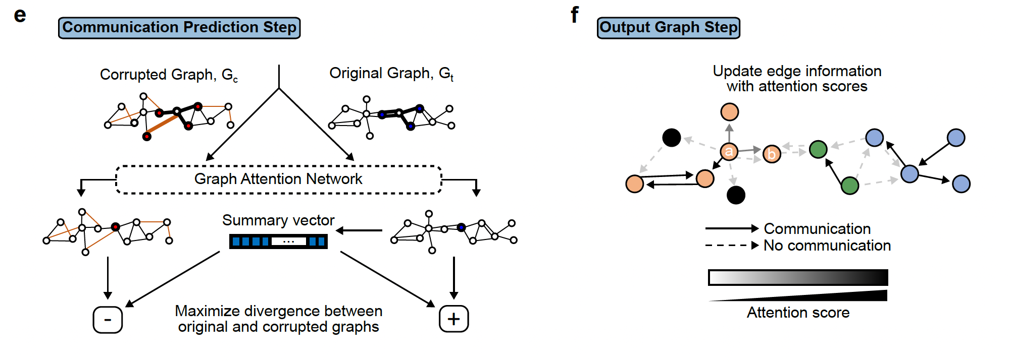 The third step involves the deep learning step that will output the final graph. The final graph retains only the edges that pass a certain threshold of the attention score. Top 20 edges are retained by default. This graph is then divided into subgraphs by the DFS algorithm. The subgraphs are represented by different colors and can be interpreted as regions of cells that are communicating a lot.
Step4:
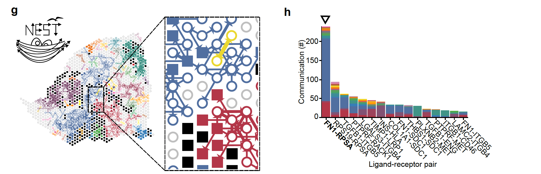
The last step is the visualization of the results of the final graph with all the ligand-receptor pairs that are the most probable cell cell communication interactions in the data under study. This is the step that we are going to explore in the lab using the NEST-interactive tool.
On the left, we see the reconstruction of the tumor section (Visium output)), the squares represent tumor cells and open circles represent stromal cells and the arrows represent the communication between the cells (ligand-receptor pairs). The different colors represent the subgraphs from the final graph of step 2. On the right, we see the histogram representing the top 20% ligand-receptor pairs that are the most represented in this dataset and evaluated by NEST and the colors are related to the subgraphs.
How to run NEST
NOTICE!
Do not run this part during the workshop.
NEST requires a graphical processing unit (GPU) to run and it is best to run it on a supercomputer (cluster). Running time and memory usage depend on the input data size.
NEST was run with 79,795 edges (each representing a ligand-receptor pair) and 1,406 vertices (each representing a Visium spot), and took 5 hours with 2.44 GB memory for each run. NEST is typically run 5 times.
Below is the information to be able to run NEST on your own after the workshop. This information is taken from the NEST github page.
NEST is written in the python language.
NEST is available as a Singularity image. Similar to Docker, it enables easy usage of NEST without set up of required environment and python packages. Furthermore, Singularity is usually installed on supercomputer/cluster system.
Steps that you would follow to run NEST:
- Step1:
- Login to your cluster system and create a folder that will store all NEST input and output data.
- Check that Singularity is installed on the cluster; check that cluster node is connected to internet
- pull the NEST singularity image
- all instructions are listed here: https://github.com/schwartzlab-methods/NEST/blob/main/vignette/running_NEST_singularity_container.md
mkdir nest_container
cd nest_container
singularity pull nest_image.sif library://fatema/collection/nest_image.sif:latest

#First time running NEST, go to NEST directory and run:
sudo bash setup.shStep2: prepare your input data. NEST takes 2 inputs:
ligand-receptor database: The default database provided by the model is a combination of the CellChat and NicheNET databases, totaling 12,605 ligand-receptor pairs. You can upload your own custom database if you are working with a different model organism.
a spatial transcriptomic data set containing:
the spatial data that contains the image and the spot localization
the feature matrix that contains the gene expression in each spot (in h5 format)
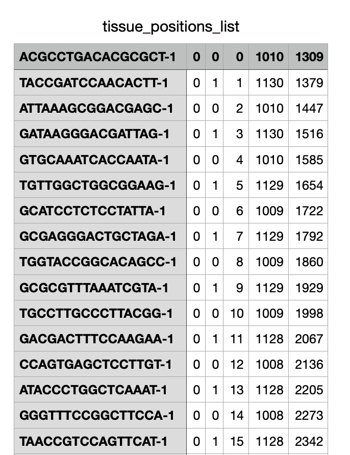
NEST requires the position matrix (tissue_position_list.tsv) and the feature matrix file. If you are working with Visium 10x, you can simply give the path to the space ranger output folder to run NEST. If you are working with other technologies, you can simply look at the format of the position and feature matrices and use this format as NEST input with your own data.
- Step3: running NEST
Preprocess
nest preprocess --data_name='V1_Human_Lymph_Node_spatial' --data_from='data/V1_Human_Lymph_Node_spatial/'Train the model
nohup nest run --data_name='V1_Human_Lymph_Node_spatial' --num_epoch 80000 --model_name='NEST_V1_Human_Lymph_Node_spatial' --run_id=1 > output_human_lymph_node_run1.log &
nohup nest run  --data_name='V1_Human_Lymph_Node_spatial' --num_epoch 80000 --model_name='NEST_V1_Human_Lymph_Node_spatial' --run_id=2 > output_human_lymph_node_run2.log &
nohup nest run  --data_name='V1_Human_Lymph_Node_spatial' --num_epoch 80000 --model_name='NEST_V1_Human_Lymph_Node_spatial' --run_id=3 > output_human_lymph_node_run3.log &
nohup nest run  --data_name='V1_Human_Lymph_Node_spatial' --num_epoch 80000 --model_name='NEST_V1_Human_Lymph_Node_spatial' --run_id=4 > output_human_lymph_node_run4.log &
nohup nest run  --data_name='V1_Human_Lymph_Node_spatial' --num_epoch 80000 --model_name='NEST_V1_Human_Lymph_Node_spatial' --run_id=5 > output_human_lymph_node_run5.log &
Postprocess the model output
nest postprocess --data_name='V1_Human_Lymph_Node_spatial' --model_name='NEST_V1_Human_Lymph_Node_spatial' --total_runs=5 Please follow the NEST github page for complete instructions and vignette to run NEST
We are going to visualize the result using NEST-interactive but please note that a command line for visualization is also available in NEST:
nest visualize –data_name=‘V1_Human_Lymph_Node_spatial’ –model_name=‘NEST_V1_Human_Lymph_Node_spatial’
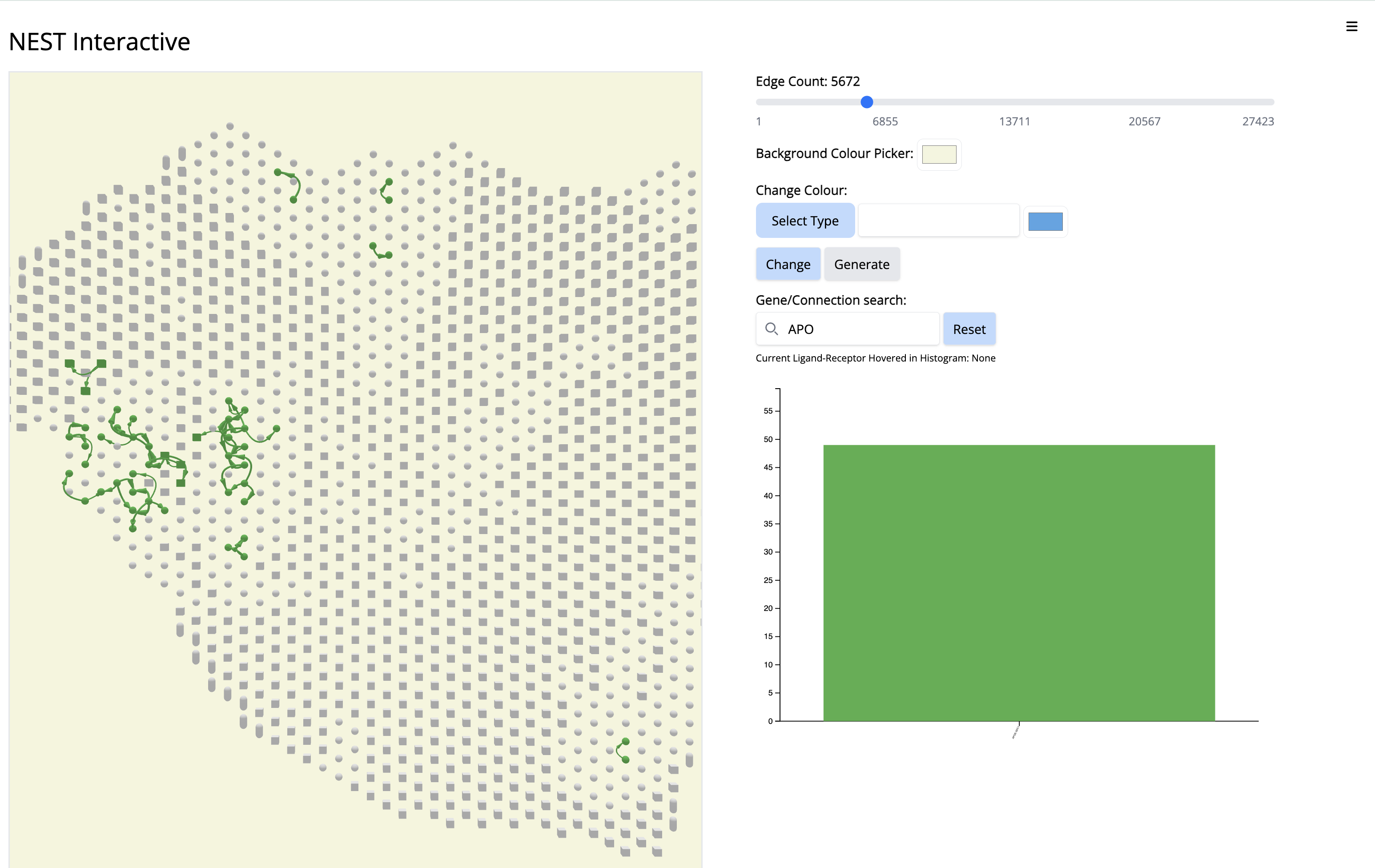
Practical lab : Pancreatic Ductal Adenocarcinoma (PDAC)
- PRESENTATION OF THE DATA:
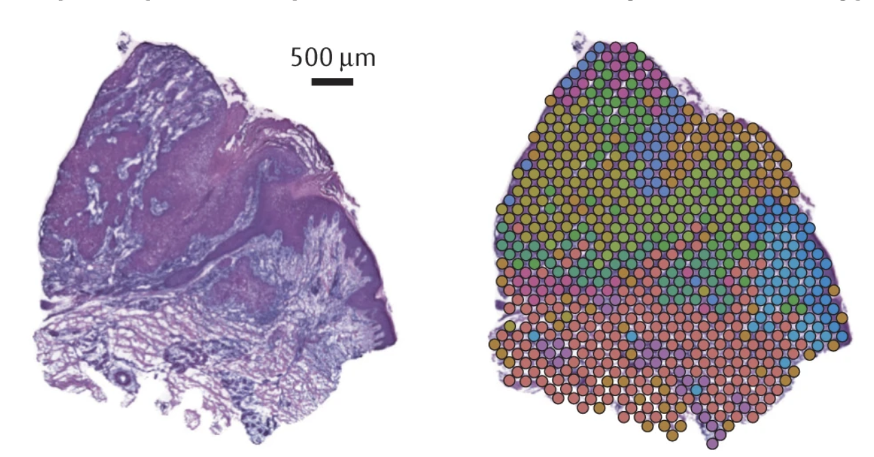
For this practical, we are working with PDAC and a tissue from a patient, PDAC_64630 , measured by Visium 10X. PDAC is recognized as a highly aggressive disease. There is immense transcriptional diversity defining discrete “Classical” and “Basal” subtypes. A PDAC tumor microenvironment is heterogeneous and consists of tumor, stromal and immune cells.
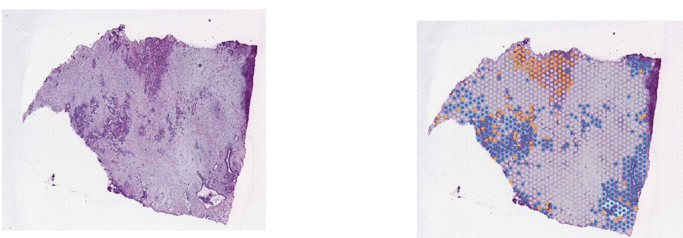
On these images, we can see the tissue section with the H&E stain on the left and we can see the Visium output on the right. The tumor regions were labelled classical (blue) and basal (red) based on some gene markers. In the middle of the tissue section, regions of stroma are colored in grey.
Goal and learning objective: - Learn how to run NEST-interactive and how to make biological inferences from the cell cell communication graph coming from the NEST output. - We will explore cell cell communication subgraphs that are localized to different regions of the tissue section: stroma, classical or basal regions. - We will explore some specific ligand-receptor pairs.
- LAUNCH THE DOCKER:
Open docker desktop (If docker is already running you can find the docker icon in your task bar. Right click on the icon and select “Go to Dashboard”).
We are going to run the Docker image that you have installed during the prework .
Open a terminal window and type the command below to launch NEST interactive:
docker run -p 8080:8080 -p 8000:8000 risserlin/nest_docker:pancreatic- Open a web browser and go to http://localhost:8080/HTML%20file/NEST-vis.html
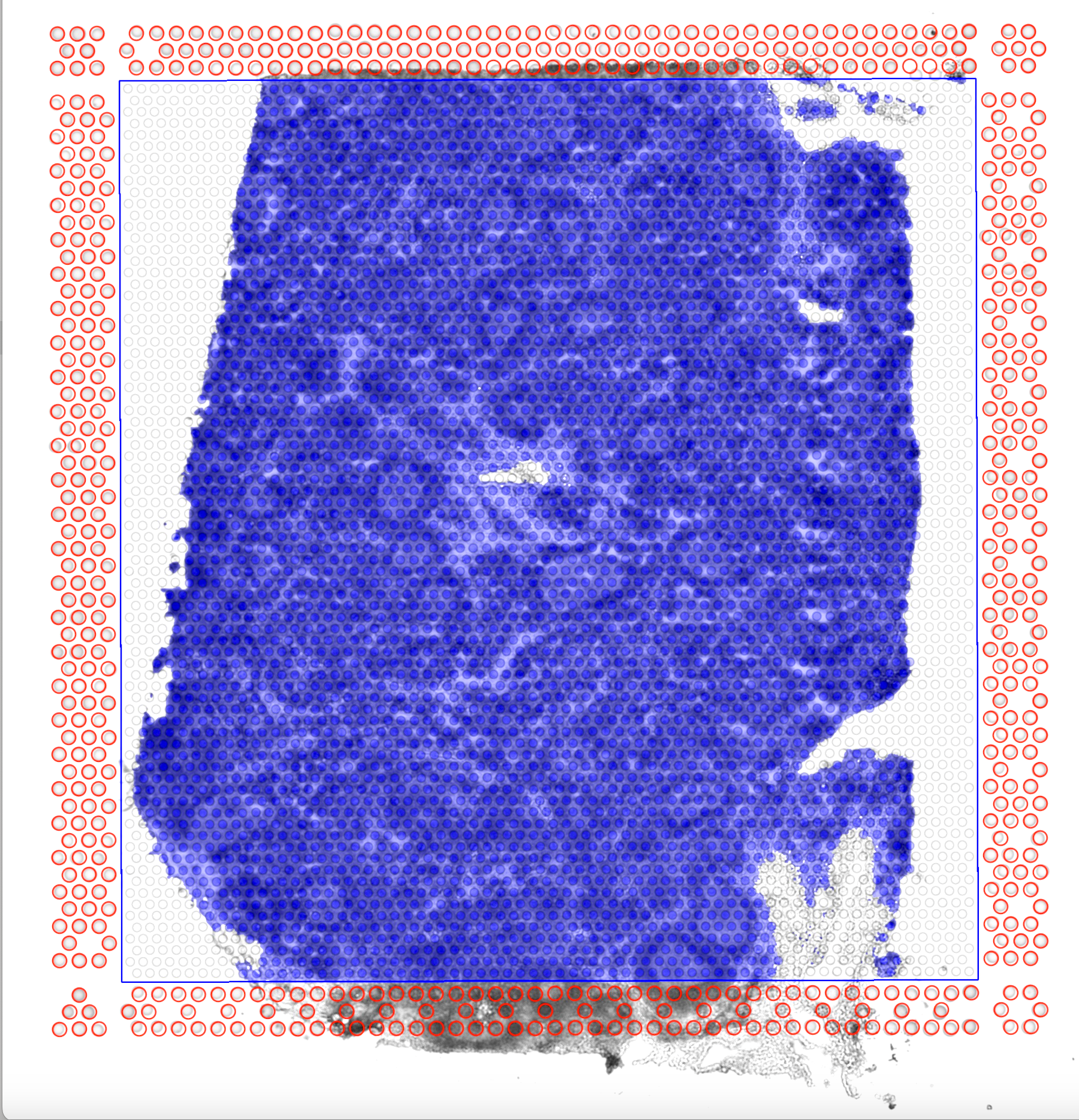
Adjust the window size or zoom out if necessary.
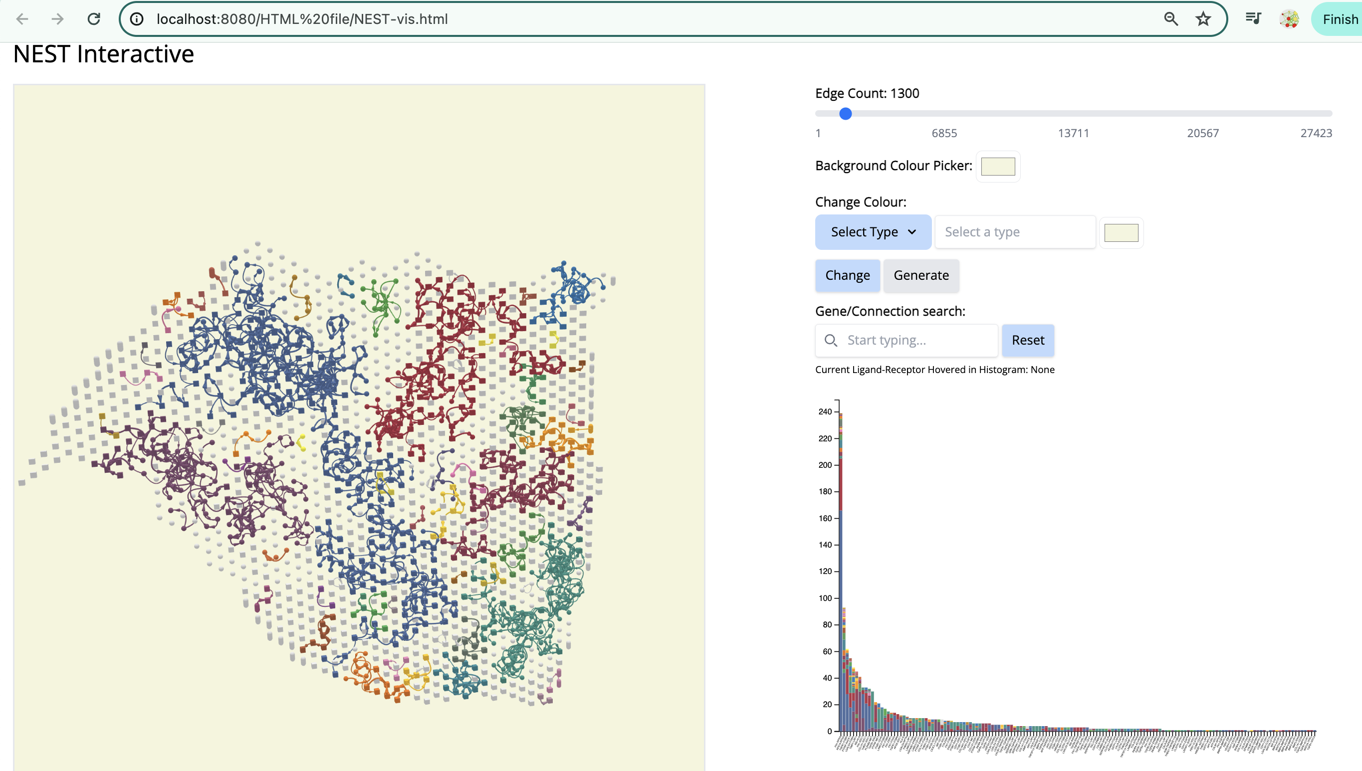
We see the Visium output of the tumor section on the left. The grey circles represent the tumor spots and the squares represent the stroma spots. Only the top 1300 edges which are the top ligand-receptor pairs based on the association score are shown. The different colors of the graph represent the different subgraphs computed by the last step of NEST ((DFS). Each subgraph groups cells that are communicating a lot together.
On the right, the histogram represents the frequency of each ligand-receptor pair on the graph. A ligand-receptor can be present in different subgraphs (represented by different colors).
- STEPS TO FOLLOW:
- Change color by vertex type: tumor - red. - Select ‘Vertex Type’ to ‘tumor’ and change the color to red. Click on ‘Change’.
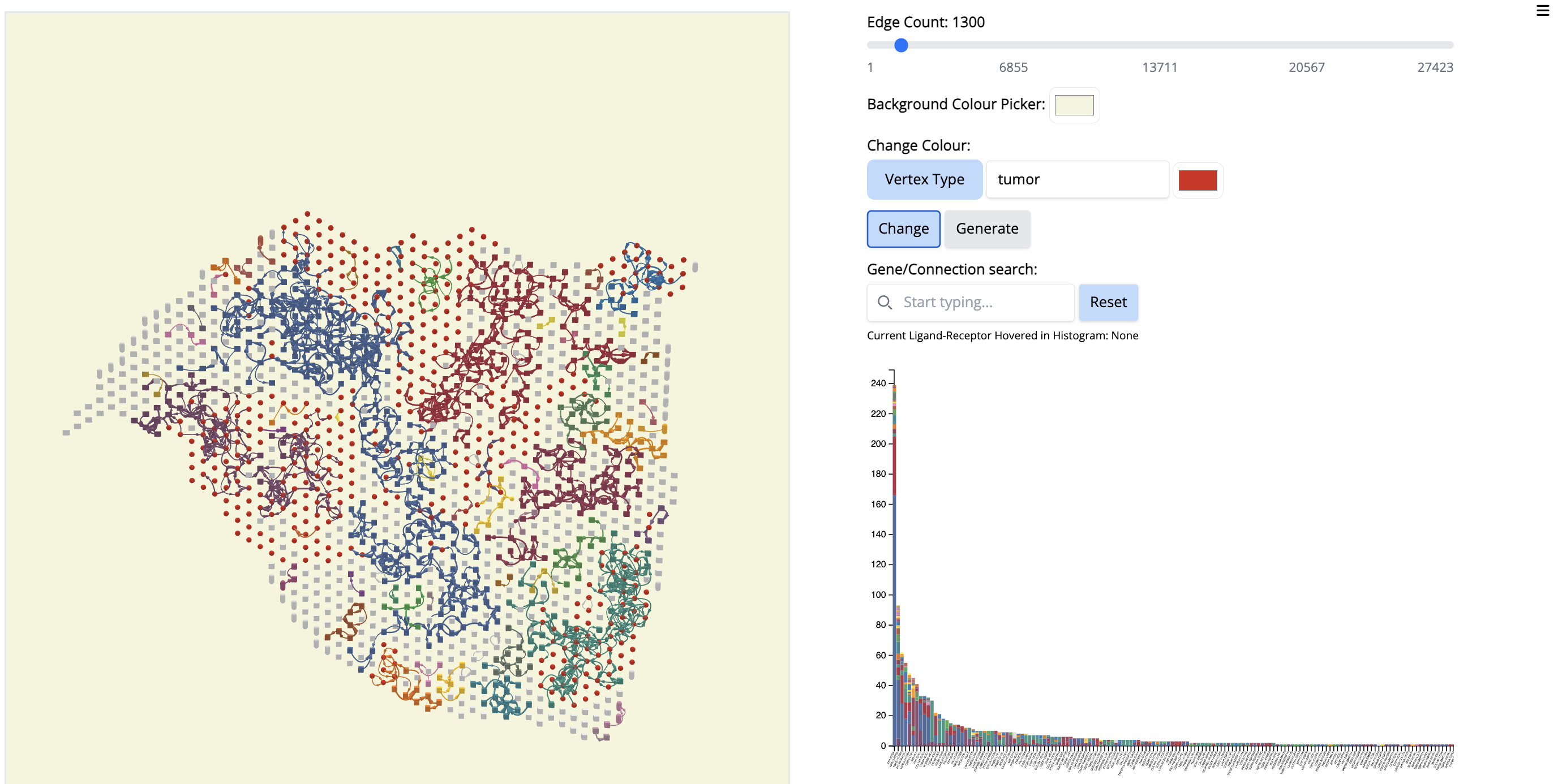
- Click on the first signal on the histogram plot. What is the first signal? Look at the literature to interpret the condition.
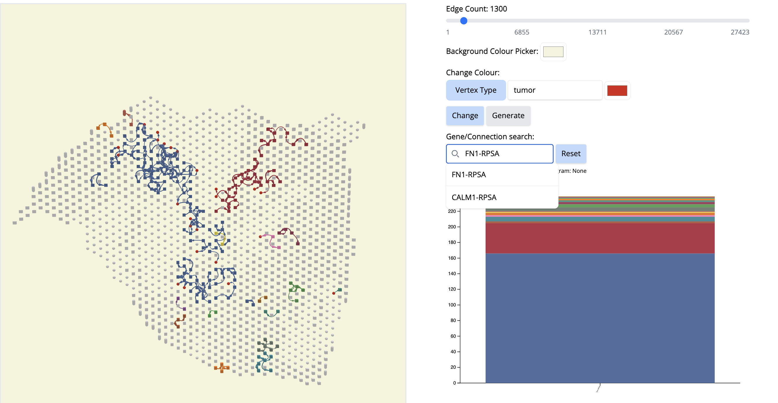
Answer: –The first signal is FN1. Fibronectin (FN1) is considered one of the main extracellular matrix constituents of pancreatic tumor stroma. High stromal FN1 expression associated with more aggressive tumors in patients with resected PDAC. Likewise, the cell membrane receptor Ribosomal Protein SA (RPSA) regulates pancreatic cancer cell migration. – so anticipate what is happening.
Reset. (Click on the ‘Reset’ button)
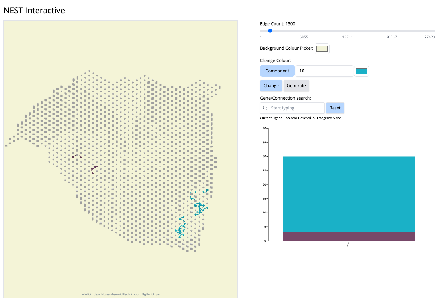
See which components cover a particular cancer region. Let’s pick component 10 (Cyan color).
- In the ‘Change Colour’ box, select ‘Component’, enter 10 and pick the cyan color. Click on ‘Change’.
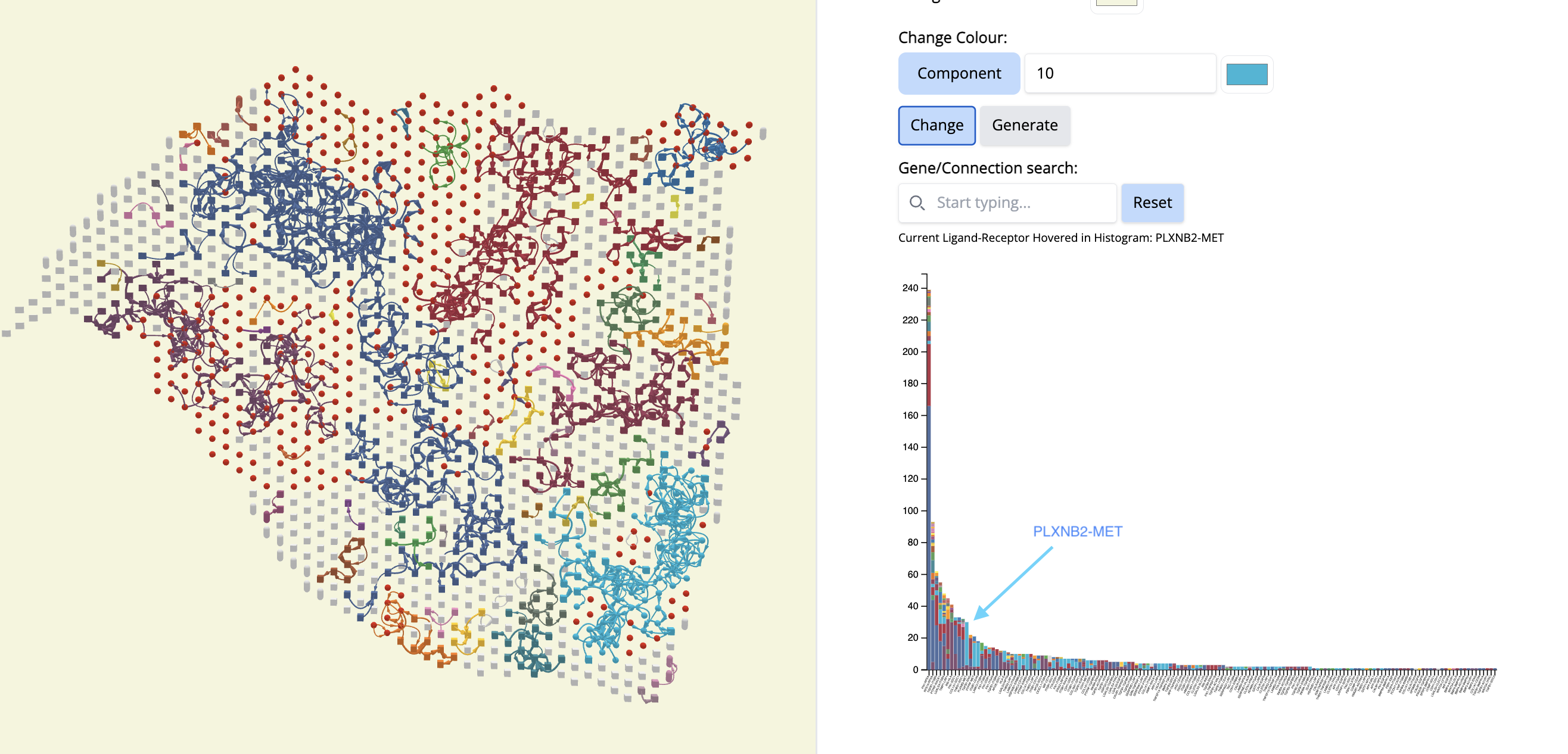
- What is remarkable is that this CCC subgraph colocalizes with the Classical subtype.
- Now, let’s see which CCCs are happening there in component 10.
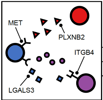
- We go to the histogram plot and click on the histogram which has the same color as component 10. Let’s pick the first most abundant CCC: PLXNB2-MET (most abundant because a bigger proportion of this CCC is associated with component 10).
If we click on this histogram, it will show the regions where only that CCC is happening. And we see that it is happening only at that particular location. It aligns with Classical subtype of the PDAC cancer. That means, PLXNB2-MET may be a potential biomarker CCC for this subtype. → Next step for your research starting from this hypothesis: navigate further studies, e.g., comparing across multiple samples to see if PLXNB2-MET is also found in other samples in the Classical region.
Reset. (Click on the ‘Reset’ button)
Pick another cancer region - Component 4. To focus on this, let us change the color ‘by component’.
- In the “Change Colour” box, select ‘Component’, enter 4 and pick the cyan color. Click on ‘Change’.
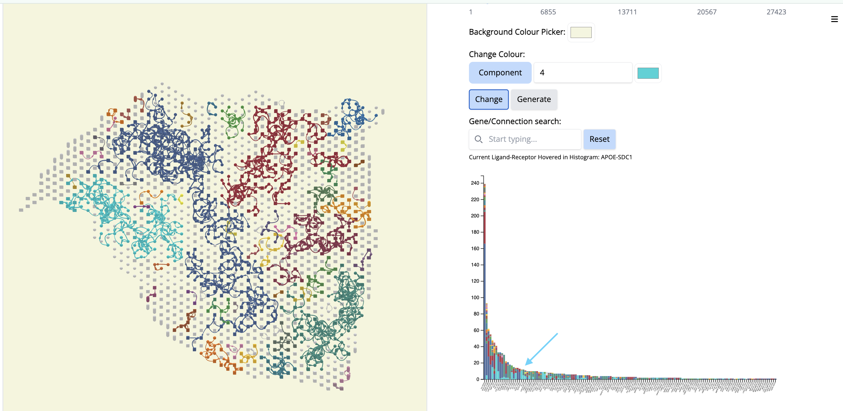
It colocalizes to another classical region of the tissue section but it will contain different ligand-receptor interactions.
- Go to the histogram plot. Pick a CCC that happens only in Component 4 - even if it is low - APOE-SDC1. Select that histogram and look at the spatial location. It is happening only in this particular region.
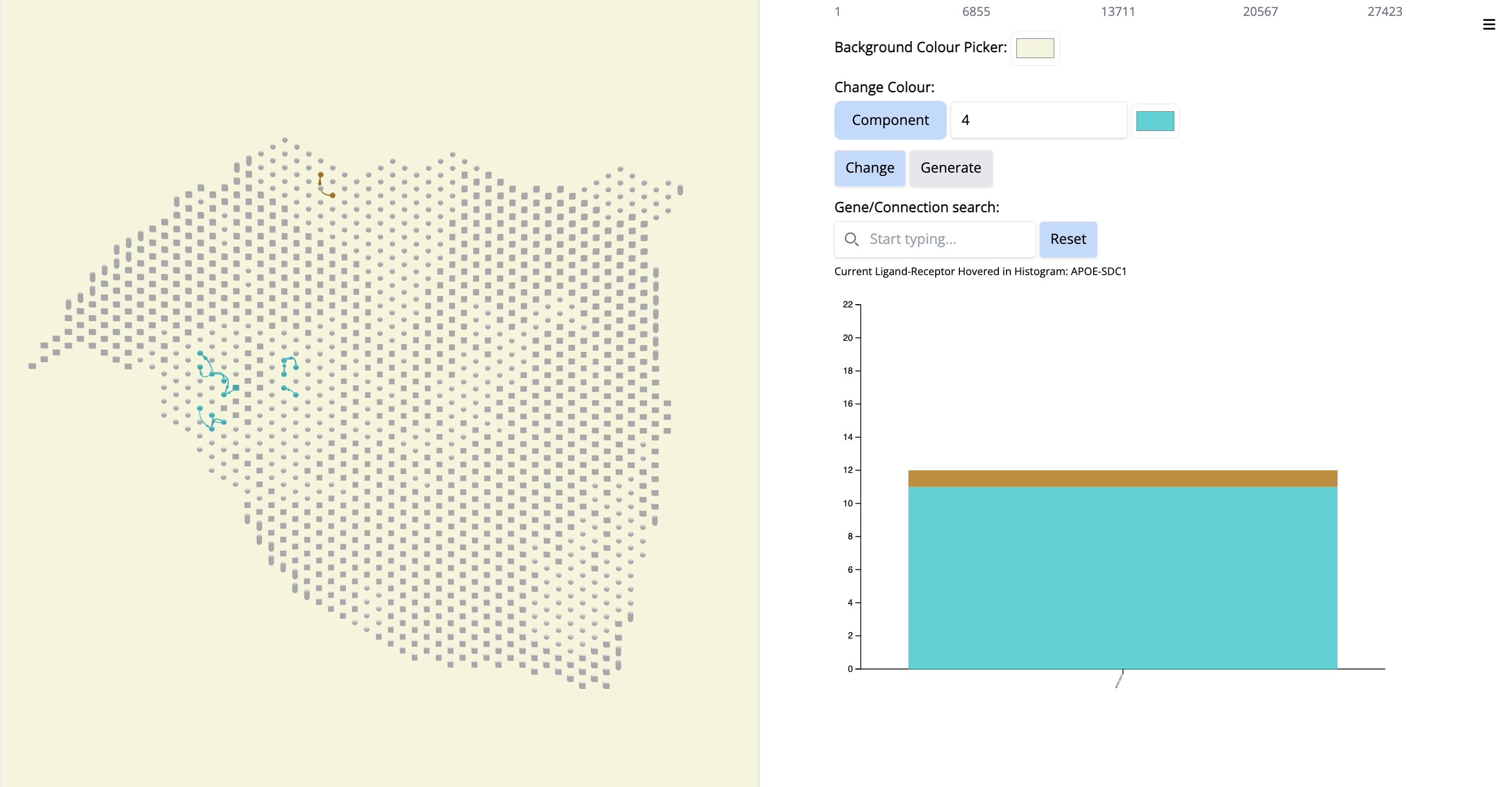
Since this interaction pair is in low amount, to gain more confidence, we could have increases the number of top CCC edges - 5000 (sliding bar on top) and repeat the process.
- Increase the number of edges. Wait until NEST_interactive finishes. In this step, NEST is recalculating the subgraphs.
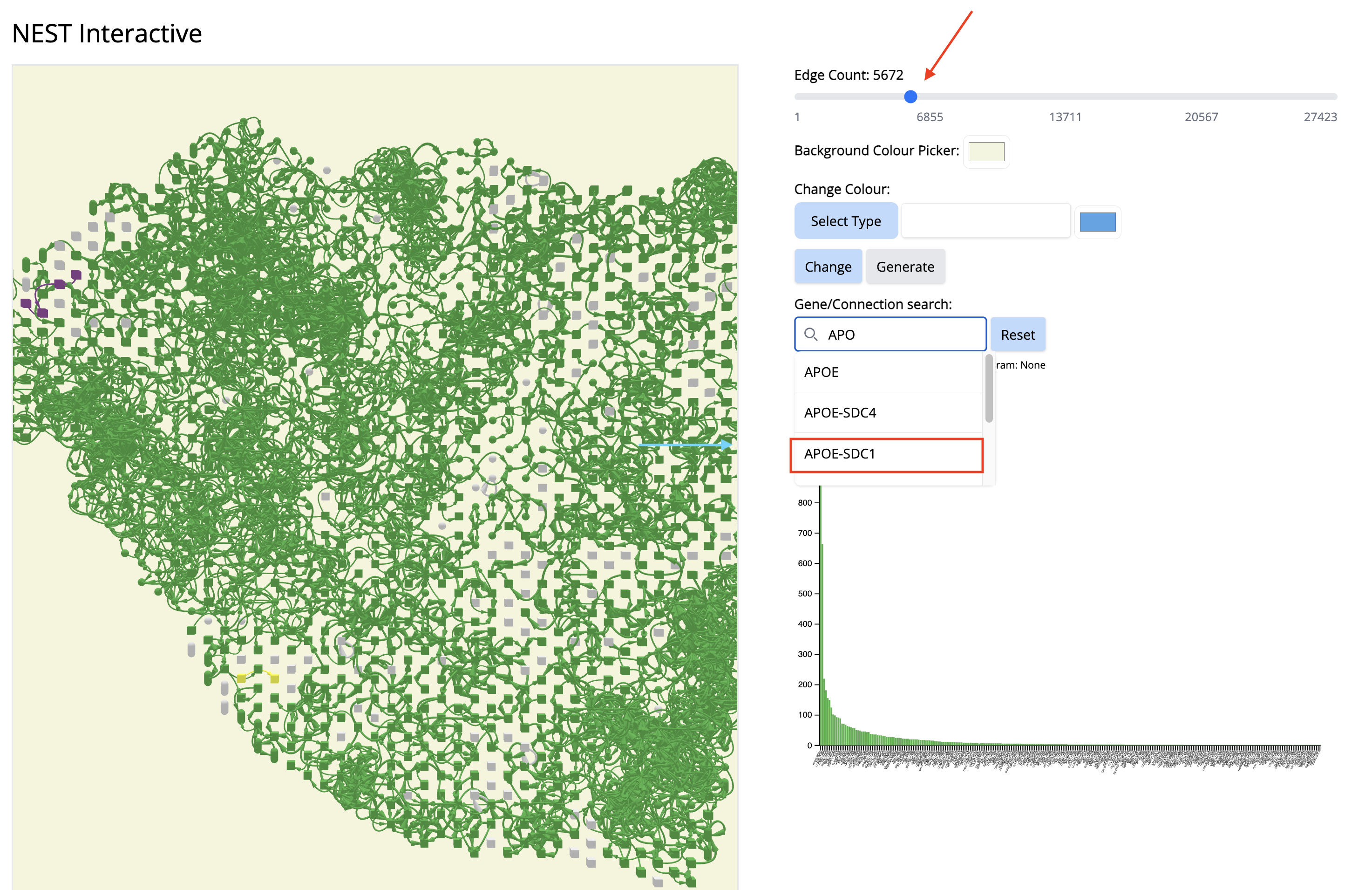
- In the ‘Gene/Connection search’ search box, look for and select ‘APOE-SDC1’